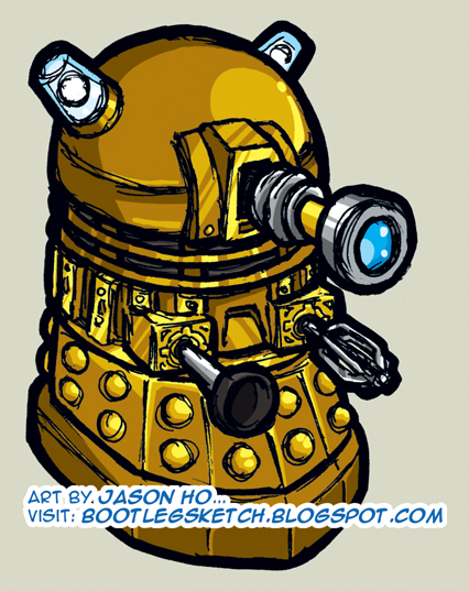
I don’t think this piece was completely successful. Instead of looking like a super-deformed Dalek, it kind of just looks like a misdrawn Dalek. What do you think?
Anyways, it’s colored gold, as per the most recent incarnation of the Daleks. A semi-significant art note, for anyone interested in the details–this is the first sketch I’ve posted where I’ve completely left the line art in black. If you go back and look at previous sketches, in each one almost all of the outlines are in color. Even most spots where the lines appear to be black, a closer look will reveal that it’s usually a very dark grey, brown, or blue. The purpose of this is to “soften” up the sketch–excessive amounts of black sketch lines can look very harsh. However, harshness, I thought, would go well with a Dalek.
I always thought the Daleks were kind of silly, I mean one arm is a toilet plunger, and the other arm is a cake mixer. What’s scary about that? And then I started thinking about it while I was drawing this… one arm is a toilet plunger and the other is a cake mixer. Do not, I repeat: DO NOT, eat an unidentified cake, if Daleks are known to be within the area!
Post Script: Regardless of what you think of the old Doctor Who (or even if you know nothing about it), give the new series a shot–it’s a good time.
mmmmmm…..cake….
Nice work Big Jase!
I LOVE HIM!!!
now post the original.
and i think the super-deformed works just fine.
finally! a little bit o’ GENIUS!
GAH! my frst comment was lost!
anyways sorry for the belated post ive not been online much.
i still think the sketch is a little messy, but this time not in its sketchiness, but rather in the sketchy quality juxtaposed against the still rather tight and illustrative execution of the colors. free up your colors, leaning in the direction of the impressionistic, and u’ll nail it!
eh, at least ur experimenting and growing.
and the thought process of each post is becoming clearer each time, which is good. the process is not important in illustration or advertising, but it is in every other area of art. of course, it’s up to u whether or not it’s important to YOU. i prefer seeing the process since i love drawing so much. but it’s an aesthetic learned.
im also glad to see ppl besides me enjoying the new Dr. Who. well, im not watching it NOW, as i cant afford cable, but u know what i mean…
and if it means anything:
i knew IMMEDIATELY it was a dalek. now draw the tripods from the War of the Worlds!
don chente: thanks comrade!
ren: glad you like it–the original version is a super-secret marketing weapon that is only to be posted when the time is right!
lord shen: thanks for the in-depth crit my man–i think sketchy lines + clean colors may just end up being my style, but i am going to try and experiment a bit (see next post). i’m glad you enjoy reading about the process–i enjoy reading that kind of stuff, so i type it up for folks to read, in case they care… or if they’re just bored. o_o