click above for larger view

Here I present a gothy, zaftig, nekomimi kunoichi, dressed in what I would describe as Miami Vice Decepticon colors, and armed with a guan dao (not quite a naginata), shuriken, and bombs:
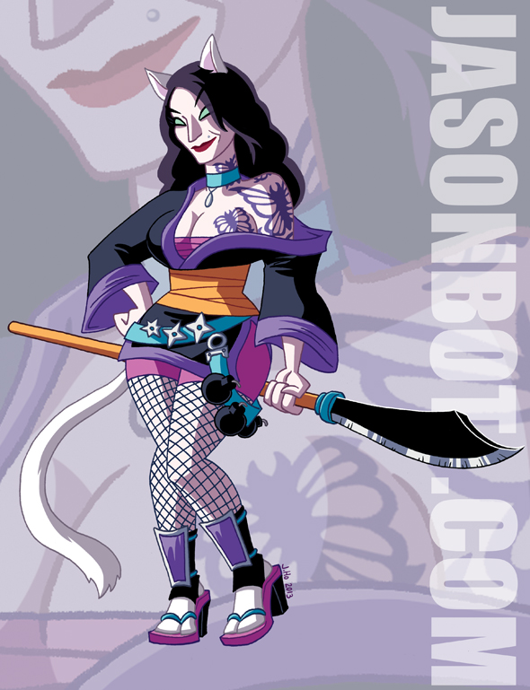
Now, if you aren’t down with a gothy, zaftig, nekomimi kunoichi, dressed in Miami Vice Decepticon colors, and armed with a guan dao (not quite a naginata), shuriken, and bombs… well I don’t even know what you’re doing here.
Side note: I apologize for the huge URL, it’s actually there to balance out the composition, because I wouldn’t, you know, think about composition before hand. WHO DOES THAT???
Now if you’ll excuse me, I think it’s high time I started a band called Miami Vice Decepticon.
*air guitar riff*
I took a trip to Portland a few weeks ago, and sat next to a really friendly couple on the plane. I drew this Captain America sketch for their son. They asked me to, I don’t just force sketches on strangers when I’m on a plane!

(Posted this on Instagram, but thought I’d put it up here too, just for archive purposes and all of that.)
On Sunday at 1am, I got pretty excited about Daylight Saving Time ending, hatched an idea for a strip that amused myself, and now, here we are:
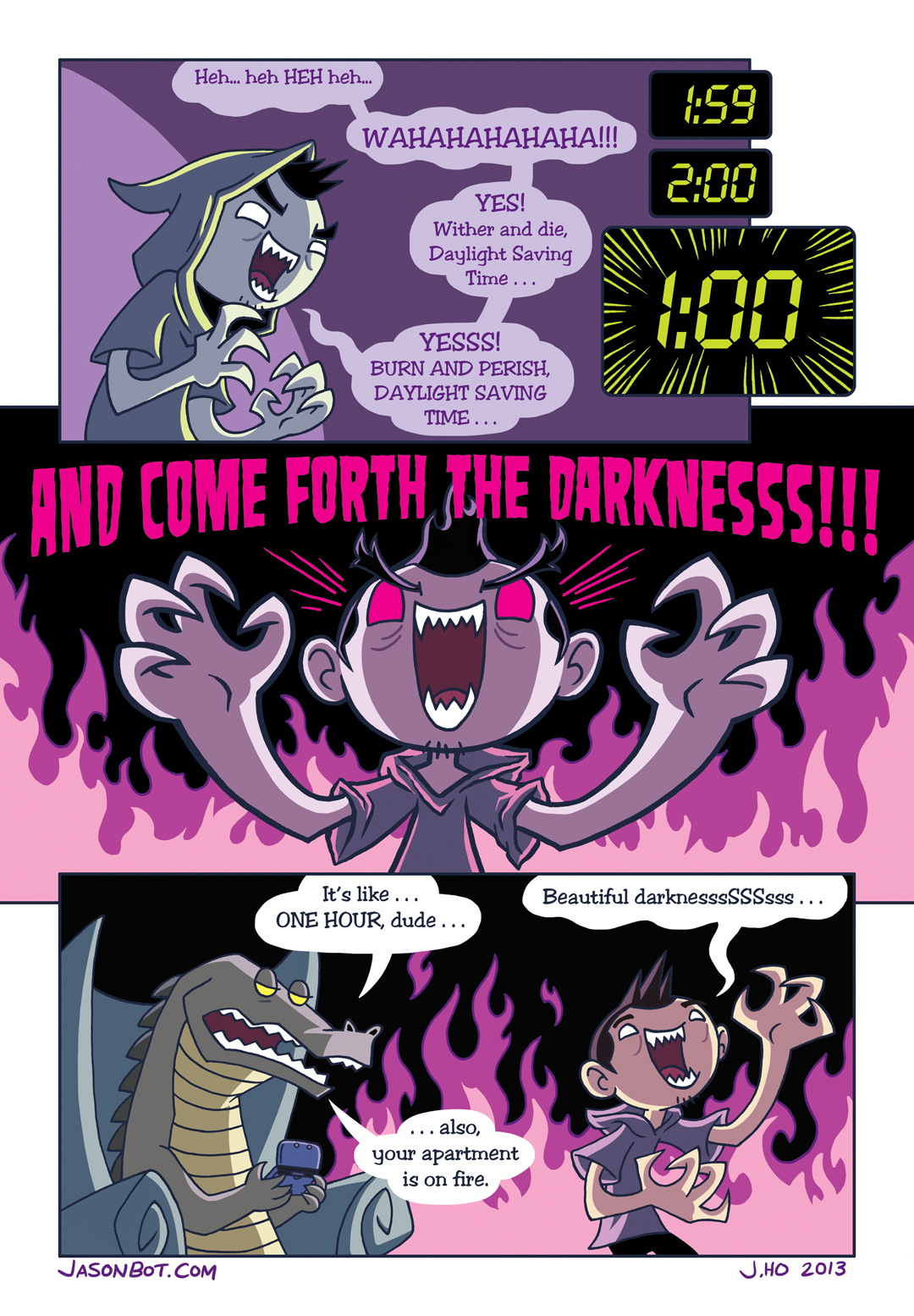
GO OUT AND ENJOY THAT EXTRA HOUR OF DARKNESS PEOPLE! TODAY WE ARE VICTORIOUS OVER THE ACCURSED SUN!
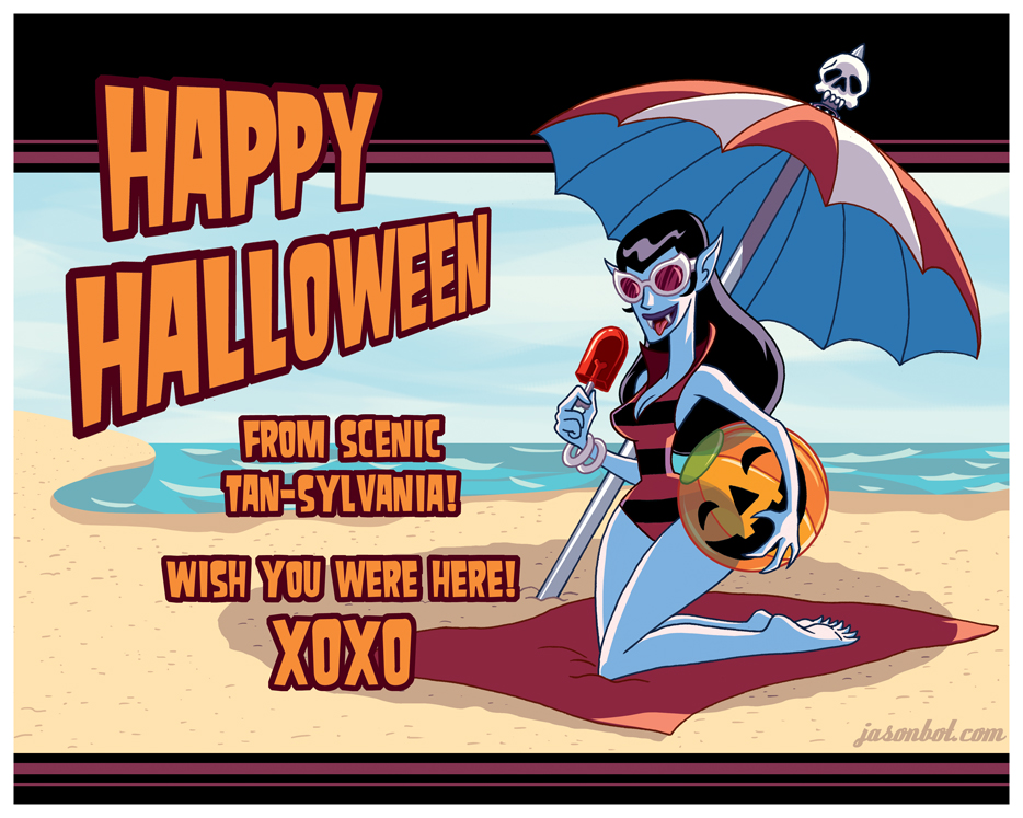
Happy Halloween, (blood-)suckas!
Okay, I posted twice this week. I think I deserve to eat an entire bag of Take 5‘s now.
Here’s a poster that I penciled for work (inks by Mike Rote, colors by Nathan Kane, and type/design by Serban Cristescu):

It’ll be available at the Bongo Comics booth, this weekend at Comikaze! Get ’em while they’re hot! I’ll be there on Saturday, you might catch me at the booth!
And here’s a look at some of my rough sketches that lead up to the final product:
I post this type of work-stuff on Instagram semi-regularly, so follow me if you want to see more! Do NOT follow me if you don’t want to see Instagrams of action figures, food, and cats.
Two weeks ago, Lou Scheimer, best known as the architect of the He-Man and She-Ra cartoons, passed away.
In the wake of his passing, there was an outpouring of love on the internet, for the man and his work. Here are a few of my favorite blog posts about the matter:
Belated, but no less sincere, here’s my own offering for the man whose work inspired a lot of kids’ imaginations, including my own:

Thank you for everything, Lou!
Why?
Why not?
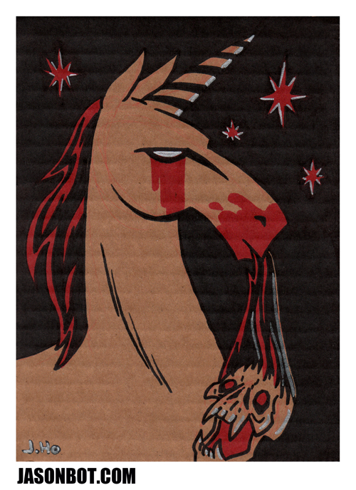
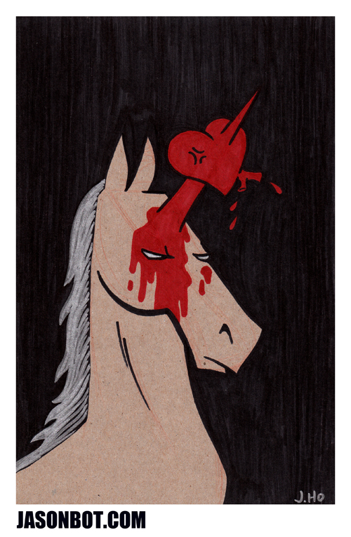
(drawn with markers on random cardboard scraps)
Eh… what’s this? *Blows dust off of URL* Oh right, I have a sketchblog! Well, I may as well post something on it. But I’m not coming up with a pun title dammit.
Ahem.
So a couple weeks ago @Brentosaur tweeted the following hypothetical scenario:
Hasbro asks you to pick five Autobots to be the main cast under Optimus Prime for the next show. Who do you pick?
— Brent Michael Fury (@Brentosaur) August 24, 2013
To which I replied:
@Brentosaur Elita-1, Strika, Tracks, Minerva, and Wheelie. Optimus is put in a coma in the pilot and Elita takes over.
— Jason Ho (@jasonhohoho) August 24, 2013
And then I decided to take it too far and draw up my Autobot team. I would have posted sooner, but I didn’t have time to finish the colors until Labor Day…

Elita-One, Tracks, and Minerva are pretty straightforward depictions, based on the G1 cartoons. Strika is based loosely on her appearance in Transformers: Animated, but with colors and elements from her original toy (I thought that made her more Autobot-y). Wheelie has proportions inspired by the original toy, but I kind freestyled it from there. For those who are wondering, Elita-One, Strika, and Wheelie were drawn without any real consideration to a Transformation scheme.
This started out as a quick and dirty pen sketch, but I ended up spending a lot of time on the colors and the background in Photoshop. I kind of like the contrast between the super scratchy lines and the very computery background… but I’d be lying if I said it was intentional!
I BET WHAT YOU’RE REALLY LOOKING FOR IS SOME NERDY BACKSTORY, RIGHT??? (The idea here is that this is a starting point for a new series with its own continuity)
* * *
While responding to a distress signal from a remote Autobot colony, Optimus Prime and Elita-One’s team of freedom fighters find themselves ambushed by Decepticons. During the battle, Optimus is rendered comatose by the notorious Decepticon warrior Sixshot, and the Autobots find themselves stranded behind enemy lines…
ELITA-ONE (leader, melee expert): With her mate and partner Optimus out of commission, the mantle of leadership falls solely upon Elita’s shoulders. She is renowned for her even-handed sense of justice, as well as her almost peerless hand-to-hand combat skills. She treats her team like a family, perhaps because she had to leave her actual family behind on Cybertron…
STRIKA (tank): Beneath her armored hide bristling with heavy artillery is… a total martinet. Like, exactly what you would expect. Strika is the only one on the team with formal military training. She often clashes with Elita’s unorthodox methods, but ultimately is loyal. In addition to providing the team with heavy firepower, Strika is a brilliant tactician and strategist. Don’t tell anyone, but I think she has a crush on Tracks…
TRACKS (flyer): It’s a toss up whether Tracks is known more for his prowess in combat or his insufferable sense of vanity. He’s a member of the Omnibot division, which accounts for his extra mode enabling him to fly as well as any Decepticon. When he isn’t dogfighting with Decepticons, Tracks is usually flirting with Minerva. He would claim that he’s just kidding around, but that’s probably because Minerva hasn’t responded to his nonsense…
MINERVA (medic): The second youngest member of the team, Minerva takes her duties very seriously, devoting most of her time to trying to revive Optimus from his comatose state. Minerva has also been entrusted with Optimus’s trailer, which converts to a mobile battle station/repair bay. BTW, she has a secret that only Elita knows about…
WHEELIE (scout): When Optimus and the freedom fighters arrive at the Autobot colony, Wheelie is the only remaining survivor. He becomes the youngest and newest recruit to the team. His outward demeanor is cheerful, but he’s acutely aware that Optimus fell in battle for his sake, and he carries that burden quietly. Wheelie is a fan of poetry and hip hop…
More to come if I get around to illustrating my corresponding Decepticon team…

Whoa, take it easy, Ice King! I know, it’s shocking that I’m finally updating my blog. I am… the worst. Buuut, one of the things I was working on whilst neglecting my blog was art (pencils/inks/colors) for a 4-page story for the Adventure Time Annual! The script was by long-time crony Josh Williamson. And if I’m not mistaken, it should be in comic book stores this week!
Here’s a look at the title panel:
I’d show show you more, but this is already like 10% of the whole story. C’mon, it’s only a 4-pager, whaddaya want from me?
Make sure you pick this issue up–it is hilarious and purdy to look at, in no small part due to the inclusion of stories by Bryce Carlson, Dustin Nguyen, and Derek Fridolfs! Props to Shannon Watters for her expert editing of this excellent edition!
Everyone’s favorite Russian sibling mutant superheroes who are sometimes supervillains:
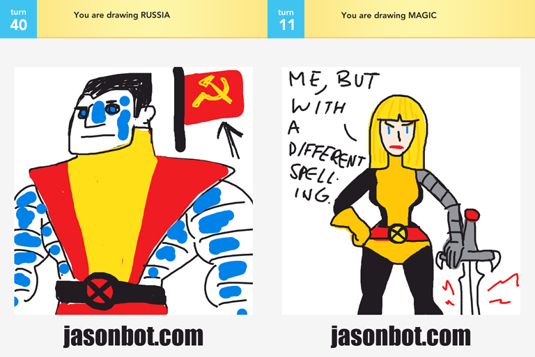
My apologies–I drew a Soviet Union flag when I should have drawn a Russian flag!
I stumbled across this old gem from ye olde daye jobbe, and thought I’d share it. It’s a staff profile of me that appeared in the letters/editorial section of Simpsons Comics circa 2003. ENJOY:

A few things have changed in the past 10 years… buuut I’m still basically the same nerdy doofus. What can I say,I YAM WHAT I AM, Popeye styles.
Two Draw Somethings for this week…
I haven’t been able to stop humming the Misty Mountain Song since December…
@_@

I’ve been watching a lot of Star Trek: Deep Space 9 recently and tweeting about it, mostly while I’m drawing. A few weeks ago, this happened:
@jasonhohoho: Odo, Robocop, and John McClane are my favorite cops.
@slimebeast: @jasonhohoho Your drawing challenge: Odo. Robocop. ODOCOP.
@jasonhohoho: @slimebeast CHALLENGE ACCEPTED. One moment…
@jasonhohoho: My three favorite cops, combined. (Challenge issued by @slimebeast) #startrek #ds9 #robocop #diehard http://instagram.com/p/UdQCfti4Fr/
Thanks to @slimebeast for the inspiration–he and I have been buddies since the old days at He-Man.org. (Old days = circa 2007)
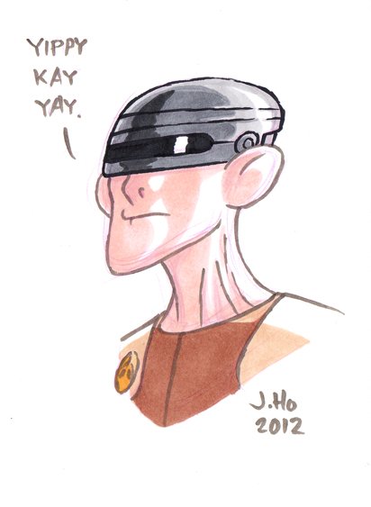
Oh yeah, I forgot it was 2013 and signed this drawing 2012. :-/
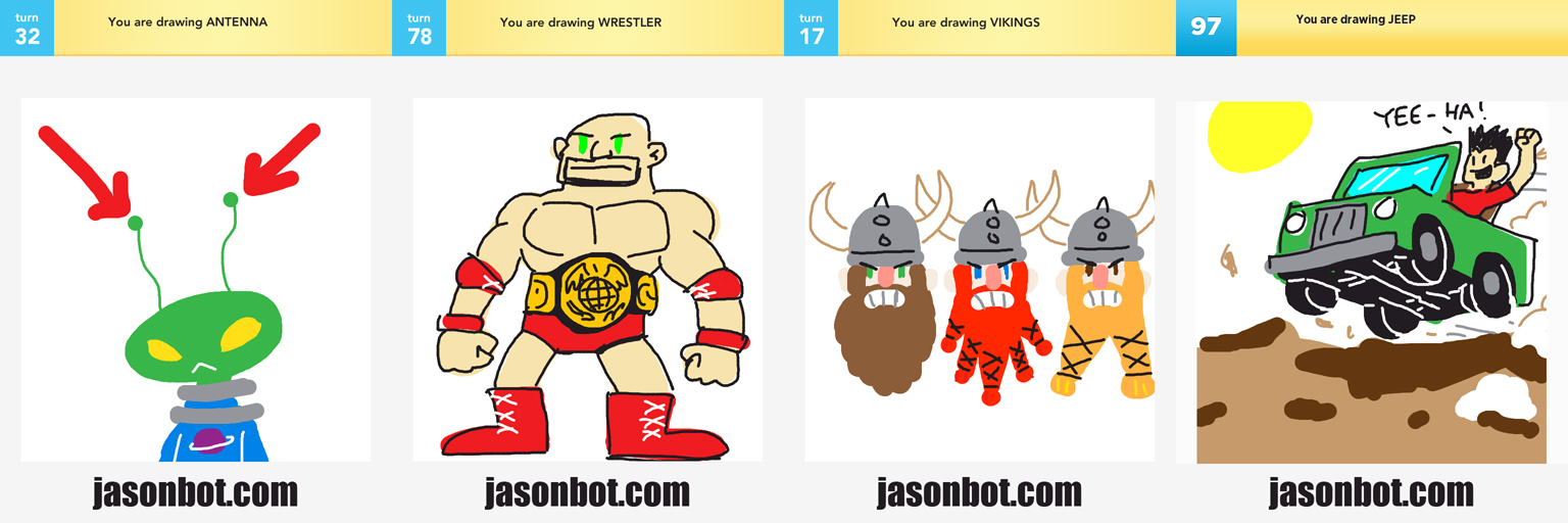
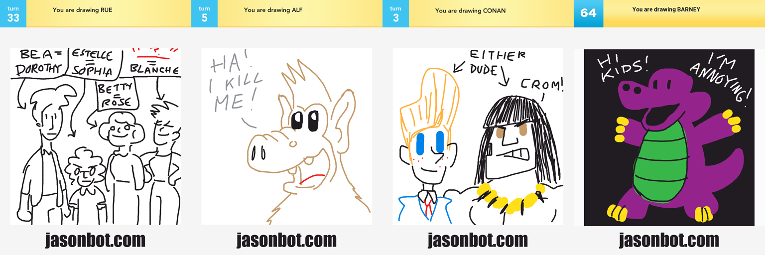
Maintaining this blog is a constant struggle between my desire for productivity, and my desire for quality–and sometimes I get paralyzed between these two desires and end up doing nothing! Finally, I have to arrive at the conclusion that something, anything, would be better than nothing, so here we are. With the 10 drawings in this post, I’ll be caught up, and ready to ring in the (Chinese) New Year with a clean slate.
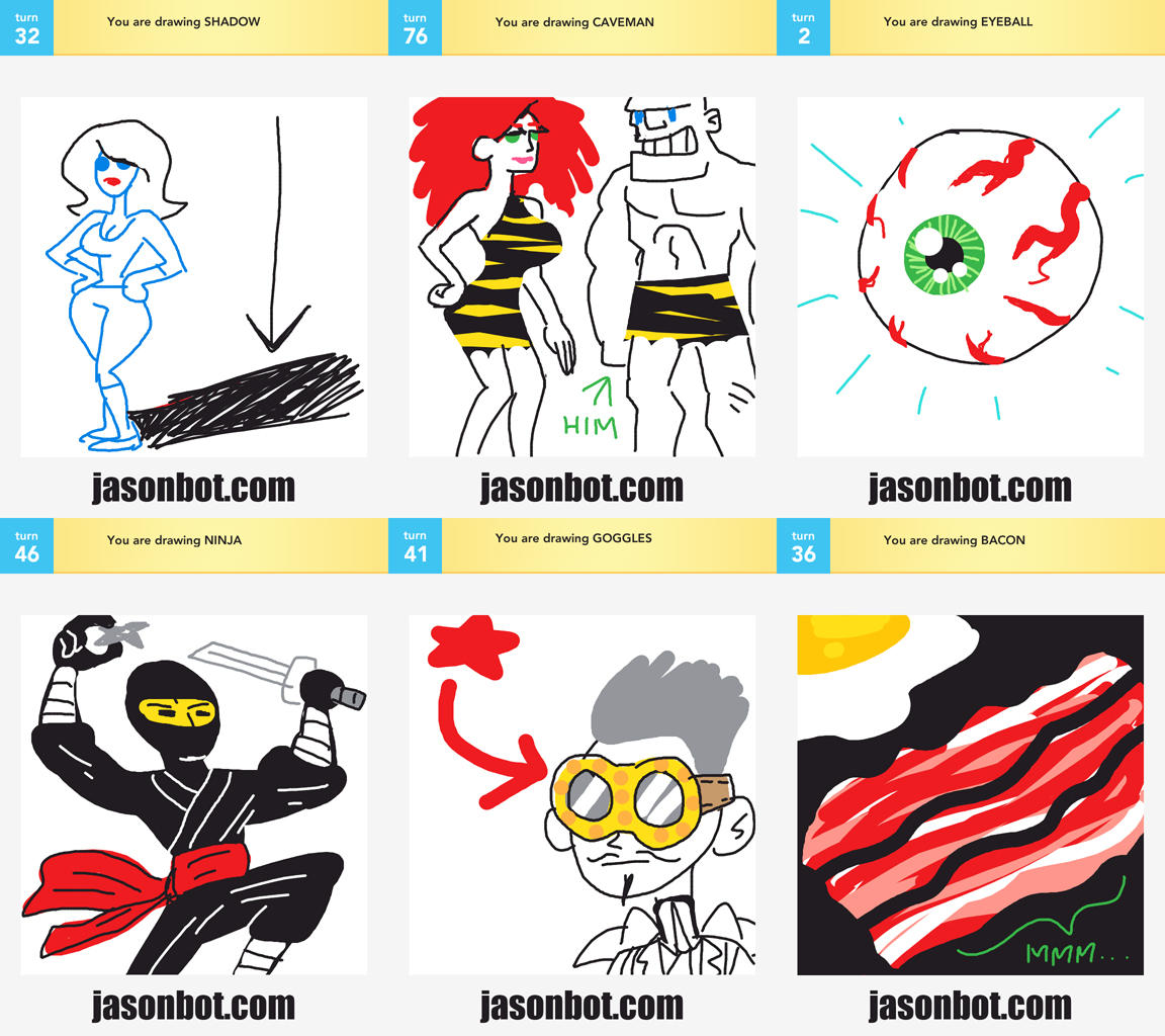
I’ve been keeping a reserve of my quick scribbles from the game Draw Something, hoping to use them as a series of extra posts. Clearly the fantasy of having the time to make extra posts is not in the cards for me, so I will be using these Draw Something scribbles as needed. (Plenty more where these came from!)
Oh, and just FYI–almost all of my Draw Somethings are from mid 2012 and earlier, so it’s not as if I’ve been playing iPad games instead of drawing blog posts! Honest!
To start, here’s a random selection. To be honest, I’m pretty proud of the “bacon” drawing.
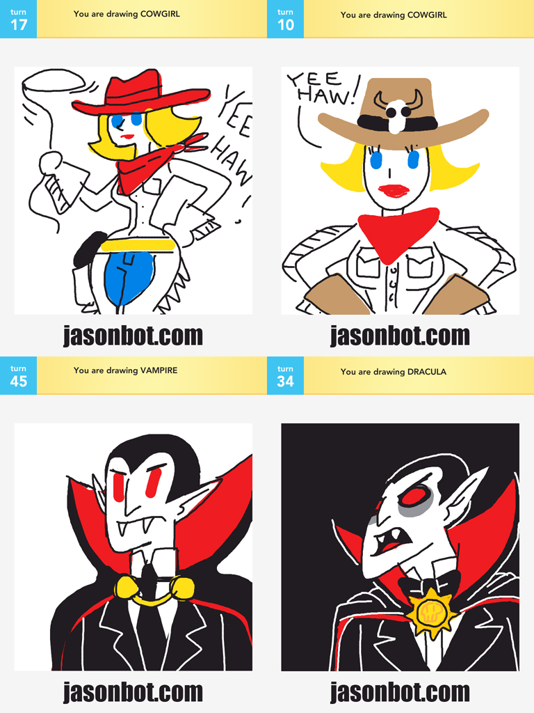
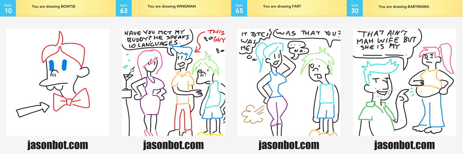
For a little while, it started to feel as if my drawings were taking on a consistent tone and a recurring character:
You know what… it feels really good to post a blog, even if it’s just random scribbles. I guess there’s a lesson to be learned here. Adios, year of the Dragon, you weren’t too shabby!