Let us hope that the New Year will bring something good!
First, here’s Kup, made to match some of my previous Transformers fan-art:
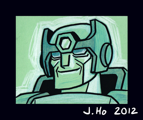
Roughly 3.5″ X 2.75″, drawn with color pencil, marker, and black Sharpie on a ticket stub from a parking garage.
Next up is the tormented Autobot X:
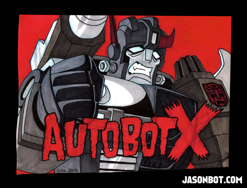
This one is roughly 9.5″ X 7.25″, drawn on a piece of irregularly cut backing board.When I saw the misfit piece of board, I knew I needed to draw a character who would match its roughness. I made this a grayscale image with red as a spot color hoping to be evocative of old monster movies (since Autobot X is likened to Frankenstein’s monster).
The past few weeks have been busy and frustrating. Minor physical maladies (shoulder/neck pain) have made drawing difficult. I will not bore you with details! I am fine now, and the past few days I’ve been drawing whilst continuing to marathon Star Trek: The Next Generation.
I have enough posts to catch me up (5 total), but I’m going to split them up rather than group them all together in one post. Why? Because I am a nut for proper organization and categorization.
First up is your friendly neighborhood Spider-Man:
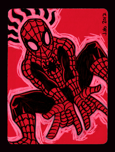
Roughly 3.75″ x 5″, drawn with black Sharpie and white color pencil on the back of an extra RSVP card.
Busy, behind, stressed, but still alive.
Happy Holidays, everyone!
When I see green, orange, and purple color pencils on my desk, I say to myself, “Damn, I should draw the Joker.”
So, I drew the Joker:
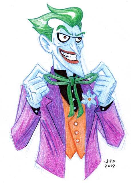
You can probably tell that my idea of the Joker is heavily based on Bruce Timm’s animated version, with just a dash of Brian Bolland thrown in.
(This Joker is not intended to go with the timeline I have imagined for my “Sons of the Bat” re-designs, but I imagine I will use this as a basis for a future Joker if/when I get to the villains of that era!)
For those who missed the first round of drawings or want a refresher, these re-designs imagine a future timeline combining elements from the comic book continuity (pre-New 52) and the Bruce Timm animated universe. For context as to how far in the future this timeline exists–Damian Wayne is in his mid-20s. Here are links to the original Sons of the Bat posts:
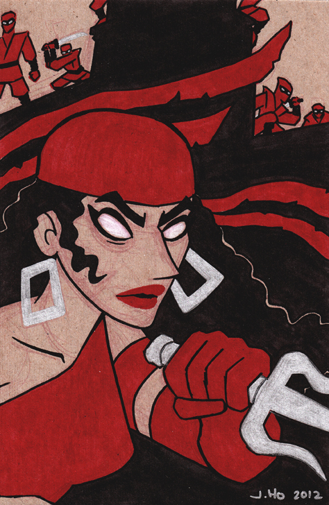
I’m going off the reservation a bit for today’s entry. The subject is Kathy Kane, who was the original Batwoman (on either Earth-1 or Earth-2), not to be confused with Kate Kane, the modern day Batwoman who, if I understand correctly, is distantly related to the first Kathy Kane who may or may not be retconned from existence in the current DC universe. Listen, I know. It’s confusing.
I have further complicated matters by deciding that in my fabricated “Sons of the Bat” continuity, the mantle of Batwoman is now taken up by Barbara Gordon. This means both Kathy and Kate Kane need new identities. I’ll get to Kate soon enough, but for now I have renamed Kathy “Phoenix” which is a codename meant to match her niece, Flamebird. Just go with it:
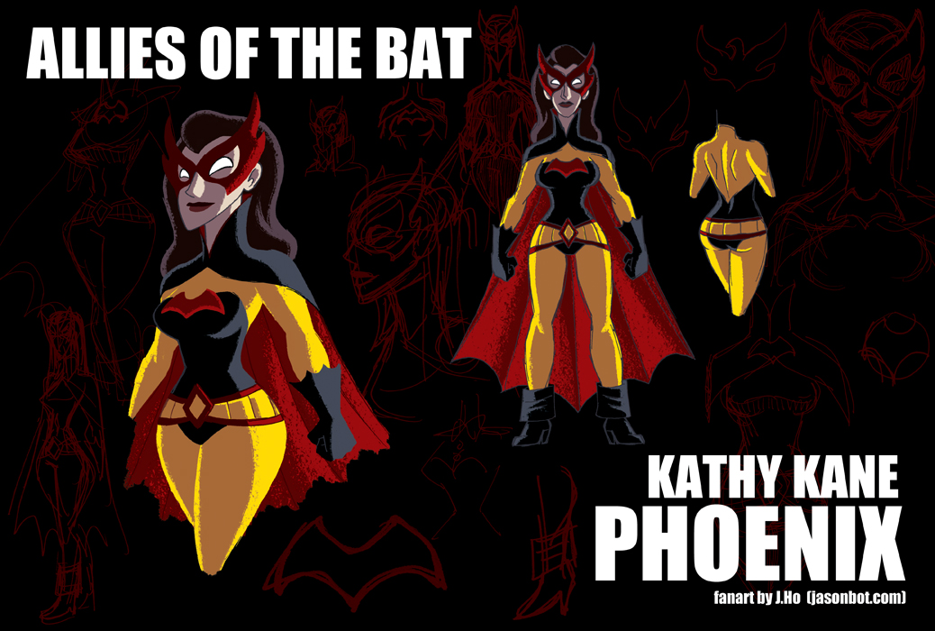
I feel like the original Batwoman and Batgirl get crapped on a lot, so I wanted to respect the characters, and give them identities that moved beyond ‘heiresses with crushes on Batman and Robin.’ I also wanted to tie in the modern day Batwoman, which I’ll elaborate on later.
The black/red/yellow colors running through the last three posts have been unintentional, I assure you! Apparently that’s a popular palette for Batman’s friends and rivals, and I don’t want to change any character’s representative colors unless I can come up with a good reason!
Not sure what the next post will be… I have some Allies of the Bat ideas lined up, but I might take a break. You’ll have to tune in to see!
For those who missed the first round of drawings or want a refresher, these re-designs imagine a future timeline combining elements from the comic book continuity (pre-New 52) and the Bruce Timm animated universe. For context as to how far in the future this timeline exists–Damian Wayne is in his mid-20s. Here are links to the original Sons of the Bat posts:
Today’s entry is Lonnie Machin, AKA Anarky:
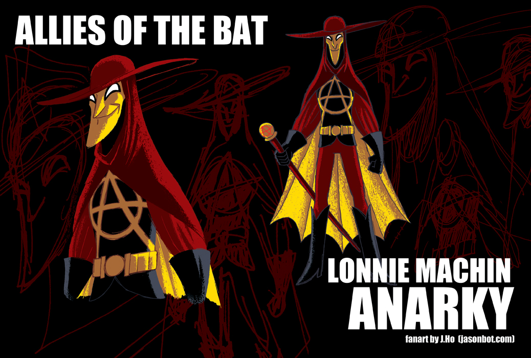
Maybe when I first encountered him, I was just at the right age to be receptive to a character named “Anarky,” but I think he’s an awesome character. In spite of his name, he’s not as obvious as the usual rebels and anti-heroes, plus he has an intellectual side that is sorely lacking in many comics these days. Definitely an underused character.
I was rather pleasantly surprised earlier this month when someone on Twitter pointed out to me that Project: Rooftop had featured my Sons of the Bat re-designs!
From the feedback I’ve read, people have generally been positive (which I truly appreciate), and would like to see Barbara Gordon as well as other female characters (which I would have guessed). As I mentioned before, I have every intention of drawing up the Daughters of the Bat. However, for the moment I decided to draw a few of Batman’s supporting players (male and female) who don’t quite fit the category of being his “children.” Allies of the Bat will be an open set of drawings and/or re-designs that I post here from time to time.
For those who missed the first round of drawings or want a refresher, these re-designs imagine a future timeline combining elements from the comic book continuity (pre-New 52) and the Bruce Timm animated universe. For context as to how far in the future this timeline exists–Damian Wayne is in his mid-20s. Here are links to the original Sons of the Bat posts:
Onwards! Today we have Jean-Paul Valley, AKA Azrael:
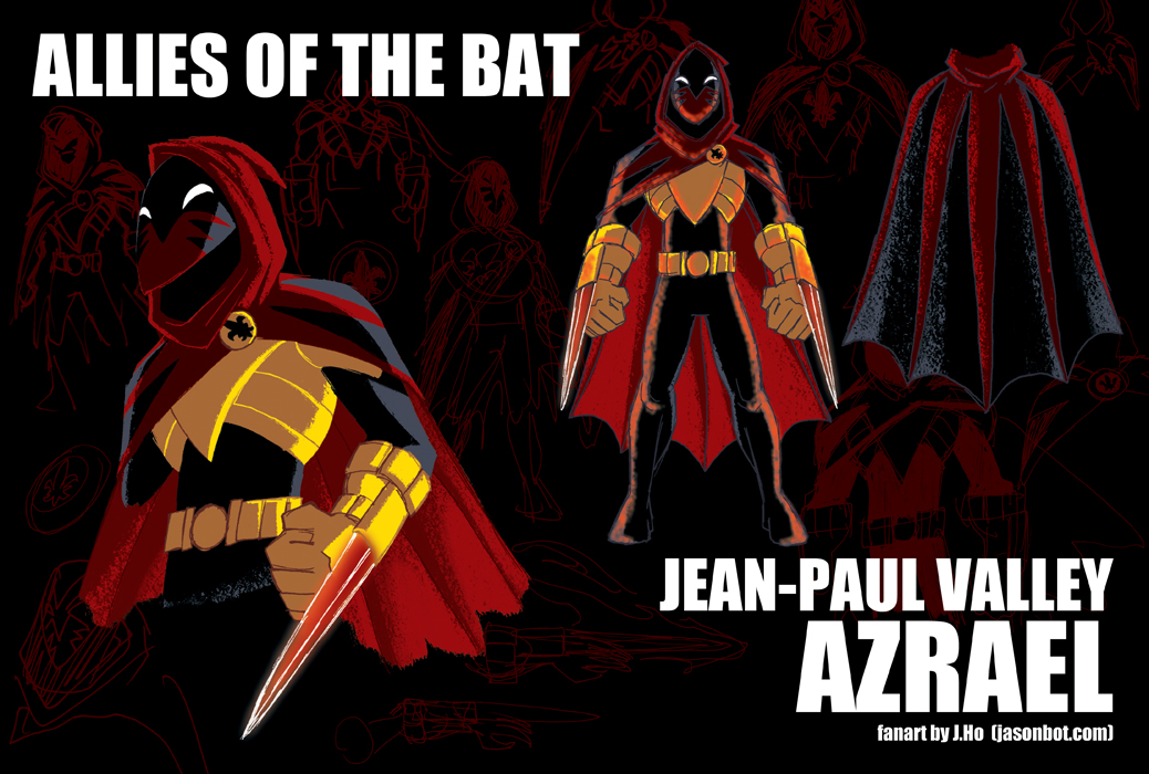
(If you caught the two non-DC Universe references in the quick little bio I wrote for Azrael, then you are a good nerd!)
So, to be honest, I’m rather torn about this costume now that I’m posting it. The problem with Azrael is that (I feel) everyone basically wants to see him in his (more or less) original costume… however, storywise, that costume represents everything the character is trying to escape. I guess I am struggling with Jean-Paul Valley’s identity as much as he is. I reserve the right to give Azrael a proper redesign in the future, besides which, I need to consider the Suit of Sorrows as well!
Anyways, during my preliminary sketches of Azrael, I did a really crude color study to see how I felt about the increased amount of black in the costume. I was going to use this as one of images in the backdrop, but when I monochrome-ized* it, I liked it enough that I thought I should post it. Plus, you know, I’m one post behind, so I needed to catch up. Two bats with one stone! So to speak.
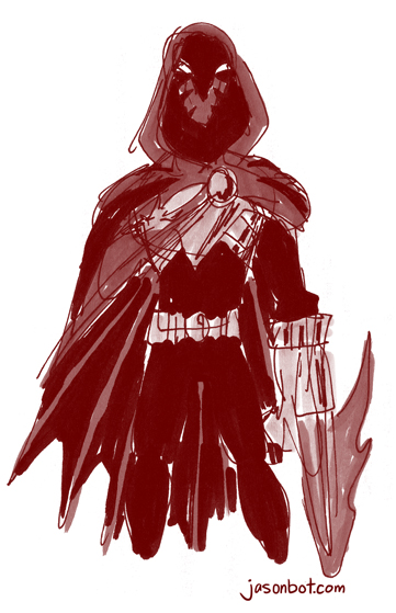
*monochrome-ized… past tense of monochrome-ize… that’s a word, right?
If you’ve read my blog before, you may recall that I’m something of a paper hoarder. I really hate to see paper go to waste. If it can be drawn or scribbled on, I’ll do my best to save it. And when I see other people throw away perfectly scribble-worthy scratch paper, I practically flinch.
Which brings me to the three sketches I have today. Each one was drawn with colored pencil, Sharpie, and marker on the back of a 2.75 x 4″ ticket stub from a parking garage. The subjects of the sketches are the Autobots Hot Rod, Arcee, and Springer. I picked this particular trio of characters because they happened to match the colors of the ticket stubs:
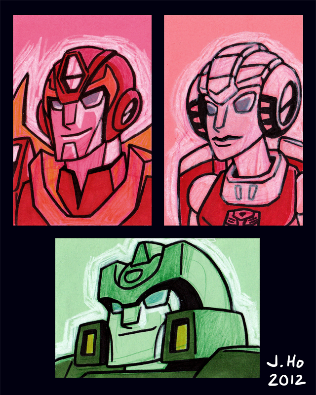
A ticket stub from a parking garage is an incredibly mundane thing. It makes me feel good to use such a thing for creativity, even if it’s merely a crude little sketch!
(There, 3 sketches and I’m all caught up again!)
For no particular reason, here’s a drawing of Aquaman zoning out:
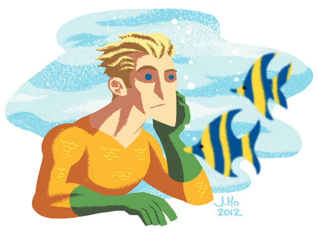
I FEEL THE SAME WAY, AQUAMAN.
As you can see, I’m continuing to experiment w/ shapes as opposed to lines and forms. Not sure where this is heading, but sometimes you just have to let the current whisk you away. YOU SEE BECAUSE I DREW A PICTURE OF AQUAMAN UNDERWATER, AND CURRENTS ARE THINGS THAT HAPPEN IN THE WATER. K, time to sleep.
(Why yes, I am both late as well as one post behind. Sigh.)
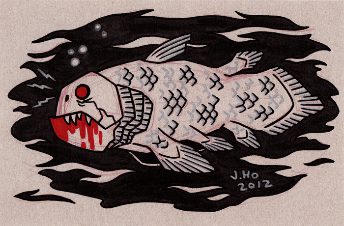
Who wants to see me draw a very innacurate picture of a coelacanth on a piece of cardboard? Show of hands?
You, in the back, with the “I <3 COELACANTHS" t-shirt, you're in luck. Please try to maintain your composure, ma'am! Here it is:
(Still behind by one post! But I’ve been getting this thing called “sleep.” I recommend it.)
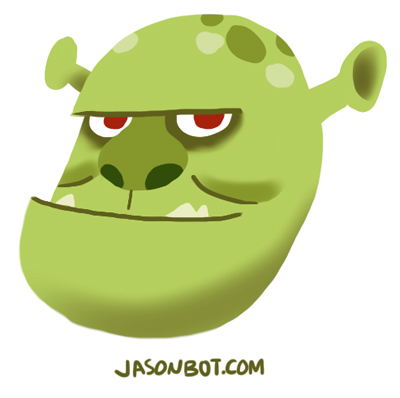
Here’s a quick sketch of the ogre Shrek that I did on my iPad. Just messing around with an approach that relies less on linework and more on shapes:
(Yes, I’m behind by 1 post.. let’s see if I can fix that soon!)
Check it out–I drew the cover for the Long Beach Comic-Con exclusive edition of Bravest Warriors #1 (published by the fine folks at BOOM! Studios):
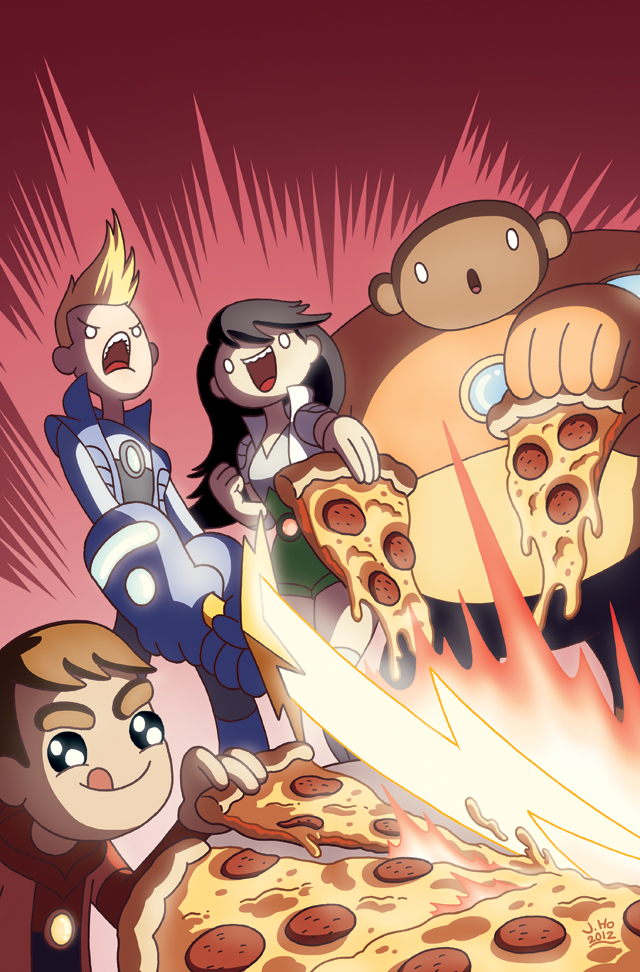
The Long Beach Comic-Con is this weekend (November 3-4), so if you live in Southern California, please swing by and get your copy of Bravest Warriors!
I will be at the BOOM! Studios booth on Saturday November 3rd, 2:00-3:00pm, signing and sketching. Come by and say hello! If you don’t, I will die of loneliness, and the guilt will haunt you for decades.
I was having a conversation with Josh over IM which lead to me proposing a hi-larious image, which lead to me drawing said image because it was suitable for Halloween. Here it is:
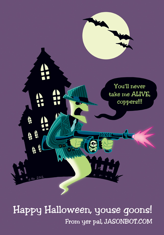
You see, they’ll never take him alive, because he’s already dead. GET IT?? I TOLD YOU I’M HI-LARIOUS! HAPPY HALLOWEEN, SUCKERS!
(I’m behind a post, but I have stuff incoming later this week… )
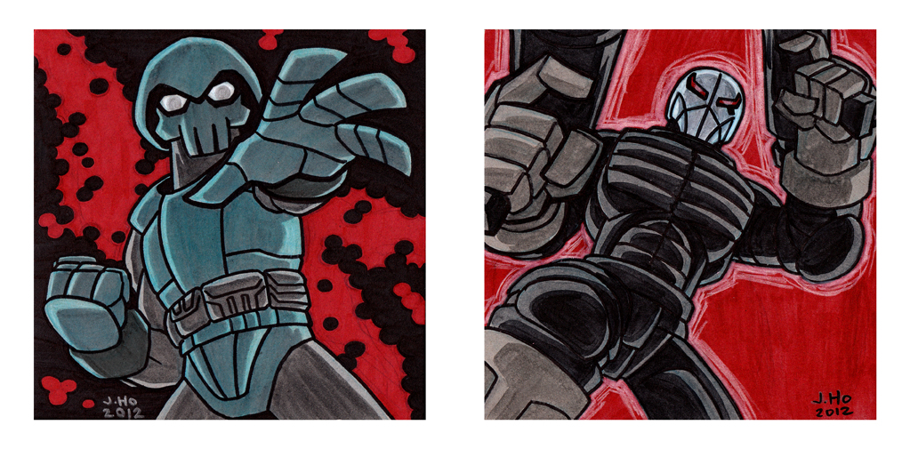
Here’s a dual post to cover last Friday as well as today. I had two pieces of sturdy cardboard lying around, so I grabbed some markers and did these two pieces:

Sketched in color pencil, lineart inked with a Sharpie, silvers filled with a Sharpie, and reds and blacks filled with Marks-A-Lot markers.
I’m sure similar such cross-over pin-ups have been drawn before, but I thought this wold be fun! (For those who don’t know, Eastman and Laird’s TMNT was inspired by Frank Miller’s seminal run on Daredevil.)
Here’s a quick sketch in honor of the passing of Ken Sansom, known to most as the voice of Rabbit from Winnie the Pooh–but to me he’ll always be Hound, the serene, nature-loving Autobot scout:
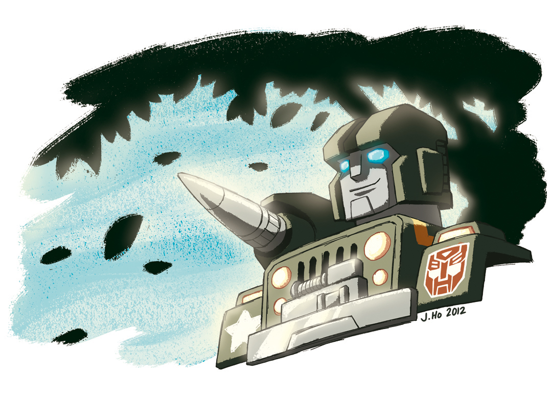
I was surprised how quickly this piece went. I’m satisfied that I was able to throw in an indication of an environment and turn a simple bust sketch into something with a little more atmosphere. Also, I managed to avoid getting anal-retentive while I was coloring. That’s an accomplishment for me!
This has been floating around on the internet for a week or two, so I can finally share it!
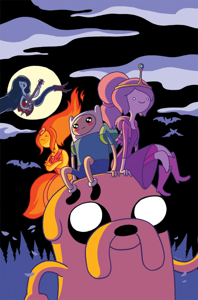
I drew an Adventure Time cover for BOOM! Studios, and apparently it’s going to see the light of day on the cover of Bleeding Cool’s upcoming print-magazine!
EDIT: I found out this is going to be a variant cover for Adventure Time #14 as well!
(For those of you playing along at home, this post catches me up on my blog posts for the time being. Sometimes when I drop off from posting it’s because I’m too busy to draw, and sometimes it’s because I’m so busy doing art-things that I just don’t have the time to post, even though I’m actually drawing a bunch! Either way it’s frustrating for me, and I will strive to keep my posting intervals a bit more regular. That is all.)
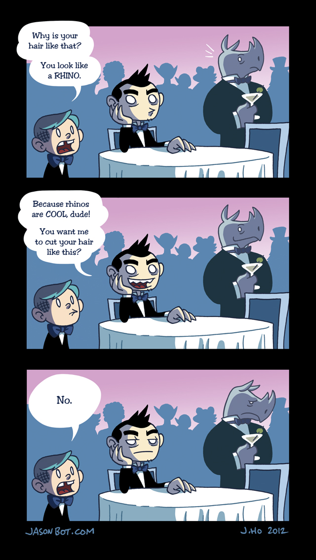
Something that happened to me at my friend’s wedding. (This is a 93% true story… in the real version, the rhino’s martini didn’t have an olive in it.)
I am a terrible letterer!
A little something I drew for a friend’s wedding, featuring the favorite characters of the bride + groom:
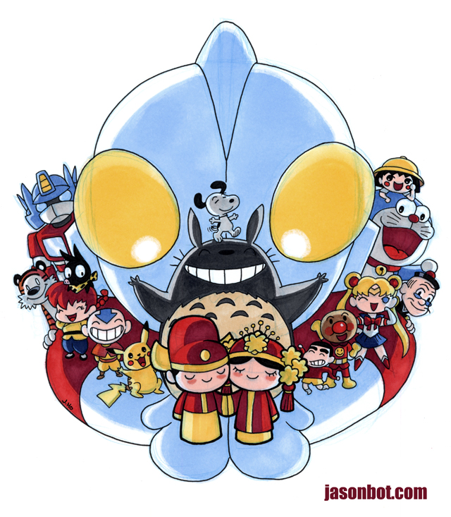
Center (from top to bottom): Ultraman, Snoopy, Totoro, Groom and Bride.
Groom Side (from left to right): Optimus Prime, Hobbes, P-Chan, Ranma, Aang, Pikachu.
Bride Side (From left to right): Crayon Shin-Chan, Anpanman, Sailor Moon, Old Master Q, Doraemon, Maruko.