"Uno Gato Muy Peligroso" o "Uno Blog Post Muy Nerdoso"

Yet another re-design challenge at the He-Man.org fan-art forums–my post is here and the original thread is here. The voting thread is here–I placed second.

The subject this time around is part of a line of Argentinian toys called Fuerza-T. These action figures used old He-Man molds (licensed by Mattel, as far as I know), with mixed and matched body parts and accessories, and new color schemes to make each figure appear unique. While they are not officially He-Man toys, Fuerza-T action figures are still of interest to enlightened He-Man enthusiasts. I am one of those enthusiasts.

Felinor is a member of the evil Aracnos faction. His hobbies include drinking the blood of his enemies. His dislikes include the rival villain group Escorpius, and the heroes known collectively as Fuerza-T. The toy version of Felinor is constructed from Mer-Man’s head, Beast Man’s body, Skeletor’s armor, and He-Man’s power sword. My version diverges from this a little, for the sake of making Felinor appear a little more unique:

click above for larger view

This one came together pretty quickly–for whatever reason, I was able to quickly pick colors that I was satisfied with, which I usually find difficult and time-consuming. The key for me was adding more cold colors to accompany the white face and turquoise brow of the original color scheme. His chest and shoulder armor were modified to resemble the Aracnos symbol, and the studded arm bracers are taken from the official illustration of Felinor. I added the nose, the tail, the scaley feet and hands, and the cat’s eye motif (A lot of the other fan-interpretations of Felinor include a cat’s eye motif as well). The cape is my addition too–inspired by the hood-like collar in the original illustration. Despite the wisdom of the Incredibles, I just think everyone is cooler with a cape. And as a nod to Felinor’s allegiance to the Aracnos, his cape has eight points, just as a spider has eight legs.

Man… posting a drawing of an obscure Argentinian action figure with a metafictional lineage that connects back to three of He-Man’s greatest foes just doesn’t seem geeky enough. What could I do to really geek this up? I KNOW. Since very little is known about him, I could write a little background material for this crazy cat (get it? cause he’s a cat)…

* * *

FELINOR is fiercely loyal to Carnivor, ruthless leader of the Aracnos faction. His golden sword was created by a master sword-maker, in a mortal attempt to mimic the divinely forged perfection of He-Man’s power sword. The sword-maker’s intentions were not sinister, but Felinor cast a spell to corrupt the blade, and the cursed sword now shares Felinor’s hunger for blood. To further bolster his strength, Felinor encrusted his power sword’s hilt with an enchanted gem. This gem is another counterfeit–copied from an artifact from the nearby planet Thundera (the gem on his breastplate is simply decorative). In spite of all this, Felinor’s power sword still does not match that of He-Man or She-Ra’s true power swords. It is rumored that the mysterious sword-maker escaped and disappeared, and was even able to forge more power-sword imitations. the existence of these swords has not been confirmed.

Most recently, Carnivor has discovered the existence of planet Earth, and has sent Felinor and a subterranean attack force to perform reconnaissance and prepare the planet for invasion.

* * *

I coined Felinor’s title of “Evil Nocturnal Champion” myself, but in light of the profile I just whipped up, I wonder if “Evil Copy Cat” would have been more appropriate?
That Dude is a Beast, Man!

His name is Beast Man
Fierce Minion of Skeletor
Savage Orange Rage

click above for larger view

I’m pretty happy with how this turned out–just don’t try examining his musculature–it’s an anatomical mess! Action pose is a little awkward, but better than my Mer-Man or Tri-Klops, I think. As usual, I tweaked the colors a little bit, where I thought it was logical to do so–the biggest change being that I made his arm-pads gold instead of red. I have no idea if there is any precedent for his whip to be made of energy, but the idea of coloring a plain black whip seemed BO-RING. I do know that the villain Blade had an energy whip in the live action Masters of the Universe movie. (+4 geek points)

As usual, this was posted on the He-Man.org fan-art forums. My post is here, the entire thread (including some of my previous sketches) is here.

TERRIBLE TITLE: If At First You Don’t Succeed, Try, Try, Tri-Klops Again…

A few quick notes–

  1. For anyone who did not notice, I put up a bonus post on Wednesday night. Check it out–it features more J.Ho art as well as some non-J.Ho art!
  2. For those who don’t care about He-Man (who are you people?)–please keep checking back–I have several pieces coming up that have nothing to do with He-Man, and at least two that don’t even have anything to do with cartoons. Really!
  3. There was an issue with the line-spacing in my posts, where I was getting single-spacing and double-spacing at seemingly random intervals. I have fixed it, and conformed all posts to single-spacing. If you have a strong preference for double-spacing please let me know.

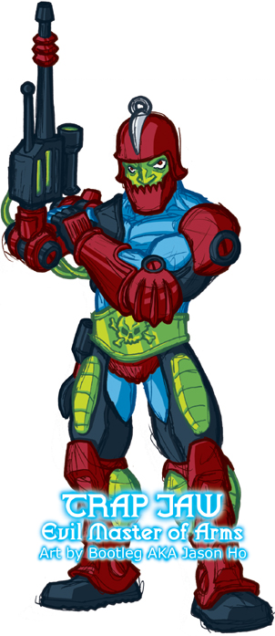
Okay, enough with the small talk–today’s entry is Tri-Klops, another evil minion of Skeletor:

click above for larger view

This was kind of an odd one–I started with a really messy sketch, which was so heavy with blue pencil that i couldn’t go over it with ink to tighten it. I was able to do a slightly-refined-but-still-very-messy ink sketch over that. I scanned that in, and tried inking it in Photoshop, but that was too clean compared to the other sketchy He-Man pics that I’ve been drawing. So I cleaned the scanned ink sketch a bit (but obviously retained a level of sketchyness to be consistent with my other drawings), and merged that with the “too clean” Photoshop “inks” to get the final line art. That whole process didn’t take as long as I might have made it sound, maybe an hour or so. The coloring of Tri-Klops was basically uneventful.

This pose is a little more dynamic than the others I’ve posted so far… still a bit awkward, but for the time it took me, I’m basically okay with it. As usual, I took a few liberties in depicting the costume details and colors. I merged the harness of his armor with his belt, because I felt that the design on the original toy was a bit redundant, and I made the green parts of his armor more olive, because I felt this matched the orange better. In a nod to the 200x design, I “covered” his neck. I also changed the colors of his sword, but I’m not sure how I feel about the result.

As for the title “Evil All-Seeing Swordmaster,” well, I’m kind of freestyling there. The original tag for the action figure was “Evil and Sees Everything.” Skeletor is a “Lord of Destruction,” and Merman is an “Ocean Warlord”… all Tri-Klops gets is the same description that I would use to describe a nosy neighbor? Not very intimidating. So anyways, I tried combining what is known about the character to create a more menacing title, while trying to stay within the style of the original toys.

As usual, this was posted on the He-Man.org fan-art forums. My post is here, the entire thread (including my Skeletor sketch) is here.

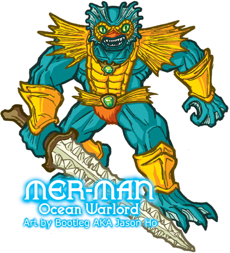
No, it’s not a sketch of Ethel Merman…

… it’s a sketch of Mer-Man–Ocean Warlord, and minion of Skeletor! As usual, this was posted on the He-Man.org fan-art forums. My post is here, the entire thread (including my Skeletor sketch) is here.
click above for larger view
Of my posts so far, this sketch is probably the… sketchiest. The pose is ten kinds of awkward, and the body is just a shade too squat, even by the uber-buffed standards of He-Man action figures. On the other hand, the face turned out the way I wanted it too, and I’m pretty satisfied with the colors… Well, they can’t all be winners.

That’s about all I have to say about that. So now, to fill space as my system experiences a catastrophic crash from a carb and sugar high brought on by my dark lord, Jack In The Box, I will list the sinister contents of my disastrous lunch:

  1. Steak and Cheddar Ciabatta Sandwich (roughly the size of a premature baby)
  2. Miniature trough full of Cheese and Bacon Potato Wedges
  3. Large Order of Curly Fries (I only finished two-thirds of it)
  4. A bucket full of Orange Fanta.
It should go without saying that I skipped dinner.

For more on Ethel Merman:

Surprise! A Nerdy Fan-Art on a Friday Afternoon!

For the uninitiated, this is kind of a complicated one. In the She-Ra cartoon, the bad guys were a totalitarian regime known as “The Horde,” and they were lead by a cyborg-ish guy with a skull-like face named Hordak. Skeletor, incidentally, was originally Hordak’s apprentice, but I digress. Hordak’s boss was an entity named “Horde Prime,” who was also supposedly Hordak’s brother. The only pieces of Horde Prime that were ever seen by the viewers were two glowing eyes and his gargantuan metallic hand (whether armored or robotic, we don’t know). And the only reference to his appearance mentions that he has two heads. Aside from the cartoon, there are also one or two minor and completely contradictory appearances of Horde Prime in the UK comic books.

All in all, this has lead to a lot of discussions amongst He-Man/She-Ra fans about the nature and appearance of Horde Prime. Here is my interpretation:


click above for larger view

A lot of hardcore He-Man/She-Ra fans don’t like Horde Prime, because he takes away from the impact of Hordak, who was always billed within the toys as the leader of the Horde. The strongest argument of opponents of Horde Prime is this:

If Horde Prime was the leader of the Horde, then why was Hordak’s face on the emblem of the Horde?

And this is what got my geeky little brain rolling. The basic assumption that I make in my illustration is this: it is not Hordak’s face on the Horde emblem. For my version, the armor was based on the UK comic book version, while the hand was based on the cartoon depiction. His head and face are, of course, based on the Horde symbol (or by retro-continuity, the basis for the Horde Symbol). As for the secondary head, I just wanted to give him his extra head in an unexpected way. Oh, and I assume that Horde Prime is, like Hordak, a shapeshifter, so the secondary head can retract and morph back into an eyeball. I view Horde Prime as Hordak’s brother, who started out roughly-human sized like Hordak–over time, his shapeshifting abilities developed further, and eventually he was able to use his powers to increase his size.

The discussion thread about Horde Prime on the He-Man.org art forums is here, and my post is here.

For more on Horde Prime:

What’s a Skeletor?

Who am I kidding–I CAN’T WAIT UNTIL TUESDAY. So here now, is my inaugural sketch, the Lord of Destruction himself:


click above for larger view

I ‘m also posting this on the forums at He-Man.org–you can find the thread here (my screenname on He-Man.org is Bootleg, so you’ll see that stamped on any art that I post there).

For those who don’t know, Skeletor is the arch-enemy of He-Man, the most powerful man in the universe. Skeletor’s hobbies, like most 80’s cartoon villains, include sinister cackling and incompetent attempts at world domination.

This is actually the sketch that got me rolling on the whole sketchblog idea. I busted out a pretty quick sketch of Skeletor, inked and everything, because I was just really itching to do a finished piece. I chose Skeletor because he’s a character whose costume I have pretty well memorized (yes, I am a dork), so digging up reference would not slow me down. Color-wise, I took a few liberties where it seemed logical to do so. As for why he’s wearing a Batman-like cape… I guess I just felt like drawing a Bat-cape.

For those of you who are familiar with my artwork, you will notice that this sketch is much simpler and looser than my normal anal-retentive clean and detailed illustration style. Basically, I am trying to loosen the hell up, so that I can be a little more productive, instead of agonizing over every little detail.

My normal process is something like this:

  1. concept sketch (any medium)
  2. loose sketch (blue pencil)
  3. tight pencils (.5 mechanical pencil, F lead)
  4. inks (usually tombo brush pens and sakura microns)
  5. colors (photoshop)
The process for Skeletor, and for 95% of the sketches that you’ll see on this blog is more like:
  1. rough gesture (blue pencil)
  2. tightening/inking (extra fine pilot v-ball pen and pentel sign pen)
  3. colors (photoshop)
So you can imagine that the process is much quicker this way. My coloring style is still pretty clean (and i’m still sooo slow in photoshop), but so far this is working. I might experiment with some looser coloring styles in the future.
Comments and criticism welcome.

For more on Skeletor: