BONUS POST: Rare Mention of the Day Job

My first professional writing credit will be debuting in comic book stores on Wednesday January 31. Before you get too excited, it’s just a 3-pager, and I co-wrote it with my friend and colleague, one Nathan “The Hammer” Hamill. This immediately brings to mind jokes about how many people of a particular brand it takes to change a lightbulb, but nevertheless, we are proud of our efforts. As it is a 3-pager, here is the only panel I can show you that has no spoilers.

In addition to co-writing the story, I pencilled it, and The Hammer colored it. The inks were executed with steady, surgical precision by the one and only Mike Rote. Our story is entitled “Scream A Little Scream” and it appears in Simpsons Super Spectacular #4, published by Bongo Comics:

Did I use "whom" correctly in this post?

This illustration was for another re-design challenge at the He-Man.org fan-art forums. The parameters of this contest were a little different–instead of re-designing existing characters from the He-Man/She-Ra canon, the goal this time was to redesign an unused concept drawing from the He-Man toyline. The concept drawing in question depicted two different versions of an unnamed female ranger-type character. The two concepts looked distinct enough that I thought each one deserved a full-fledged character design. My post is here, the whole thread (including the original concept drawing) is here. Voting thread is here–I placed third.
click above for larger view

You may or may not notice, but the inks on this sketch are much cleaner than anything else I’ve posted so far. This is the result of a few factors:

  1. My natural tendency towards the anal-retentive style that I have referred to in the past (ironically, drawing loosely requires more conscious effort on my part).
  2. The relatively small size of the original pencil sketch, prohibiting a certain degree of looseness.
  3. Female subject matter–whom, if drawn with an excess of sketch lines, can begin to appear harsh even if that is not the intended result.
  4. More design work than usual–the more I have to design a character’s costume elements, etcetera, the tighter I pencil. The tighter I pencil, the tighter I ink.
The coloring this time around was a bit difficult for me. Because I had no pre-existing colors to go off of, I went through several different color schemes before settling on what you see here. The trick was that the image needed to capture the bright, saturated, primary colors that I associate with the style of the He-Man universe. My first few attempts were done in subdued earth tones and olive-greens that were more befitting forest rangers in the “real” world. However, the result was that my redesigns simply looked like generic Dungeons and Dragons types rather than characters that looked like they specifically belonged in He-Man’s world. With that in mind, I adjusted the colors to try and capture the cartoony feel of He-Man as best I could. I think Trakka’s color scheme is more of a success than Rayn-Ja’s.

Here’s a brief profile that I whipped up for the two of them (oh, and the cheesy names were completely created by me):

* * *

TRAKKA (an Eternian “human”) and RAYN-JA (of the Tree People) are expert foresters and sworn sisters. They patrol the wilderness ranging between the Eternian capital and the ancient home of the Tree People, guiding travellers and merchants, apprehending poachers, and negotiating disputes between various forest-dwelling tribes. TRAKKA’s skills in archery are unparalleled by any villains that the Horde or the Snakemen have to offer–only Skeletor’s henchman Ninjor has ever equalled TRAKKA’s deadly aim. RAYN-JA uses her MOON STAFF to channel potent druidic powers that allow her to shape and communicate with the wilderness. They frequently ally with Moss Man, and the matching hunting knives that they carry were given to them by King Randor in honor of their heroic deeds.

* * *

That Dude is a Beast, Man!

His name is Beast Man
Fierce Minion of Skeletor
Savage Orange Rage

click above for larger view

I’m pretty happy with how this turned out–just don’t try examining his musculature–it’s an anatomical mess! Action pose is a little awkward, but better than my Mer-Man or Tri-Klops, I think. As usual, I tweaked the colors a little bit, where I thought it was logical to do so–the biggest change being that I made his arm-pads gold instead of red. I have no idea if there is any precedent for his whip to be made of energy, but the idea of coloring a plain black whip seemed BO-RING. I do know that the villain Blade had an energy whip in the live action Masters of the Universe movie. (+4 geek points)

As usual, this was posted on the He-Man.org fan-art forums. My post is here, the entire thread (including some of my previous sketches) is here.

Found $1300 This Weekend!!!

Okay, that title is wildly misleading, but stay with me, Dear Reader, as I relate my fantastic tale:

This weekend, my mom found a stack of my old college notes and papers. I sorted through it, and about half of the papers were blank on one side and therefore still usable as scratch paper for me to draw obscure He-Man characters on. (I compulsively save any paper that can still be drawn on–I sort of have a reputation for being “that guy”)

Anyways, after doing some calculations about the time span that those papers covered, and the amount of tuition paid during that time, I somberly informed my mother that it was about $1300 worth of paper that I was recycling, and the stack of scratch paper I was taking with me was worth another $1300. I don’t know if she found it as amusing as I did.

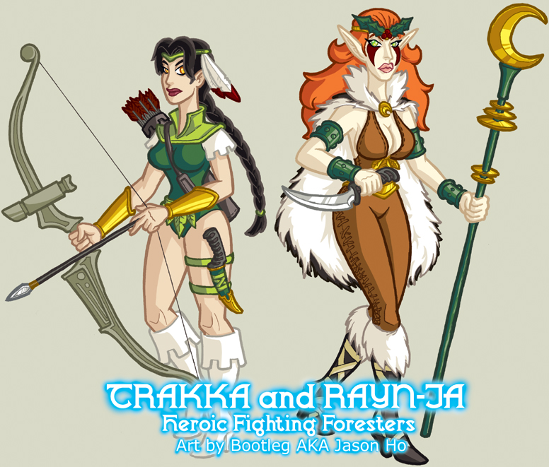
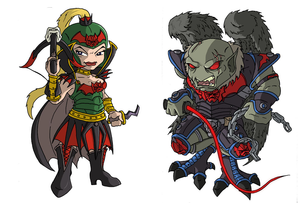
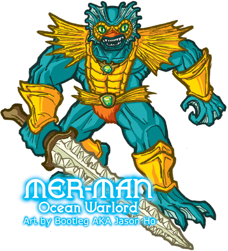
What does that have to do with anything? I guess I just thought it was a funny little story. OH RIGHT, you folks are here for sketches of obscure nerdy characters. Here you go:

click above for larger view

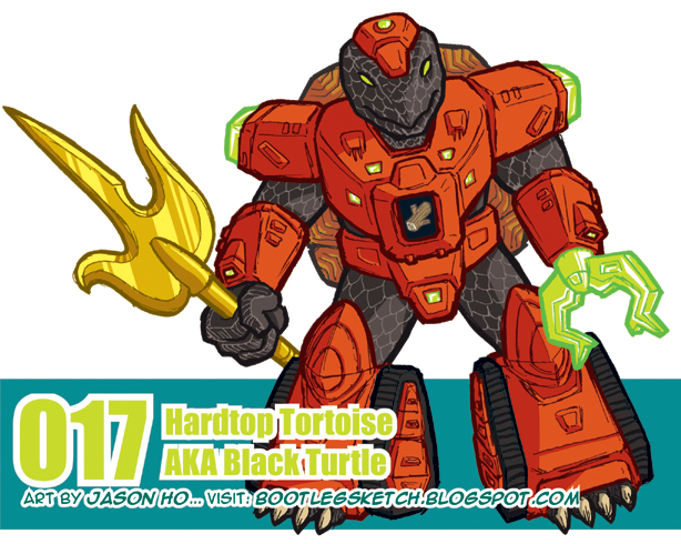
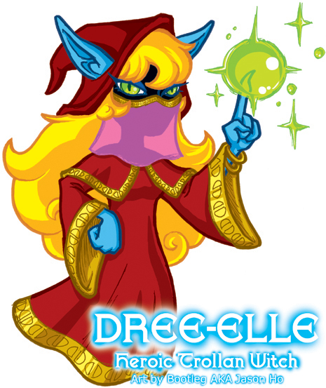
However, speaking of my rabid conservation of scratch paper, it is worth mentioning, for those who are interested, that the preceding illustration was drawn on a piece of lined yellow paper from a legal pad. I scanned it in color, and by fiddling around in Photoshop with the “Select Color Range” function, I was basically able to clean up the image without doing much work, and color it as I normally would.

Numbered 017, Hardtop Tortoise (known in Japan as Black Turtle), is one of many characters from the toyline Battle Beasts.

Fun Fact: Battle Beasts started off in Japan as a spin-off of the Transformers, and they were known as Beast Formers. When they were brought to he United States, they were renamed and marketed without any mention or indication of their relevance to the Transformers mythos.

TERRIBLE TITLE: If At First You Don’t Succeed, Try, Try, Tri-Klops Again…

A few quick notes–

  1. For anyone who did not notice, I put up a bonus post on Wednesday night. Check it out–it features more J.Ho art as well as some non-J.Ho art!
  2. For those who don’t care about He-Man (who are you people?)–please keep checking back–I have several pieces coming up that have nothing to do with He-Man, and at least two that don’t even have anything to do with cartoons. Really!
  3. There was an issue with the line-spacing in my posts, where I was getting single-spacing and double-spacing at seemingly random intervals. I have fixed it, and conformed all posts to single-spacing. If you have a strong preference for double-spacing please let me know.

Okay, enough with the small talk–today’s entry is Tri-Klops, another evil minion of Skeletor:

click above for larger view

This was kind of an odd one–I started with a really messy sketch, which was so heavy with blue pencil that i couldn’t go over it with ink to tighten it. I was able to do a slightly-refined-but-still-very-messy ink sketch over that. I scanned that in, and tried inking it in Photoshop, but that was too clean compared to the other sketchy He-Man pics that I’ve been drawing. So I cleaned the scanned ink sketch a bit (but obviously retained a level of sketchyness to be consistent with my other drawings), and merged that with the “too clean” Photoshop “inks” to get the final line art. That whole process didn’t take as long as I might have made it sound, maybe an hour or so. The coloring of Tri-Klops was basically uneventful.

This pose is a little more dynamic than the others I’ve posted so far… still a bit awkward, but for the time it took me, I’m basically okay with it. As usual, I took a few liberties in depicting the costume details and colors. I merged the harness of his armor with his belt, because I felt that the design on the original toy was a bit redundant, and I made the green parts of his armor more olive, because I felt this matched the orange better. In a nod to the 200x design, I “covered” his neck. I also changed the colors of his sword, but I’m not sure how I feel about the result.

As for the title “Evil All-Seeing Swordmaster,” well, I’m kind of freestyling there. The original tag for the action figure was “Evil and Sees Everything.” Skeletor is a “Lord of Destruction,” and Merman is an “Ocean Warlord”… all Tri-Klops gets is the same description that I would use to describe a nosy neighbor? Not very intimidating. So anyways, I tried combining what is known about the character to create a more menacing title, while trying to stay within the style of the original toys.

As usual, this was posted on the He-Man.org fan-art forums. My post is here, the entire thread (including my Skeletor sketch) is here.

BONUS POST: Double Bonus + Extra Bonus!!!

This illustration was for the second re-design challenge that I entered at the He-Man.org fan-art forums, during the second half of December. My post is here, the whole thread is here, and the voting thread is here. After the results were tallied, I tied for first!

Double Trouble is a character from the She-Ra toyline that never appeared in the cartoon. She-Ra and her allies in the Rebellion were at constant war with the evil Horde, a totalitarian regime that dominated most of the planet Etheria. Double Trouble’s action figure was billed as a “Glamorous Double Agent,” and her action feature was switching her face from good (smiling) to evil (grimacing). And really, I think that’s all kids need to know about morality:

smiling = good

click above for larger view

Inspiration struck when I was looking at pictures of the Double Trouble toy–I noticed that the crest on her helmet, and the symbol on her chest, both had vaguely the same silhouette as the emblem of the Horde (a skull with bat wings). So, rather than having the “evil” version of Double Trouble just grimacing, I designed a complete Horde disguise for her.

The Horde version (left) of Double Trouble is armed with a gargoyle-crossbow thingee, which I assume is standard issue for high ranking Horde officers, because almost all of the Horde action figures came with one. I darkened the green on her uniform so it would be a bit more “military” and added in some red and black to emphasize the Horde theme (for those who do not know, red and black are more or less the colors of the Horde). The end result is sort of christmas-looking, but that was just a coincidence!

The Rebellion version (right) has just has a few tweaks from the original–I added some green on the shoulder pads, and made her bracers and choker silver to match her boots and the accents on her helmet. I’ve never been a fan of the sheer tutus that many of the She-Ra figures had, so instead I made the “skirt” part of a tunic.

BUUUT, that’s not all

click above to view Super-Munkyboy’s Deviant Art post


Mad props to forum member Super-Munkyboy, who drew a chibi version of my Double Trouble re-design–he even modernized the costume to match up to the more intricate character designs of the 200x He-Man cartoon! (The character on the right-hand side is a Horde villain named Vultak) Super-Munkyboy’s post on He-Man.org is HERE, and his deviant art page is HERE–check it out, he’s taken “chibi” to a whole new level!

No, it’s not a sketch of Ethel Merman…

… it’s a sketch of Mer-Man–Ocean Warlord, and minion of Skeletor! As usual, this was posted on the He-Man.org fan-art forums. My post is here, the entire thread (including my Skeletor sketch) is here.
click above for larger view
Of my posts so far, this sketch is probably the… sketchiest. The pose is ten kinds of awkward, and the body is just a shade too squat, even by the uber-buffed standards of He-Man action figures. On the other hand, the face turned out the way I wanted it too, and I’m pretty satisfied with the colors… Well, they can’t all be winners.

That’s about all I have to say about that. So now, to fill space as my system experiences a catastrophic crash from a carb and sugar high brought on by my dark lord, Jack In The Box, I will list the sinister contents of my disastrous lunch:

  1. Steak and Cheddar Ciabatta Sandwich (roughly the size of a premature baby)
  2. Miniature trough full of Cheese and Bacon Potato Wedges
  3. Large Order of Curly Fries (I only finished two-thirds of it)
  4. A bucket full of Orange Fanta.
It should go without saying that I skipped dinner.

For more on Ethel Merman:

AMAZING TECHNOLOGICAL ADVANCES!

Brought to you from the far-flung future of 2007:

  1. Images now open in a new window when you click on them for a full view. If anyone has excessive conflicts with their pop-up blockers, please let me know. I had no problems with it in Explorer or Firefox (haven’t tested Safari yet).
  2. Site feed is now enabled, for anyone who wants to subscribe. I really don’t know how RSS or any of that stuff works, but let me know if there are any problems and I’ll do what I can.

This Post Needs A Funny Title

Yet another illustration entered into a re-design challenge at He-Man.org. My post on the fan-art forums is here, and the entire thread can be found here. The voting thread is here–I managed to snag third place again.
The subject this time is a character named Sea Hawk from the She-Ra cartoon. He appeared in a handful of episodes, and was the love interest of She-Ra (lucky bastard!). Sea Hawk was a swashbuckling pirate modelled after Errol Flynn, and named after one of Flynn’s movies.

click above for larger view

This interpretation is based on a later appearance of the character where he inherits a few special artifacts and temporarily takes on a masked identity to fight evil, like the Scarlet Pimpernel. I just made some minor tweaks on the costume to push the superhero aspect of Sea Hawk’s masked persona. Actually, if you ignore the color scheme, this looks sort of like a cross between Green Arrow and Robin (Tim Drake’s original costume).

It just occurred to me that this post is uncharacteristically humorless. I think lack of sleep has finally caught up to me… LOOK AT THE MONKEY!!!

*runs*

Regarding Comments: BLOGGER IS A MORON

It has been brought to my attention by a few people that comments are not posting properly. NOT MY FAULT THIS TIME–BLOGGER IS BEING A PAIN! At any rate, I’m going to try and get this comment nonsense sorted out, and until then, please feel free to email me at:

I will post and respond to your hilarious and witty comments!

Post Script: If you don’t know me in “real life” please include the word “sketchblog” in the subject of your email. Thanks!

**UPDATE: 1/10/07 11:21pm**
I don’t think it was anything that I did, but comments appear to be working again. If anyone has trouble posting comments, please email me. Or if you just don’t like the unreliable Blogger comment system, feel free to email your comments instead. As for you Blogger, I’m sorry I called you a moron. It’s just… you know I hate it when you don’t post comments and you do it anyways. I love you Blogger, and I want to be with you, but sometimes you just drive me crazy. Please, can’t we get past this?

SNIKT

As I prepare to post this, it is only 11:31pm on Monday night. But I’m impatient, and it’s already Tuesday on the east coast anyways. So here we go…  

 
IT’S THE ONE WEEK ANNIVERSARY OF MY BLOG! A MOMENTOUS OCCASION, INDEED!  

To celebrate, here’s a little break from the He-Man/She-Ra stuff:

click above for larger view  

Not much to say about this one. You should all know who Wolverine is, for god’s sake. I have not read a comic featuring Wolverine in a truly long time, but I still have a lot of (strictly hetero) affection for the character. I drew him wearing his wearing his black-and-tan, because that’s just how I roll. The more common blue-and-yellow got way over-exposed in the 90’s, and the current, slightly revised blue-and-yellow is not something that I’m a fan of. I know he’s back in his black-and-tan in the Origin ongoing series, but I also heard there’s some new uniform that he’s wearing… am I mistaken? I couldn’t find any pics, so please shoot me a link if I’m not dreaming this.  

 
For those who are interested, this pic went from straight-up pencils (no blue pencil) to being colored in photoshop.  

 
Fun Fact: Wolverine, like me, is Canadian! Seriously. Unless you follow that Origin stuff where he’s a southern dandy. And I am, in fact, not a southern dandy.

Surprise! A Nerdy Fan-Art on a Friday Afternoon!

For the uninitiated, this is kind of a complicated one. In the She-Ra cartoon, the bad guys were a totalitarian regime known as “The Horde,” and they were lead by a cyborg-ish guy with a skull-like face named Hordak. Skeletor, incidentally, was originally Hordak’s apprentice, but I digress. Hordak’s boss was an entity named “Horde Prime,” who was also supposedly Hordak’s brother. The only pieces of Horde Prime that were ever seen by the viewers were two glowing eyes and his gargantuan metallic hand (whether armored or robotic, we don’t know). And the only reference to his appearance mentions that he has two heads. Aside from the cartoon, there are also one or two minor and completely contradictory appearances of Horde Prime in the UK comic books.

All in all, this has lead to a lot of discussions amongst He-Man/She-Ra fans about the nature and appearance of Horde Prime. Here is my interpretation:


click above for larger view

A lot of hardcore He-Man/She-Ra fans don’t like Horde Prime, because he takes away from the impact of Hordak, who was always billed within the toys as the leader of the Horde. The strongest argument of opponents of Horde Prime is this:

If Horde Prime was the leader of the Horde, then why was Hordak’s face on the emblem of the Horde?

And this is what got my geeky little brain rolling. The basic assumption that I make in my illustration is this: it is not Hordak’s face on the Horde emblem. For my version, the armor was based on the UK comic book version, while the hand was based on the cartoon depiction. His head and face are, of course, based on the Horde symbol (or by retro-continuity, the basis for the Horde Symbol). As for the secondary head, I just wanted to give him his extra head in an unexpected way. Oh, and I assume that Horde Prime is, like Hordak, a shapeshifter, so the secondary head can retract and morph back into an eyeball. I view Horde Prime as Hordak’s brother, who started out roughly-human sized like Hordak–over time, his shapeshifting abilities developed further, and eventually he was able to use his powers to increase his size.

The discussion thread about Horde Prime on the He-Man.org art forums is here, and my post is here.

For more on Horde Prime:

Regarding Comments: I AM A MORON

To the couple of people who left me comments in the past few days–I had stupidly left on “comment moderation” in my settings which means that i need to approve each comment before it will display. So basically for the past few days I’ve been checking on my blog obsessively and wondering why nobody has been leaving me any comments. Yes, I am a sad and needy mess. BUT COMMENTS WILL NOW SHOW UP AS SOON AS YOU POST THEM! So everyone, please feel free to leave me a note–I require your validation!

Anyways, in summary, as the title of this post says, I am a moron.

Also: who left me the long annonymous tirade in the comments about Skeletor??? It was hilarious, and I must know who you are!

BONUS POST: "I got an Orko." "What’s your Orko got to do with me?"

Every two weeks, the art forum at He-Man.org holds an character re-design challenge. The subject is almost always an obscure character so as to inspire a bit more creativity. This particular sketch of mine is the first piece of art that I posted in the forums (this was just a few weeks ago, in mid-December). You can see my post here. The whole thread is here, and the voting thread (where members of the forum decide which re-design they like best) is here–my entry landed in 3rd. A bronze isn’t too shabby, right?

Dree Elle is the girlfriend of Orko, from the He-Man cartoon. And if you don’t know who Orko is, I honestly don’t know what to do with you. Fine, fine, you can read about Orko here. Anyways, Dree Elle is basically a female version of Orko, but she’s more competent, and she has sexy bedroom eyes. Frankly, I think she’s got it going on, girlfriend. *snap*

click above for larger view
My version of Dree Elle has just a few modifications–I swapped the colors around a bit, making her gown lighter than her hood rather than vice versa, and added some bracelets and gold trim on her cuffs. The purpose of the shawl/cape was to give her better defined shoulders, and I changed her scarf to a veil so that we could see the silhouette of her slender neck. I felt that this emphasized her femininity just a touch, so that she wouldn’t just look like Orko in drag. As for the caption, Dree Elle and Orko both belong to the Trollan race. And apparently, I was mistaken in hyphenating “Dree Elle,” which is actually making my borderline OCD brain a bit crazy.

Fun Fact: The original title for the this post was “Nowadays everybody wanna talk like they got something to say/But nothin comes out when they move they lips/Just a bunch of gibberish/And m*********s act like they forgot about Dre (Elle)”

What’s a Skeletor?

Who am I kidding–I CAN’T WAIT UNTIL TUESDAY. So here now, is my inaugural sketch, the Lord of Destruction himself:


click above for larger view

I ‘m also posting this on the forums at He-Man.org–you can find the thread here (my screenname on He-Man.org is Bootleg, so you’ll see that stamped on any art that I post there).

For those who don’t know, Skeletor is the arch-enemy of He-Man, the most powerful man in the universe. Skeletor’s hobbies, like most 80’s cartoon villains, include sinister cackling and incompetent attempts at world domination.

This is actually the sketch that got me rolling on the whole sketchblog idea. I busted out a pretty quick sketch of Skeletor, inked and everything, because I was just really itching to do a finished piece. I chose Skeletor because he’s a character whose costume I have pretty well memorized (yes, I am a dork), so digging up reference would not slow me down. Color-wise, I took a few liberties where it seemed logical to do so. As for why he’s wearing a Batman-like cape… I guess I just felt like drawing a Bat-cape.

For those of you who are familiar with my artwork, you will notice that this sketch is much simpler and looser than my normal anal-retentive clean and detailed illustration style. Basically, I am trying to loosen the hell up, so that I can be a little more productive, instead of agonizing over every little detail.

My normal process is something like this:

  1. concept sketch (any medium)
  2. loose sketch (blue pencil)
  3. tight pencils (.5 mechanical pencil, F lead)
  4. inks (usually tombo brush pens and sakura microns)
  5. colors (photoshop)
The process for Skeletor, and for 95% of the sketches that you’ll see on this blog is more like:
  1. rough gesture (blue pencil)
  2. tightening/inking (extra fine pilot v-ball pen and pentel sign pen)
  3. colors (photoshop)
So you can imagine that the process is much quicker this way. My coloring style is still pretty clean (and i’m still sooo slow in photoshop), but so far this is working. I might experiment with some looser coloring styles in the future.
Comments and criticism welcome.

For more on Skeletor: