It’s Friday night before a long weekend. I don’t know what you nerds are doing, but I’m posting a blog about a Batman character. Jealous?
Continuing in order from the previous segment, here’s Tim Drake, AKA Oracle:
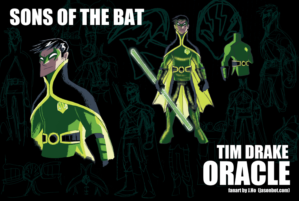
click above for larger view
- Age: Late 20’s
- When Barbara Gordon returned to action as Batwoman, it only made sense for someone else to take up the mantle of Oracle and provide information and support for the heroes of Gotham. Initially Tim took up the role as a temporary position while injured, but he assumed the role permanently when he realized how well suited he was for the task. Since becoming Oracle, Tim has been working closely with Bruce Wayne and Lucius Fox to research and develop new technologies. Perhaps most notably, Tim was instrumental in the development of the hard light melee weapons. Tim keeps in shape for the occasions where he must return to the streets and rooftops of Gotham. This isn’t a regular event, but it happens often enough that the criminal underworld now fear Oracle’s agility and precision as much as they fear the reach of his intelligence.
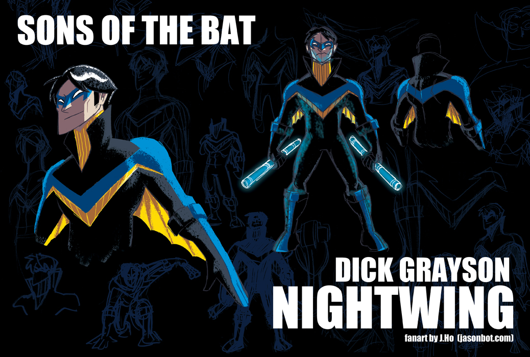
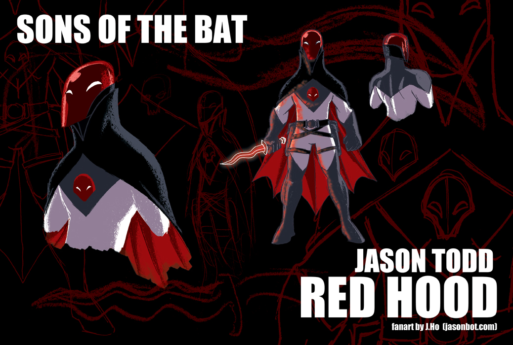
- Tim has had several costumes in both comics and animation that have dropped green out of the design, leaving red as a dominant visual. As stand alone designs, they were fine, but the color red just doesn’t suit Tim in my opinion. Tim is well-adjusted, centered, and cerebral–he’s much more of a green than a red. It’s those same attributes that lead me to assign him the vacant identity of Oracle.
- The emblem on his chest is very similar to Barbara Gordon’s Oracle symbol, but modified to resemble the “face” that was often found on Batmobiles (and other Bat-vehicles) of the 40′s and 50′s, just as I did with the Red Hood’s emblem.
- I always thought of Tim as being a little bit more “kung-fu” than the rest of the Batman family, probably because his early adventures and rogue’s gallery featured a lot of DC martial arts characters, so hopefully the costume reflects that.
- Overall this costume is strongly based on his original Robin outfit, as a reminder that Tim will always be strongly associated with that alter ego, arguably more so than anyone else. While many “mainstream” fans of the Batman franchise will think of Robin as Dick Grayson, I think most actual comic readers think of Tim as Robin, and Dick as Nightwing. But I digress.
- I purposely excluded visual nods to Tim’s current Red Robin costume–I actually like that costume a lot, but it always felt too reminiscent of Doctor Mid-Nite, and the emblem felt too reminiscent of Hawkman’s.
- Tim’s signature close combat weapon (a bo staff) is now a hard light construct.
As you can see, I had a little bit more to say about Tim than Dick and Jason. Just around the time that I was really getting into comics, Robin #1 came out, and Tim quickly became one of my favorite characters. I think I followed Robin longer than any other monthly book.
(2 more missed posts to make up. Hopefully I’ll be able to wrap up this series in the next few days and close out that debt! We’ll see…)