click above for larger view
I will be at Comic-Con International in San Diego from July 25-29, You will be able to find me at the Big Boss Comics table in the small press area. Our table number is N10. And please visit our friends, the Tired Girls at table N4.
As promised, I have two illustrations to cover the week’s posts, which simultaneously act as plugs for my convention projects. Convenient and diabolical, yes? Click images for larger view.
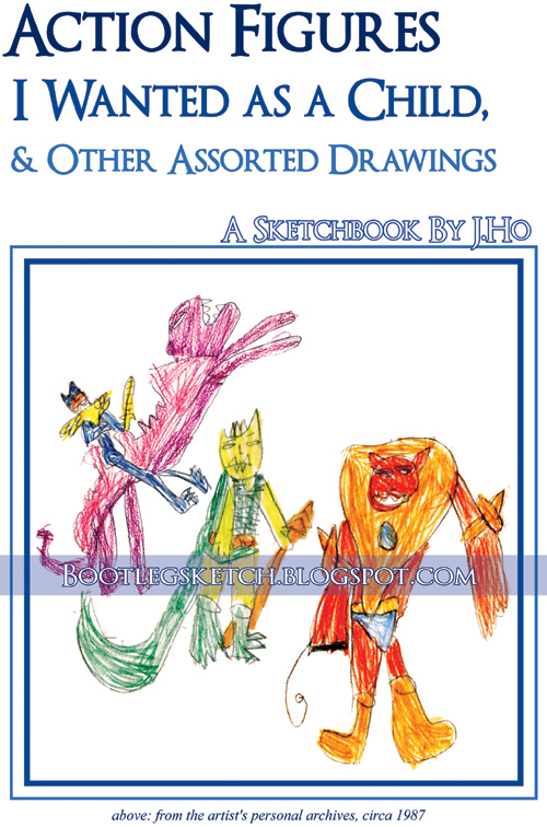 The first up is the cover of the sketchbook that I’ll be selling. The lovingly rendered characters on that cover are (from left to right) Mer-Man astride Panthor, Whiplash, and Beastman, as rendered by me when I was about 9-years-old. The guts of the sketchbook, however, contain my modern day work–including a lot of uncolored line art from the sketches that go up on this blog, but also debuting a number of pieces that have yet to appear. The sketchbook, titled Action Figures I Wanted as a Child, & Other Assorted Drawings, is 40 pages, with color cover and black and white interiors, and sells for a mere $5. FYI, the real version of the cover doesn’t have the watermark with the blog URL across the cover.
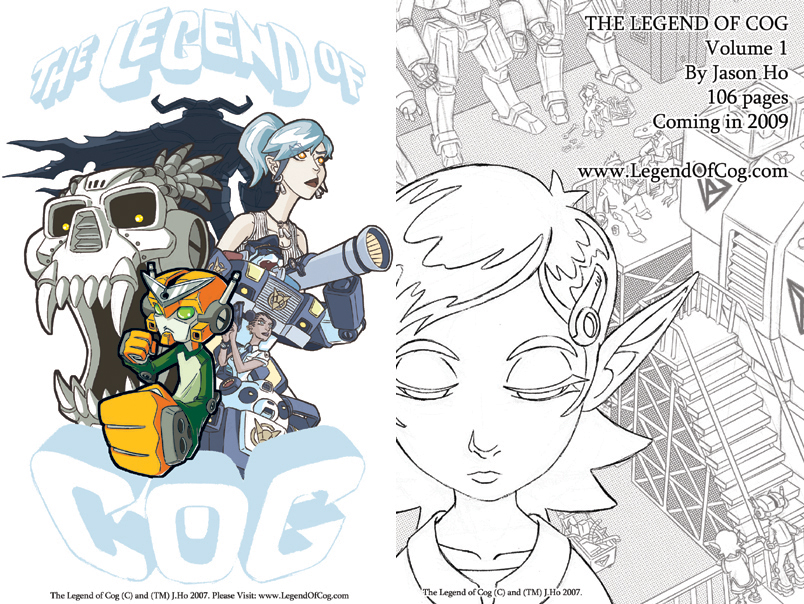 Next up, is art from both the front and back of a free promotional postcard for my comic-in-progress, The Legend of Cog. For more on the progress and status of Cog, please check out the website (and you can read the first 8 pages for free). I will also be selling copies of the first “issue” of The Legend of Cog, which is basically a black and white ashcan preview that gives you the first 24 pages of the story. The ashcan goes for the neglible price of $1.
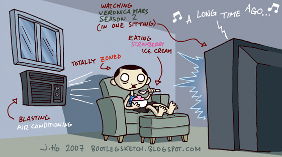
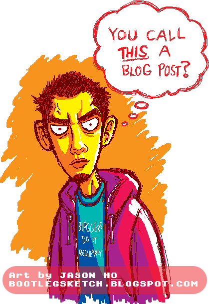
 In addition to the Cog postcard, I also put together a free promotional postcard to promote this very blog. The art, of course, is taken from this post, which I spruced up with some type and background elements.
 Beyond my personal projects, I’ve got some stuff going on with the day job, as well. One of the give-aways at the Bongo Comics booth will be a mini-comic promoting the return of Futurama. I penciled the comic over Bill Morrison’s layouts.
 Also, I will be speaking on a panel. Actually, I will probably do everything in my power to not speak, but I will be sitting on the stage, with the other people on the panel. The reason I’m on the panel is that I’m pencilling a 6-page story for this year’s Treehouse of Horror comic, written by none other than the uber-funny Patton Oswalt himself. Patton Oswalt couldn’t make it to the panel, but I’ll be there, and I’m just as funny and talented. BWAHAHAHAHAHA… well, we all had a good laugh about that. Anyways, here’s the info about the panel from Comic-Con’s website:
Thursday, July 26, 2:00-3:00 Bongo Comics Sneak Peek— Bongo Comics offers a mouth-watering preview of upcoming projects featuring The Simpsons and Futurama. Managing editor Terry Delegeane and creative director Bill Morrison host a panel featuring the writers and artists who create the comics and books based on Matt Groening’s phenomenal TV shows. Find out what’s in the future for Futurama Comics and what to expect in Simpsons Comics and Simpsons Super Spectacular. Plus, Thomas Lennon (Reno 911), Tone Rodriguez (Violent Messiahs), and Gerry Duggan (The Last Christmas) will be on hand to talk about their terrifying contributions to this fall’s star-studded issue of Bart Simpson’s Treehouse of Horror! This is a ”must-attend” panel for all fans of The Simpsons and Futurama—and anyone looking for a place to sit down! Room 3
 My tablemates from Big Boss Comics have got plenty of goods too. First up is the Big Boss Comics Was Here anthology. For a measly $10, you get 100 whopping pages in black and white, with a gorgeous color cover by Andrew Tunney. The Kid Justice story I mentioned a few posts ago is in there, with a humble “cover” by yours truly, and awesome interior art by Vinny.
 Speaking of Vinny, he’ll be selling the latest issue of It’s Ninja Time, a quirky action-packed comic that I dearly love. Vinny will also be selling color sketches, many of which you can see on his blog.
Big Boss is also promoting Josh’s new comic  Necessary Evil, which is in the August Issue of Previews, and will be on sale in October, published by Desperado Comics. The cover for issue #1 (as seen in the flyer to the right) is by the superb Dustin Nguyen, who’s a pretty big deal over at a little company you might have heard of called… DC comics. O_O
 And don’t forget about the Tired Girl Collective. They were quite a hit last year, and they’re back for more. Jodi will be packing buttons and various hamster-related paraphenelia. Sherri will have a book called Johnny Popcorn and a book called Momfight! (Surely, your interest must be piqued by now!) And Ren will be there with clever and surreal cards, nerdcore totebags (see below), shrinky dinks (yes really), and more!
 So, in summary. If you are in San Diego this week, go to the convention and visit:
Phew–I’m off to the convention! Back to the normal hi-jinx next Tuesday. Have a great week everyone!

Just a quick little pen sketch, with some Photoshop colors slapped in. Anybody remember this little guy?
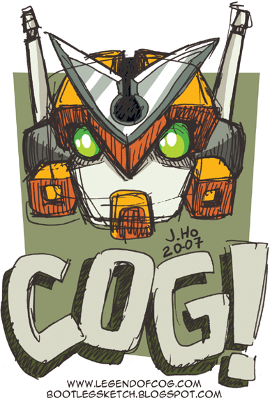
Not an obscure 80’s cartoon, not a hoax, and not a fever dream–it’s Cog, the title character of The Legend of Cog, an ashcan comic that I sold at Comic-Con in 2006. Basically the 24-page mini-comic is the lead-in to a much larger story which, theoretically, will see the light of day within the next couple of years. You can read the first eight pages at http://www.legendofcog.com/. Unfortunately, that website has been horribly neglected (as has Cog) for the past year. Again, theoretically, I should be updating that site soon.
There won’t be a new issue of Cog at this year’s convention, but I am pretty busy working on a few other things for the convention–a sketchbook, and two give-away postcards (one of which features Cog himself). I’ll post more about that stuff and talk a little bit about where I’m at on The Legend of Cog as the convention gets closer.
My second entry for the Practice Makes Perfect Art Jam. The subject this time is “The Three Hands of the Dead“:
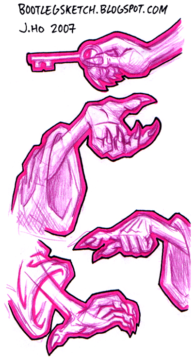
Yeah, I know there are four hands there–out of all my sketches I was happy with four, so I figured I’d throw in the extra one. I had so much fun with my Sasquatch post, that I basically used the same technique again–sketched in purple pencil (Col-Erase is my brand of choice, in case you were wondering), and outlined with a hot pink Prismacolor marker (yes, the color was actually called hot pink) and an ultra-fine black Sharpie.
As for the hands themselves, I think I did an okay, if bland job of it. Check out the other entries at Practice Makes Perfect.
I needed a last minute emergency post, and asked Hammers what to draw. He said “sasquatch” apparently because of the Tenacious D movie. I haven’t seen it yet, but I came up with this:
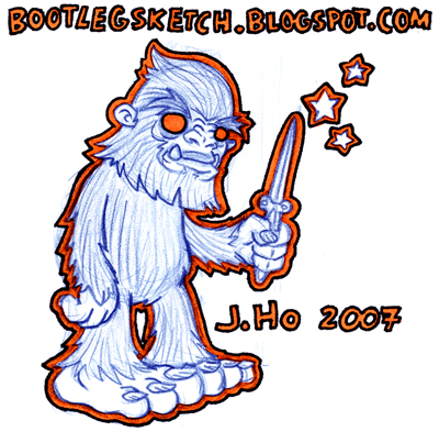
The switchblade was my idea, but I still felt it needed some more zing, and Hammers suggested a gleam or a star.
My plumbing problem is fixed and my sewage carpets have been replaced by hardwood laminate. Also, apparently, I’m the only person in the universe who does not like hardwood floors. At any rate, my woes have come to an end (knock on hardwood), and we will be returning shortly to the robust posts of extreme dorkiness that you have come to expect from this blog.
**EDIT**
When I typed up this post, I was a little under the gun and forgot a few things I wanted to mention–the sketching was done in (obviously) blue pencil, the thick outline was done with an orange Sharpie, and the thin outline was done with a black ultra-fine-tip Sharpie. After scanning the sketch, I adjusted the blues and oranges separately to achieve the hues and contrast that I wanted. The natural color of an orange Sharpie is considerably darker.
Ballpoint pen and red sharpie, done in one shot, no preliminary pencils. Minimal Photoshop cleanup:
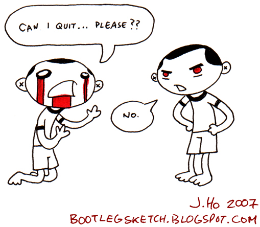
I don’t show it much on this blog, but I do play around with different styles a lot when I’m sketching. In the midst of my on-going plumbing/garbage-carpet crisis, I have focused on doing simple pen drawings to keep me sane. Doing these minimalist pen drawings without making major mistakes is a zen-like exercise that helps keep me from moidalizin’ everything around me. With this particular comic, I think I was subconsciously swiping/homaging the style of my good friend Annie, of Ape Kabuki. However, her comics are simultaneously better, funnier, and more enigmatic. Stop looking at my crap, and go look at her blog!
This squirrel looks aggravated:
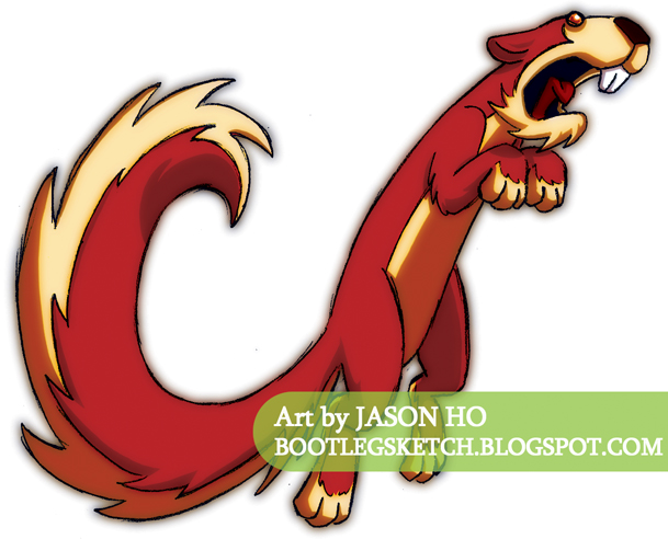
Colored using techniques from an excellent tutorial on Deviant Art. It was nice trying something a little different, and while I don’t think this piece was a complete success, the process did give me an idea of how I might integrate this kind of soft lighting into my normal coloring style (which is not so drastically different to begin with).
Perhaps he’s alarmed that this is such a lame post? However, I am happy with the background colors on this. What can I say, folks, the day job has been awfully busy recently. O_O
Anyways, the first challenge was to come up with a “Living Tree of Woe,” with an emphasis on working out the facial expression. After doing a couple of pages of fast pen sketches, I picked out the one that I liked the most, did a tight pencil version of it, then scanned and colored it:
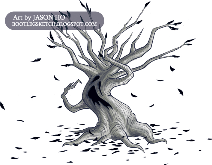
To be honest, I think I got carried away with trying to get the tree part right, and failed to really nail the facial expression. I’m lame!
Anyways, while sketching, I also drew a tree of woe with no face at all, emphasizing body language instead. I quickly tightened some pencils over it, scanned it, and slapped some colors on:

I realize this in no way makes up for my failure to get the face right on the first one, but I just figured I’d share it since it was a by-product of my first attempt.
Comments and critiques?
Check out the Practice Makes Perfect Blog for everyone else’s entries!
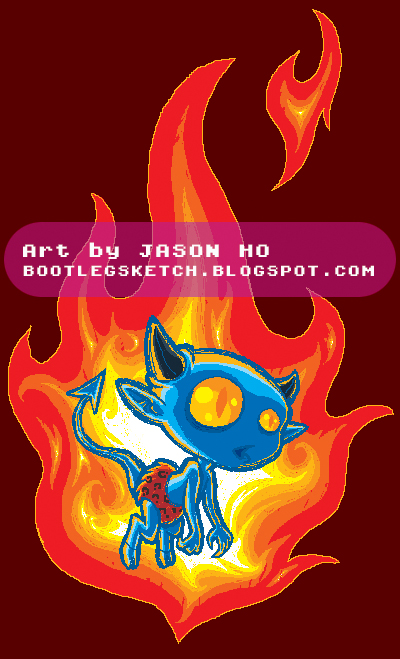
The way this was originally drawn, the devil boy was supposed to be engulfed in flame. Obviously the way I colored it changed it so that the flame is really just behind him. I’m not sure if my attempts at depicting fiery backlighting were successful at all, but I did have fun with this one. The cold versus hot color scheme is, I think, something that I subconsciously was trying to swipe from the Brothers Hildebrandt.
This started out as kind of a quick random sketch done for the sake of fulfilling my Friday post (hence the self-deprecating word balloon and the super hi-larious t-shirt text). I felt somewhat lukewarm about it, until I stumbled upon the idea of using an abstract color scheme. Now I’m actually pretty happy with it.
The style of this piece resembles an Oekaki, but rather than using a dedicated Oekaki program or interface, I just used the pencil tool in Photoshop to sketch and color this. The simplicity of sketching with the pencil tool is something I’ve been enjoying, and I dig the pixelly pseudo-16-bit look.
Post Script: Perhaps you’ve noticed the advertisement on the sidebar for Skill City? Check it out–it’s free and fun, and… what do you know, my dear friend and longtime crony Jacob designed 90% of the visuals. Seriously, it’s good stuff, and I will gladly play anyone a game of Librum Confundo! My screen name on Skill City is “Ohsnap”–drop by and say hi!
**EDIT** It was brought to my attention that I should have warned people that Skill City is for Windows only. Sorry!
**EDIT#2** For whatever stupid reason, I had comments on this post turned off. I am an idiot. Comment away, if you so desire. Thanks, and sorry for the inconvenience!
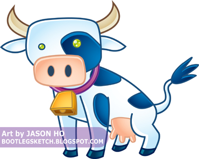
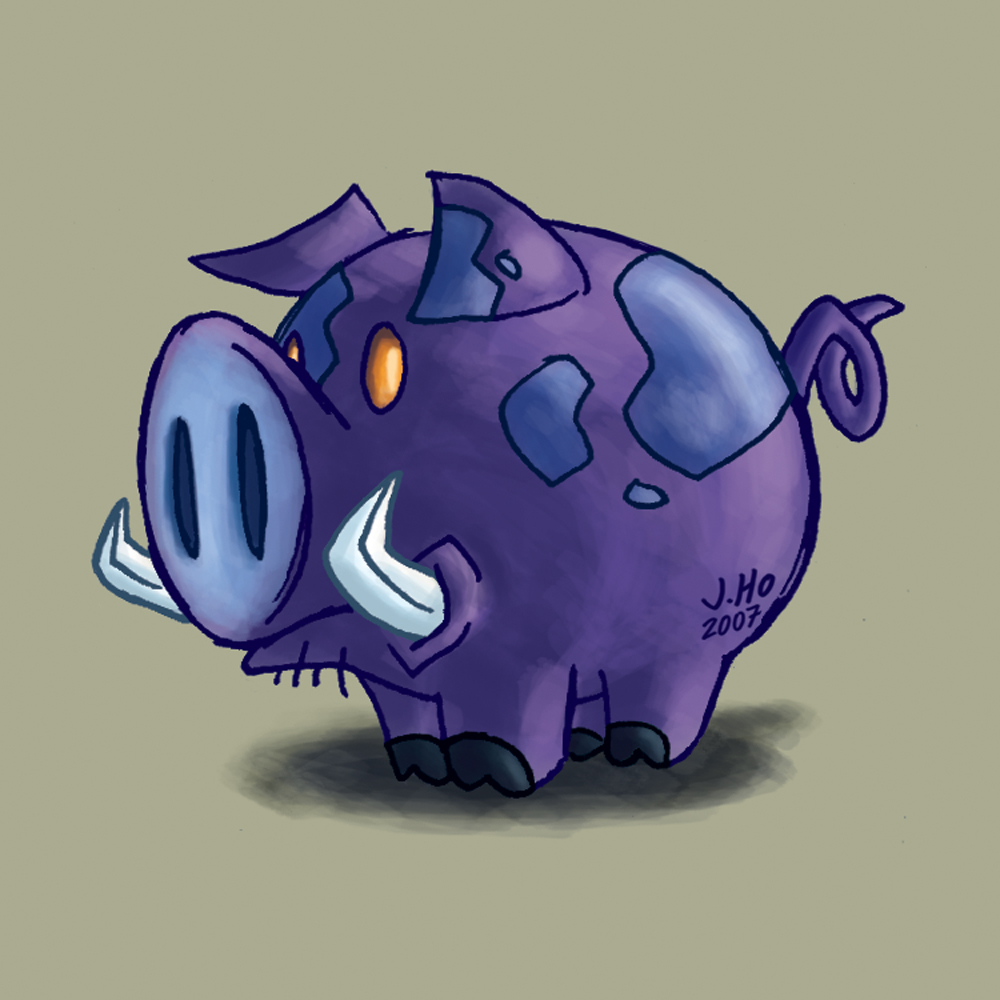
I’ll be brief today: I’m starting to get a better handle on this vector stuff, i think. I’m satisfied with most of my color choices and gradient placement on this one, but I need to work on my vector drawing skillz–I should probably start playing around with different brushes rather than sticking to strictly uniform lines. As for subject matter, this cow has no particular significance–just a little doodle that I decided to vectorize.
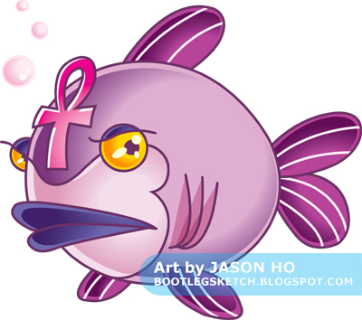
Sketched loosely in Photoshop, and inked and colored in Illustrator. After my previous attempt at vector illustration, I decided to make things simpler and more stylized. Though I think in this case, I went a little too simple. Ah well, damned if you do, damned if you don’t. I shaded this guy using some techniques that I have observed in the better executed vector illustrations of others. As far as the colors go, I’m basically satisfied, though I wasn’t quite sure what to do with the gills (and I think it shows) and the eyeballs lack the illusion of depth that I was going for.
More vector stuff to come. By the way, in case you didn’t know, that thing on his head is an ankh.
Post Script: Charles said he was going to write a profile for this little guy, but he’s been having some computer troubles, so there’s gonna be a little delay on that. I will post an update when he can get around to it!
**EDIT**
Well thankfully, Charles got his computer in order, and he posted the mystical fish’s extensive background story, entitled “The Children of the Gods”!
Go read it! Go!
A little something different–today’s illustration was sketched loosely in Photoshop and then inked and colored in Illustrator (I did also do a few tiny touch-ups in Photoshop). For those who don’t know the difference, Illustrator is a Vector-based graphics program, while Photoshop is a Pixel-based graphics program. This page gives a quick overview about the differences between the two, and you can read here if you want more details.

The colors are not quite what I expected–they looked different after I imported the image into Photoshop. I think maybe I need to adjust my color profile in Illustrator or something? Maybe someone who, unlike me, actually knows what they’re talking about could offer some helpful advice about this issue?
The whole purpose of this was to practice my vector skillz, and on that note I think this drawing/concept was just a little too involved for a vector rookie like myself. To achieve what I’m envisioning in my head (in terms of vector illustration), I need to learn to simplify shapes a bit more, and general simplify and stylize my drawings. I am however, happy with the way the bamboo “print” on the tunic turned out. It’s far from perfect, but as an experiment to gauge what I can do with vector illustration, it was a success.
Since the completion of this piece, I’ve done a few simpler vector sketches, which I will, of course, be sharing over the next few weeks, dear reader.
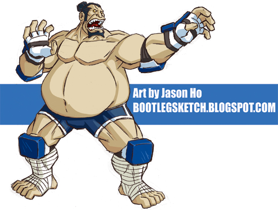
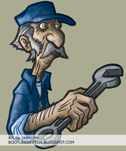
Tight pencils (in my less often seen anal-retentive style) with the usual Photoshop colors. I was afraid this was going to be another bland one, but I ended up being happy with how it turned out. Or maybe I just like the color blue? The pose is a little static (he’s supposed to be poised to make a powerful sumo palm-strike) and the hands are a bit clunky, but I think I did a decent job with giving a sense of this dude’s volume.
I started off with a very rough pen sketch, which I scanned and inked over in Photoshop. The colors are a bit lackluster, and I think if I had to do it again, I’d leave the line art in black. I am a man of few words today. Go, and be merry, dear Reader!
Character of the week, for Rick’s character design blog–a hobo:
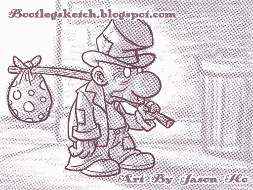
I definitely took a different approach this time–this one was completely digital. I just started sketching in Photoshop, without knowing where I was going to end up. I refined the line art for the hobo in a separate layer and started shading the hobo and rendering the background in the original layer. For the final touches, I used a half-tone filter on the shading/background layer, adjusted the hue/saturation on the whole thing to get a sort-of sepia color, and then dropped in my signature and URL in an old-timey font.
There are some bad tangents and clutter where the hobo’s upper lip eclipses part of his left hand… I need to be more aware of that kind of stuff in the early stages of sketching, because by the time I noticed it, I was too lazy to go back and re-do that whole section of the drawing.
Not a style that I’ll be going with all the time, but this was quick and fun. It’s good to mix it up so I don’t feel like my stuff is getting stale.
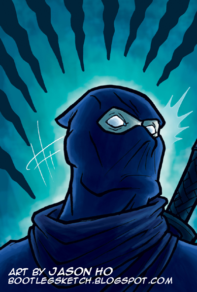
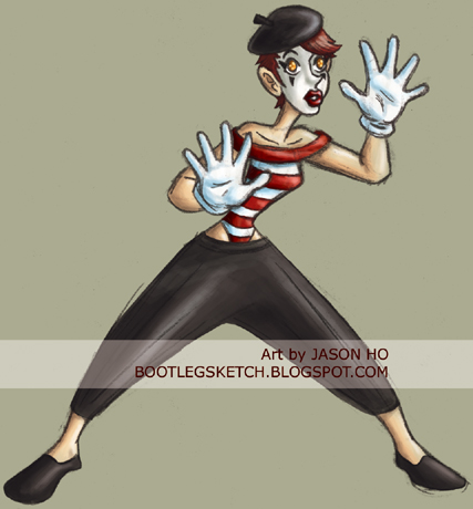
For this week’s challenge over there at Rick’s character design blog, a headhunter:

I’m happy with how this turned out… am I too self-congratulatory on this blog? Should there be more “artistic” self-loathing? Rest assured, dear readers, I am merely putting on a brave front for you. This bravado, this devil-may-care attitude, this John Wayne-like swagger–an act, all of it. Inside, I am suffering like the most neurotic of nebbishes… But nevertheless, I’m pretty happy with how this turned out. There are some problems with perspective (which is sadly standard for me) but I set out to do something with a bit more action and to mix it up with the colors, and I think I accomplished those goals. Admittedly, the all-cool color scheme is something that was inspired by Jacob’s mime from last week’s challenge.
I’ve been having fun playing around with this new, somewhat more painterly style. But, wow… it’s been like a week and a half since I put up a nerdy fan art. I promise I’ll post something very dorky on Tuesday!
My technique is getting pretty routine now which means two things:
Fun Fact: One of the rejected titles for this post was Should Auld Acquaintance Be Pork-ot. Seriously!