Fish-Brained Schemer

A whiiile back, my buddy Dylan (AKA Super-Munkyboy) had a contest on the He-Man.org fan-art forums–the goal was to create a new “big bad” for He-Man’s rogue’s gallery, and the prize was to have the newly created villain drawn by Dylan, Jazyl (AKA Two-Bad), and myself.

The contest actually ended in a tie, and one of the winners was Patreek, who I have previously drawn a fan character for. Here’s my interpretation of his character:

click above for larger view

You can check out the thread here, and see the other prize drawings here. Art of the other winner will be posted soon!

Tough As Nails

Real quick like: For those who enjoyed the step-by-step walkthrough from the last post, I’ve compiled it into a single huge image file–you can get it on my DeviantArt account here.

But back to today’s post…

I yammered on forever in the last blog, so I think I’ll try to keep it brief today. It’s Red Claw from Batman: The Animated Series:

click above for larger view

During a typically nerdy late night conversation, I was talking about B:TAS with Josh, and was reminded of this bad-ass villainess, so I decided to draw her. Sometimes it’s just that simple!

Step by step and day by day (that’s two ABC TGIF references in a row–I promise this won’t become a trend!)

(EDIT, 01/20/2011: for those who are interested, I’ve compiled this step-by-step walkthrough into a single huge image file–you can get it on my DeviantArt account here)

I talk a decent amount about my artistic process on this blog, but I don’t think I’ve ever really given you, Dear Reader, an actual step-by-step glimpse at what my process looks like. So I thought today it would be nice to take a look at how a finished drawing by J.Ho comes together. Let’s get right into it…

* * *


STAGE ZERO: The assignment and the character.

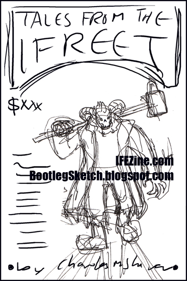
The “assignment” in this case was not a blog post (although it has become, a blog post), but rather a cover illustration for a book. My old crony Charles produces an e-zine of speculative fiction called If-E-Zine (pronounced Iffy Zine). He was planning to compile some of his work into a book, and I offered my services for the cover.

The cover was to feature the e-zine’s mascot and sometimes ‘host,’ Iffy the Ifreet, a horn-mohawked, skull-faced demon, garbed in leather, chains and spikes (very metal). Charles has dressed as Iffy for Halloween a few times (link, link, link), but always with a slightly different appearance, so I was given free reign to come up with a unique character design, as long as I met the basic criteria.

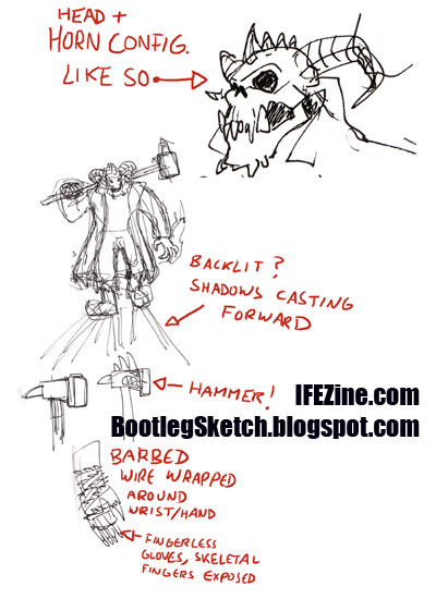
STAGE ONE: Basic concept for character design, and rough thumbnail for pose.

click above for larger view

At this stage I’m just loosely sketching Iffy, figuring out what he’s going to look like. Combining my favorite aspects of Charles’ past Iffy Halloween appearances, I’m able to decide on the proportions of Iffy’s face, and the configuration of his horns. I sketch him with a powerful build, and very quickly I stumble upon what will become Iffy’s pose for the final illustration–Iffy will be a menacing figure, stalking towards us, with a dangerous warhammer hefted over one shoulder, and a hand aglow with mystic fire.

I start working on some of the details of his costume and his weapon’s design, but before I get any further, I send what I have to Charles, to make sure he likes where it’s headed. He gives me the go ahead and I move forward…

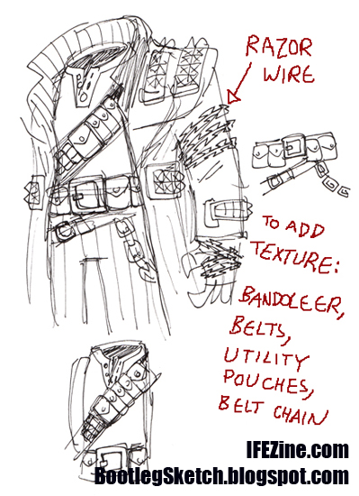
STAGE TWO: Working out costume details.

click above for larger view

A character like Iffy should have a costume that isn’t to symmetrical, but on the other hand, you want the elements to feel balanced so that no one area feels too busy or too bare. One of the changes I make here is to change the barbed wire to razor wire for a more streamlined visual read.

STAGE THREE: Rough cover layout.

click above for larger view

Not much to see here–I just take the rough pose that I’ve come up with, and put it in a template matching the dimensions for the cover, so that I can figure out how the type will match up with the illustration.

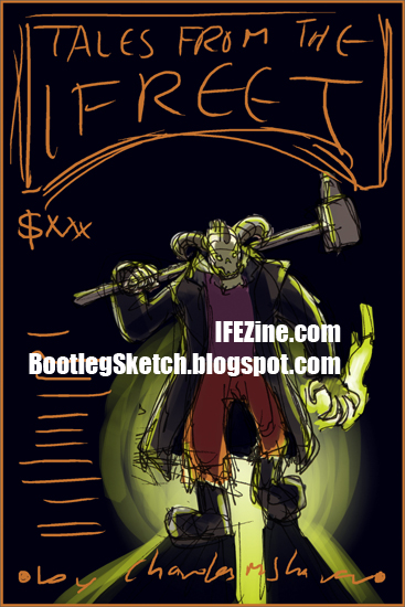
STAGE FOUR: Color study.

click above for larger view

Now I’m ready to start the actual drawing… but not really. I’m planning on a very particular backlit color scheme, and I feel the need to do a quick color study over the rough cover layout. This piece isn’t crazy-involved, but I want to make sure that what I’ve got in my head (in terms of layout, type placement, and color) will actually work out on paper. Once I’m satisfied with it, I clear it with Charles, and start drawing…

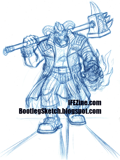
STAGE FIVE: Loose pencils.

click above for larger view

This probably seems like a complex step, but once the costume details and pose are set, fleshing out the drawing is relatively straightforward. If you look carefully, you can see that I’m contemplating a flame pattern emblazoned on Iffy’s coat, but I’m not crazy about how it’s looking. Charles decides the flames on the coat are too busy, so the final version won’t have them.

When I’m inking my own work, it’s usually unnecessary to tighten the pencils further than this, so I leave it as is and move on to the final inks…

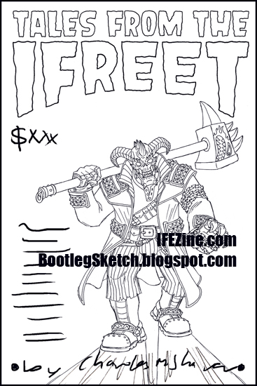
STAGE SIX: Type treatment + final line-art in layout.

click above for larger view

When I finish the final inks, I scan them, clean them up in Photoshop, and place them in the rough cover layout. Charles wants a retro-horror-looking title font, so I research some, and hand-draw a treatment for the title. I place that in the rough cover layout as well, and now we’ve really got an idea of how the final piece is going to look.

STAGE SEVEN: Colors.

click above for larger view

I might have mentioned never shut up about what a slow colorist I am, so for me, this step is particularly time consuming. Someday I’ll make a step-by-step post about my coloring process, which is a whole thing unto itself, but for now I’ll just give you the basics.

Usually I just start slopping some colors around to nail down my color choices. Once I’ve got that figured out, I clean everything up. To keep things flexible for revisions, I tend to keep like-colors in separate layers, and give lighting effects (like the green flame and green highlights) their own layer as well. Color-wise, the important thing with this piece is the dramatic lighting created by the backlight and the green flame, so that’s my focus as I bring this illustration to a close.

Charles is happy with what I’ve done, so that means the illustration is finished, and I just need to finalize the cover layout…

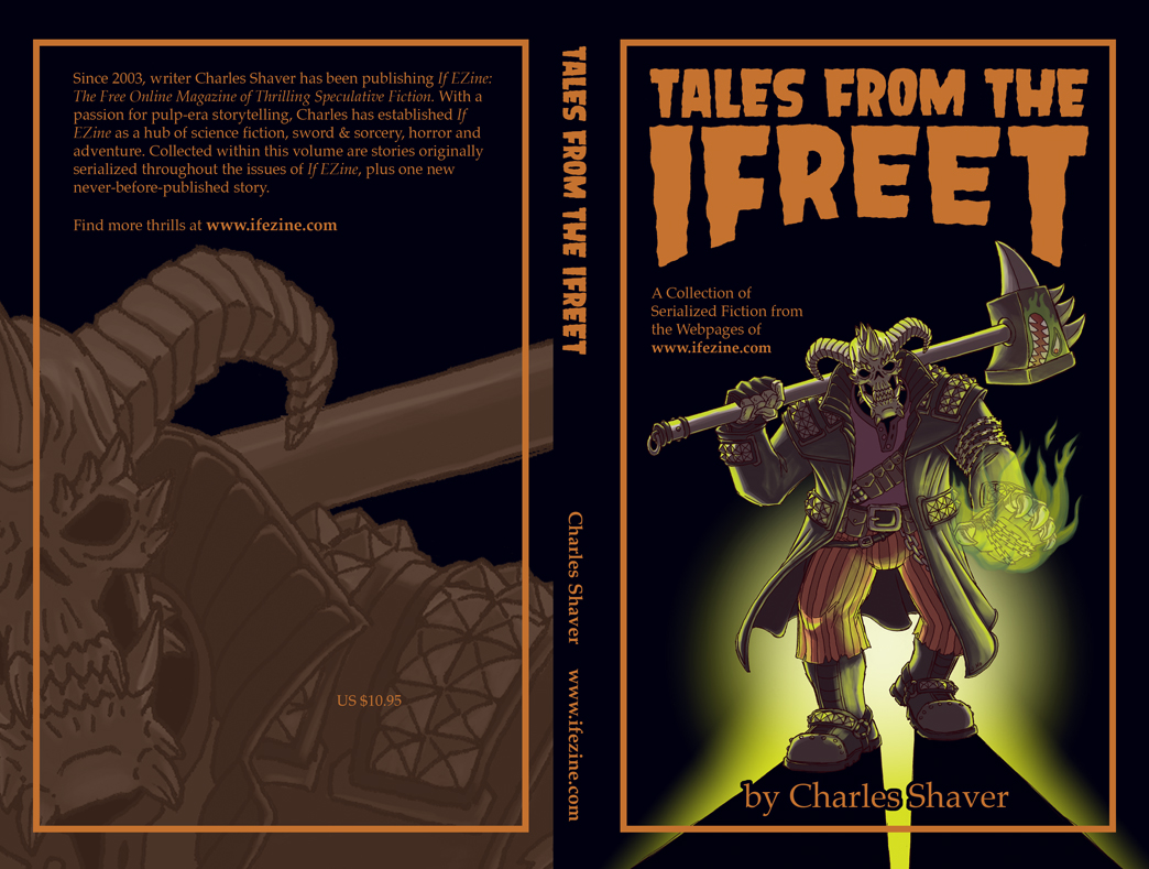
STAGE EIGHT (FINAL): The result.

Charles gives me a template for the cover, as well as all the pertinent copy for the front and back covers. I make a blown-up, faded, monochromatic version of Iffy to use as a design element for the back cover, and insert that, along with all the copy. Behold, the final result:

click above for larger view

You would like to buy a copy, yes?

The only Dave Coulier reference I will ever make: Cut! It! Out!

I have a cool Cutman trading figure sitting on top of my scanner, so I was inspired to do my own take on him:

I was just sort of working out how I would interpret the character, and randomly decided to take it a step further, and render him with markers and colored pencils. This was fun and quick to do, and as always, it feels nice to bust out some traditional media rather than the same old Photoshop stuff I’m used to. Plus, I feel like being on graph paper inherently improves a drawing of a robot.

By the way–some time last year I finished using up the cache of scratch paper that I mentioned in this post. However, I have since found another sizable cache of old college papers and homework… so today’s piece is drawn on the backside of a piece of graph paper containing my Chinese vocabulary words. Zhen de!

(That means “Really!“)

The Big O (neither the giant robot anime, nor the tire store, nor the other thing)… Also: Tron, and Happy New Year!

First off–if you’re here because of my Tron Calamari post from two weeks ago, welcome! I got a few re-tweets regarding that post, not the least of which were from renowned Twitter maven Bonnie Burton, and the official Star Wars Twitter account! So a big thanks to Bonnie, the folks at @StarWars, everyone else who re-tweeted me, and everyone who dropped in to look at my blog (both new and long-time readers). And of course, another big thanks to my crony Dave, who came up with the title Tron Calamari.

Secondly–I was in a bit of a rush last week, so I didn’t get a chance to mention what I thought about Tron: Legacy–so how about a five second review?

* * *

Tron: Legacy (In theaters in 3D and IMAX 3D)

The dialogue was mostly very standard for a special effects blockbuster, with occasional moments of brilliance (often via Jeff Bridges’ unexpected moments of channeling the Dude/himself). The 3D was uneven and generally not a big deal–though I’ve heard a lot of people say otherwise–your mileage may vary, as projectionists at individual theaters may not have their gear properly calibrated. The pacing and performances were strong, and the special effects and art direction were pitch perfect. But most importantly, this movie knows what it is, where it came from, and isn’t ashamed of it.

Verdict: Awesome. I had fairly high expectations, and was pleasantly surprised to have those expectations satisfied. A big bucket of black glass, neon piping, and FUN!

For More Computer World Adventure: Track down the original Tron, or watch some Reboot (coming to DVD soon, by the way!).

* * *

And now back to our abnormally scheduled nerdiness:

So, the tradition around here is that I draw up a Skeletor or He-Man (or some version thereof), and post it to commemorate the New Year. Well, I wasn’t sure which version to go with, and as I sat here looking at the menagerie of action figures on my desk, it occurred to me that the Masters of the Universe Classics version of Orko (character info/figure) would probably be the only figure I would keep if I had to sell off my He-Man collection. This in turn made me realize that Orko is one of my two favorite He-Man characters (the other being the Sorceress). True, Orko was most often relegated to the role of goofy sidekick, but I always thought he looked cool, had a cool species backstory (he’s a member of the inherently magical Trollan race from another dimension), and as a character, he always had the potential for more. Anywaysss… here he is:

click above for larger view

I threw in some costume elements from the 200x version of Orko, but mostly kept his classic proportions. The big “O” on his chest, while iconic, was always a bit too goofy for me–so I styled it as a circular magical ward. Yes, I know, I’m splitting very nerdy hairs in regards to what’s goofy and what isn’t. Perhaps most significantly, I changed up his eyes, to give him more of an otherworldly quality. I don’t think Orko should ever be played as “dark” or creepy, but giving a character an alien look can add a little edge to him, without changing his personality.

I think this is a huge improvement over my earlier depiction of Orko’s lady friend, Dree Elle.

Happy Nerd Year, everyone! (Note: that was intentional, not a typo. You nerds.)

Also posted on the He-Man.org fan-art forums. My post is here, the entire thread (including some of my previous sketches) is here.

I’m back, but more importantly: TRON x STAR WARS

Very briefly: I’m going to start posting again, but I think I’m going to ease into it first… let’s see how one post a week goes until I get back into the swing of things, shall we? I’ll talk a little bit about my hiatus in a future super-boring post, but for now (if anyone still reads this thang), let’s just get right back to the main event: ridiculously dorky nerd art.

So, Dave and I were talking about Tron and Star Wars action figures, and the following happened:

6:40:11 PM ME: so i opened my white light cycle
6:40:14 PM ME: and it’s awesome
6:40:21 PM ME: but i had two thoughts
6:40:39 PM ME: 1) white light cycle would match ackbar’s white uniform
6:40:42 PM ME: or
6:41:12 PM ME: 2) blue lights would match a blue mon calamari, but i would have to put the mon cal head on a tron body w/ blue lights
6:41:16 PM ME: ._.
6:41:18 PM ME: just sayin

6:41:35 PM DAVE: lol
6:41:37 PM DAVE: oh man
6:41:46 PM DAVE: you ponder that some more
6:41:47 PM DAVE: or DRAW IT
6:41:52 PM DAVE: and put it on your sketch blog
6:42:04 PM DAVE: TRON CALAMARI
6:42:06 PM DAVE: omg
6:42:13 PM DAVE: i basically just gave you that for free

6:42:15 PM ME: O_O
6:42:18 PM ME: NICE

And thus was born a custom figure created from Star Wars action figure Ibtisam (info/figure) and Tron: Legacy action figure Sam Flynn (info):

click above for larger view

I’m not an experienced customizer by any means, so this was a pretty basic head and arm swap. First, I used the boil-and-pop method to remove the relevant body parts from the original figures. Ibtisam’s forearms plugged right into Sam Flynn’s elbows, but as a result the custom’s arms are a bit short. The socket in Ibtisam’s head was too big, so I bummed some Epoxy putty off of Hammers to partially fill in the socket, and then used the superglue method to make the ball joint fit tightly. Aaand then I drew this:

click above for larger view

So, for those of you keeping track at home:

  • I have purchased Tron: Legacy toys.
  • I have made a custom Tron Calamari figure.
  • I have drawn dorky fan-art of Tron Calamari.
  • I am listening to the Tron: Legacy soundtrack at home, in my car, and at work.
  • I have been flipping through the pages of the Tron: Legacy artbook.
  • I have not seen the movie yet…
  • … but have tickets for a 3D IMAX screening on Saturday morning.

It feels good to blog again. If you’re reading this, thank you.

Big thanks to Brian Warmoth and Comics Alliance! And an apology for my terrible timing!

Brian Warmoth wrote a very generous article about this very blog over at Comics Alliance, which came completely out of the blue!

Please check out both Comics Alliance and Brian Warmoth’s personal blog:

I cannot thank Brian Warmoth and Comics Alliance enough for putting my art in front of so many viewers. But I will try: THANK YOU THANK YOU THANK YOU!

However, this means that I have chosen a terrible time to put the blog on hiatus, which I apologize for. Unfortunately current circumstances are what they are, so I’ll still need a bit of a break. Rest assured, that with encouragement like this, I will definitely be back sooner rather than later. See you soon, folks!

This isn’t "goodbye"… this is, "see you later, after an undetermined interval of time… probably."

With a heavy heart, I am putting this blog on temporary hiatus.

At the moment, I kind of feel like Life is stepping on my neck. I’m just a little too busy with the day-job, a little too burnt out overall, and a little too dissatisfied with some of the lazy posts I’ve been putting up. Plus there’s all the other stuff that goes on in life, miscellaneous things that I’m trying to work on outside of the blog, not to mention Comic-Con coming up next week… woof.

So I’ll be taking off an unspecified period of time, with the intention of refreshing my outlook, and renewing my dedication to this blog, and to my productivity in general. Before I go, I leave you with this:

click above for larger view

Of course long-time blog readers will recognize this as a callback to a much older post. Sure, I might be a big baby who can’t take the heat… but at least I’ve improved artistically, right? I think it must be destiny for me to take a break–as I finished this drawing, I realized that I was in fact wearing that shirt.

Thank you for your patronage, Dear Reader. With any luck, I’ll be back soon.

Lazy Summer Afternoon

I enjoyed a relaxed, lazy summer afternoon this past weekend:

click above for larger view

Please pardon the frosty palette–we have been blessed in Los Angeles with some nice overcast days and cool temperatures. The blistering heat will arrive soon enough, so I’m enjoying this while I can.

Not Quite Cuckoo

I’ve been itching to get back to some sculpting, and finally had a chance over the long weekend. This was supposed to be a cuckoo, but the crest got a bit too big, and instead it looks like some kind of gold-colored cardinal:

click above for larger view

The burnt tips on the crest and tail feathers are strictly a happy accident–I let this thing cook for too long! The gold Premo Sculpey that I used was a bit harder and slightly more crumbly than the other types of Sculpey I’ve tried, and unfortunately there were a few cracks after the baking. I don’t think volume or size was the problem, as my previous tiger project had no cracks whatsoever (the bird is just under 2 inches tall, while the tiger is closer to 3 inches tall, and obviously much longer). The transition between the neck and chest is somewhat awkward, and the head got flattened a bit along the way, but overall I’m pretty happy with how this turned out.

Sculpting is a lot of fun. Maybe it’s because it’s a change of pace, or because I’m not so familiar with the process of it, but I find the whole experience to be really relaxing. Hopefully I’ll be able to set aside some more sculpting time in the near future!

For, Forer, Forest

Just had an itch to play with some color in Photoshop. This probably took me about an hour:

AND BY THE WAY: all image links are now officially fixeddd! Enjoy all the super nerdy drawings on my super nerdy blog, from the present day stretching back continuously into the ancient, ancient past of early 2007! Thank you for your patronage and patience.

Pun-ishment

When I am IMing with Dustin in the wee hours of the night, this happens:

1:31:00 AM Dustin: [CENSORED]
1:31:04 AM Jason: LOL
1:31:06 AM Jason: wth???

1:31:10 AM Dustin: lol
1:31:11 AM Jason: you are a sick sick man
1:31:12 AM Dustin: just sayin…
1:31:27 AM Jason: yes, you are indeed just sayin
1:31:38 AM Dustin: like dragon ball z man
1:31:41 AM Dustin: just saiyan
1:31:47 AM Jason: hahahahahaah
1:31:51 AM Jason: +700 nerd points to you
1:31:55 AM Dustin: lol
1:32:44 AM Jason: lol…. you should draw a picture of goku shrugging and at the bottom it says “just saiyan”
1:32:57 AM Dustin: YOU should

And thus:

click above for larger view

I did some research, and as it turns out, we were not the first two geniuses to stumble upon this pun. But I still felt that this particular version required rendering. Just saiyan.

The H-Word

I think I’m out of vague teasers for the moment, so let’s see if I can get back to the regular nerdy fare for the moment, yes?

I wanted to do something quick, fun, and 100% digital, so here’s a super deformed Hellboy done in less than two hours (my sloth-like idea of “quick”):

Please forgive any inaccuracies–I drew this without looking up any reference.

Vague 4Ever!

He looks a bit gruff, but actually the service is superb:

I promise that these vague updates will not last forever! At some point this blog will have super nerdy fan-art again! Or possibly full-blown reveals rather than vague previews and teasers! And continued exclamations!!! Please humor this temporary lull folks! See you on Friday! Bye!!!

3 Vague 3 Squirrelous

Um, I should probably explain something… these posts aren’t necessarily building up to a big, immediate reveal. After I’m done with it, there will probably be a bit of a delay before I can actually post it here. Err… until then, enjoy these cryptic glimpses?

Squirrel!

I’m a delight, I swear!

If you talk to my close friends, it’s pretty well understood that I prefer a stern talking-to over a kind word. And unfortunately for my friends, I give what I wish to receive. I made this hand-drawn card for a dear friend (link unavailable) who’s going away for a few months:

click above for larger view

It’ll be like I’m right there the whole time, nagging away!

Vague.

In regards to my previous blog post, the weekend was a success. Fun (Pokemon), and productivity (drawing/coloring) were had.

I’m working on something, and this is all I’m willing to show for now. I’m not trying to be a tease–I just don’t have anything else to post! Stay tuned.