Changing it up a bit today–step into the third dimension with me, won’t you?
Knowing in advance that I would be watching over my seven-year-old niece on the day of of Chinese New Year’s Eve, I planned a little art project for the two of us. All it took was some Sculpey (colors: terra cotta, white, and black), thin wooden dowels (to internally support the connection between the head and body), some beads (for the eyes), two wooden plaques, and some high-strength adhesive (to glue the beads in, and to glue the finished tiger to the wooden plaque):
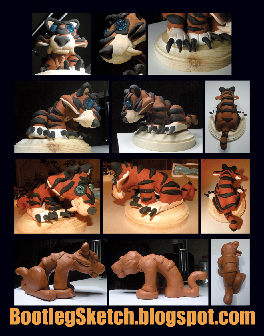
click above for larger view
The top two rows are photos of the tiger that I sculpted, the third row is my niece’s excellent work, and the fourth row is the partially finished prototype that I sculpted a few days prior to project-day.
To break it down quickly–I sketched out the rough geometric shapes that would be necessary to build the tiger, and then built a partial prototype to make sure that it would be do-able, and made some basic notes about how much Sculpey would be necessary for each part. I planned out the project so that I would sculpt along with my niece, showing her along the way how to make each component.
On project-day, the first components that I sculpted with my niece were the claws, teeth, nose, and inner ear. We baked those pieces first, so that they could be easily inserted into the un-baked components. After that we sculpted all the white parts, then the orange (terra cotta) parts. Next, we assembled the components, and lastly sculpted the black parts and added those last. It was important to move from the lightest colors to the darkest, because Sculpey leaves just enough residue on your hands to stain the other colors. It was inevitable that some of the white would get stained, but the results would have been a lot messier if we had started with black.
My niece did a great job–she really didn’t need much help creating the components, except for the stripes, which were all cut by me. I think you can tell in the application of the stripes that she and I were both starting to feel fatigue, and I sort of rushed us through that part because I just wanted to finish the project while I still had her attention.
After the sculpting and assembling, we made indentations in the head with “decoy” beads in the spots where we wanted the eyes to be. We removed the beads, and then baked our almost-finished sculptures. I didn’t want to bake the beads, because I didn’t know how the heat would affect the plastic. And I threw away the “decoy” beads, because they now had residue from the black sculpy on them.
After the sculptures baked, we let them cool, and we each picked out eye colors from the bag of multi-colored beads. My niece chose a lighter sky-blue, while I opted for a mid-range blue/cyan. I don’t trust seven-year-olds with high-strength adhesive, plus at this point her attention was fully absorbed by the TV, so I attached the eyes for both sculptures, and then fixed each tiger to its wooden base.
If you compare the finished pieces to the prototype, you can see that the prototype actually has a better, more defined torso. I can only attribute this to the fact that I didn’t have the time to fine tune each piece on project-day, but overall I think things turned out well, and it was a lot of fun. I’m a so-so sculptor at age thirty-decrepit, but my niece is advanced at age seven!