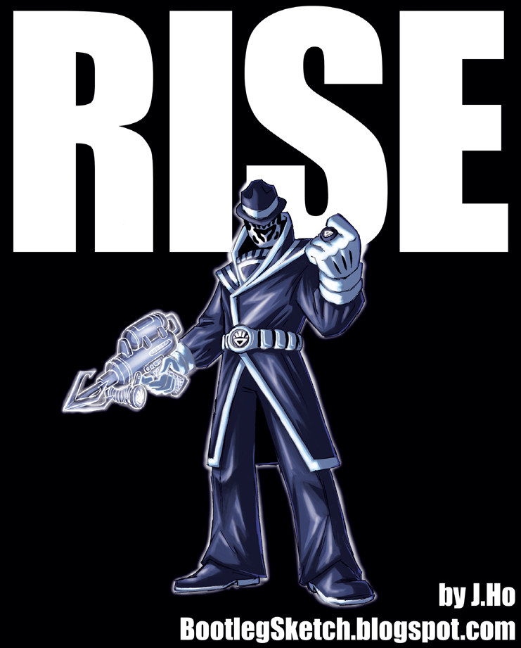
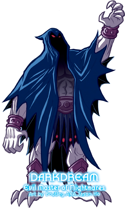
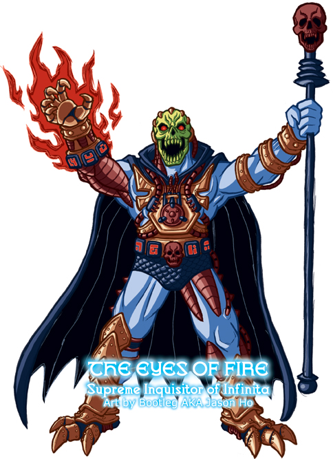
Today I’ve got Laser Light Skeletor for you, re-imagined as (surprise) a new character. His weapon is a Havoc Staff topped with a humanoid skull as per one of the prototypes. I went with this weapon, and changed his cape from purple to black to distinguish him from Skeletor. His name comes from the Spanish version of Laser Light Skeletor, Ojos de Fuego:
click above for larger view
In terms of color and design, Laser Light Skeletor seems like a mess, if you ask me. He’s got a great head sculpt, but his body has all kinds of noodly details that seem very un-Masters of the Universe to me. I streamlined the details, but did my best to keep the general flavor, so that he’s be recognizable. I’m pretty happy with the colors on this one… I think the warm oranges and reds play off nicely against the cold blues and blacks. But really, it’s the super nerdy background info that makes it all worthwhile…
* * *
PROFILE: His true name and identity lost to the ages, he is addressed only by his rank, SUPREME INQUISITOR, and spoken of in hushed tones by his official sobriquet, THE EYES OF FIRE, a name bequeathed to him by the High Priests of Infinita. Dispatched by the Elder High Priest, the Supreme Inquisitor seeks out and punishes the enemies of Infinita, burning them with arcane fire, and cursing them with ancient spells.
HISTORY: The Supreme Inquisitor gazed out from the observation deck of the Infinitan flagship. The glow of his red eyes was dull and smouldering. Trance-like, he seemed to peer deep into space, a vision drawing him in.
Many millenia ago, in the cold, empty halls of the Central Infinitan Temple, a man stands over two glass coffins. The coffins are the same size–one occupied by a woman, the other occupied by a mere child. The child looks peaceful, but so small in the full-sized coffin. The woman looks sad, but resigned. It is night, and the moons of Infinita shed cold white light into the temple halls, through towering windows and arches. The blue skin of the man, and the two bodies, almost looks silver under the moonlight. Who is this man, and who are these corpses, the Inquisitor wonders absently.
The man’s eyes are in a trance, emotionless. Looking at the two bodies, but somehow not seeing them–instead staring past them. He is wounded. His right arm and chest are badly burned and bandaged. He does not move; his heart barely beats beneath his bandaged, charred chest.
Footsteps echo through the halls. Another man, draped in a black hood and cape, approaches from behind. The Inquisitor does not know who this man is either. The wounded man speaks, as if to interupt the other, though the other is silent. “This was my fault.”
The hooded man’s chalk-white skeletal jaw and exposed teeth glint in the moonlight, his voice is tight with rage… or anticipation? “No. This is the fault of Eternian scum.”
The wounded man knows this is not true. But he does not care what is true anymore. “Will it make me strong?” He asks.
“Yes.”
“Will it make me forget?”
“Yes.”
The wounded man stares past the bodies. What is he seeing, the Inquisitor wonders idly.
The wounded man is tired. That’s the closest thing to an emotion that he has betrayed in days. “So be it.” Questions float through the Inquisitor’s consciousness. What will happen to the wounded man? What will happen to the bodies?
The hooded man walks away, his footsteps seem forceful… or gleeful?
The wounded man follows the hooded man down the hallway. It seems to stretch on endlessly. The Supreme Inquisitor now gazes absently not into the distant past, but at his own dark reflection in the glass, superimposed over black starlit space. In one hand he holds a Havoc staff, topped with a humanoid skull. A smaller humanoid skull is mounted on his belt buckle, flanked by black slabs of stone, carved with Infinitan runes. These artifacts have been with him for as long as he can remember, but he cannot remember where they came from. He touches his belt buckle lightly with his robotic right arm. He cannot remember where he came from.
Forceful footsteps in the observation deck. The Supreme Inquisitor does not move. Reflected in the glass, a hooded man draped in black appears behind the Inquisitor. His chalk white mandible catches the light. All else is darkness. The Inquisitor knows who this man is–his mortal master, the Elder High Priest of Infinita, second only to the God-King himself.
The clarity of the vision dissipates, and the Supreme Inquisitor finds himself swallowed up once more by the present, and by madness. He no longer wonders about the vision, not even idly–it is forgotten.
“What do the Eyes of Fire see?” Asks the hooded man.
“I see the future. I see war… I see Eternia burning.”
* * *
As should be apparent, I wanted to create very Vaderian mythos for this guy. Hopefully I pulled it off without being too obvious or too corny. A little obvious and corny is okay though.
Also posted on the He-Man.org fan-art forums in my variants thread. The thread is here and my post is here.


