Drawn circa 2000 for an animation pitch:
Probably one of my very earliest (completed) attempts at digital coloring.
Drawn circa 2000 for an animation pitch:
Probably one of my very earliest (completed) attempts at digital coloring.
A commisioned piece for an animation pitch–a surly beaver with an eyepatch who wants you to stay away from his pancakes:

You’d better do what he says!
I believe this is the first 100% digital piece I ever did, circa 2003-2004. The colors were pretty awful and over-saturated, so I adjusted them.

That elf sure looks pissed off about something. He’s probably angry beause his favorite sketchblog decided to run old artwork for the next few weeks.
It was not so long ago that I expressed regret over the amount of old artwork that I have been posting. Well, sadly, I’ve been treading water since then, barely able to complete my posts in a timely manner. So instead, I’ve decided to strip-mine my art archives, and post an extended series of old artwork in order to give myself time to catch up and stockpile new posts.
Many of the pieces in the coming weeks were drawn for friends, some were drawn for pitches and projects, and none of these pieces has ever really been seen by more than a handful of people. In other words, this art should be new to you, dear reader.
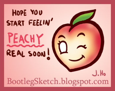
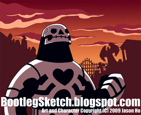
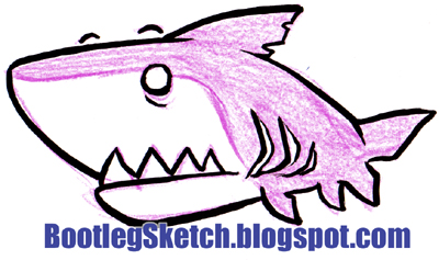
First up… a get well card drawn for a friend, circa 2005.

It seems like everyone I know has been sick multiple times this year, and I myself have been transformed into a plague-infested bag of putrid virulence on at least three (3) separate occasions this year (feeling well currently, knock on wood). So if you’ve got a sick friend, send ’em this pic! The terrible pun and intentionally over-saccharine image will either make them feel better… or finish the job. Okay, maybe you shouldn’t send this to anyone.
I’ve made promises in the past that I have yet to make good on. So maybe this is something and maybe it isn’t, but for now, let’s just enjoy it as an image appropriate to the Halloween spirit, shall we?
Get off the internet and go eat some candy, you nerds! Happy Halloween!
Wow, that’s the title I came up with? Sorry everyone. Here’s some more Halloween-themed fun… at least I hope it’s fun?

A little something for the season… a vampire bat greaser:
This follows a few of my previous posts–Mummy, Golem, and Frankenstein Monster.
Something of a belated follow up to an older post, it’s Raphael:

Am I the only one who prefers cuttingly sarcastic, smart-ass Raphael over brooding, angry, thug-Raphael? The optimal characterization probably falls somewhere between the two, but he’s consistently been portrayed as pissed-off and thuggish in recent years. Just a thought.
I posted a picture of a lumberjack some time ago, which was originally commisioned by my friend James, as part of an animation pitch. Here’s a forest ranger from the same pitch:
I’m still pretty happy with this piece, I think it holds up alright–but let’s be honest folks, my blog posts this year (so far) have been all over the place…. tons of last minute posts and Flashback Fridays. I’ll endeavor to (metaphorically) provide fresher produce in the future.
Sorry for the interruption in the series. From City of Heroes, here’s the Statesman‘s archenemy, Lord Recluse (named for the venomous brown recluse spider):
I took a few liberties with the costume design on this one, but I think it worked out. Recluse’s logo is normally only seen on his forehead, while a generic spider emblem is emblazoned on his breastplate. I think Recluse actually has a pretty cool looking logo, so I put that on his breastplate instead, and left his forehead blank.
C’mon, Recluse! Take a hint from Cobra Commander–if you’ve got a good logo, flaunt it!
Please enjoy:

Unlike a shark, I do not have to keep moving. I’m going to sleep early and I’m going to stay very still.
My apologies for the interruption of my “MMO Tuesdays” series of sketches–
friends in town + Long Beach Comic-Con + crushing sinus pain + me being a big baby = me not having the time or energy to color.
However, the Con was great (I definitely recommend that everyone check it out next year). I got to meet a lot of cool people, and it’s always a good time hanging out with the usual suspects (Josh, Dustin, Derek, Marcus, Peter, Tu, etc).
The aforementioned guys all had tables in artist’s alley, and while they were trying to do business, I was hanging around bothering them all, and sketching stuff like this (which I inked after the con):

Another shark coming up on Friday, and the conclusion of the MMO series next Tuesday. Stay tuned!
What has four legs, spits up hairballs, and causes me to put up last minute blog posts?

Sketched with various markers, generously touched up in Photoshop.
As promised, here’s an MMO villain–Doctor Destroyer from Champions Online:
I have no idea why the good Doctor’s character design so closely resembles that of Doctor Fate. You’ll have to take that up with the creators of Champions. I also have no idea why my drawing turned out so meh and stiff. That is strictly my fault. I think the colors turned out decently though. Gold is shiny.
._.
OH HEY–don’t forget to go to your local comic book store tomorrow and pick up the new JLA 80-page giant, which includes stories written by my pals Josh and Derek! Click on the pic below for details… DO EET!
Here’s a self portrait, in which I look agitated and pale (as I often do):
Sketched in ballpoint pen and colored in Photoshop.
For those keeping track at home, I do have a sleeveless black hoodie in RL, but I do not have a t-shirt featuring my favorite saying (unfortunately). My apologies for this interjection by my raging ego. Regular sketch-blog service will resume next time.
Of course I would not have paid tribute to Champions Online without also acknowledging its predecessor, City of Heroes.
Here’s Statesman, flagship hero of Paragon City:
How about some MMO villains next? Tune in next Tuesday.
Carrie Kelly, of Dark Knight Returns:

Pen sketch + color pencil + minor touch-up in Photoshop. Hmm… sometimes I draw something (like this) and immediately have zero enthusiasm for my own work. Oh well, recognizing mistakes and moving on…
“MMO Mondays” would have been a much catchier title, but oh well.
Here’s Defender, from the recently launched Champions Online MMO (based on the Champions pencil & paper RPG):
Erm… there are some problems with this drawing, but I enjoyed coloring the glowy parts at least. Tune in next Tuesday for more MMO heroics!
Today’s post is for a re-design challenge at the He-Man.org fan-art forums. The thread is here, my post is here. The voting thread is here–I placed second. The subject is Scrollos, an obscure character from the UK Masters of the Universe comics:
The reference pictures of Scrollos all had slightly different color schemes, but almost all of them included some element of blue/cyan or purple/magenta. However, the picture that struck me the most had an all-green color scheme. At first I tried to combine the various color schemes, but that was too complex a task for my humble coloring skills. I settled on the green scheme, which I’m content with.
On the whole, everything in the picture is supposed to give a sense of a character who is powerful, but aloof and preoccupied with knowledge and information. The floating scrolls and holographic displays are there to emphasize the contrast between science fiction and fantasy that makes me so fond of the He-Man Universe. Inserting some of my previous art into the holographic displays took me a surprisingly long time. Hopefully the details are visible enough to warrant the time spent.