A little something different for today…
If you work in an office anything like mine, there are two realities that you will understand. Co-workers and impromptu crafts.
Any office will experience occasional lulls, and it’s during these times that you look at whatever materials are lying around the office and find a way to craft them into artifacts of boredom reduction. In the case of my office, we often receive and send things, which means boxes, which means cardboard. Sometimes I simply put a cardboard tube on my arm and pretend I’m a cyborg, but other times I draw Skeletor’s torso on a cardboard poncho, and pretend I am the Lord of Destruction. There have been paper moustaches, dioramas of Peeps murdering each other, styrofoam capes and boas, dog snouts made of paper cups, and more. For years, two cardboard box lids with happy faces hung on the wall in front of my desk. I only recently took them down because I want to preserve them somehow (perhaps by having them mounted on wood blocks).
Accompanying you on these lulls and cardboard larks, are your co-workers–the people who are in the trenches with you everyday, the people who you see more than almost anyone else, and the people who understand your countless in-jokes. In my case, these are the people who understand that when I walk up to their desk, and they ask me how I am doing, I will punch myself in the stomach, make a fake barf noise, and they will reply, “I hear ya.”
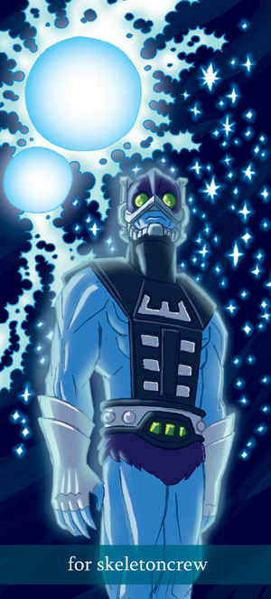
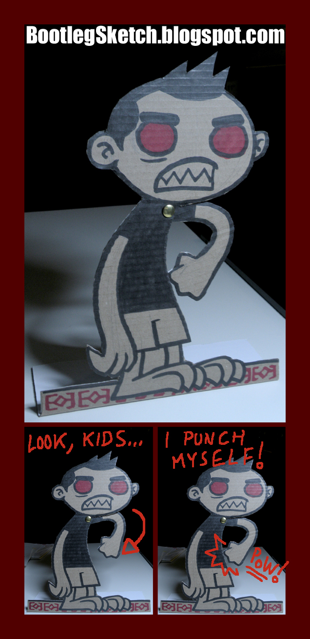
Yesterday was the last day of a co-worker and good friend of mine, who’s moving on to bigger and better. Erroneously, she had decided that she was sad about leaving–so I realized quickly that I am by far the awesomest thing in the office, and manufactured this cardboard android as a substitute co-worker to accompany her in her new endeavors:
click above for larger view
I had always intended to make an occasional foray into three-dimensional art on this blog, but here I am finally doing it. This crude standee stands about a foot tall, was sketched on a dismantled Fed-Ex box, detailed with magic markers, cut with ordinary old scissors, and assembled with packing tape and a single conspicuous brass brad.