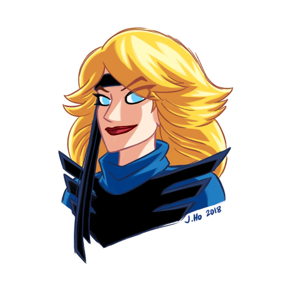
What’s more appropriate for a warm-up sketch than Black Canary in her 80’s aerobics-esque costume? I unironically and unapologetically love this costume btw.
Superheroes
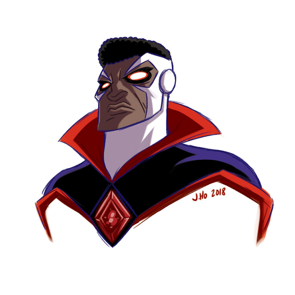
Bloodwynd
ink on skin
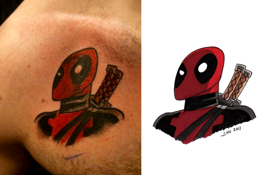
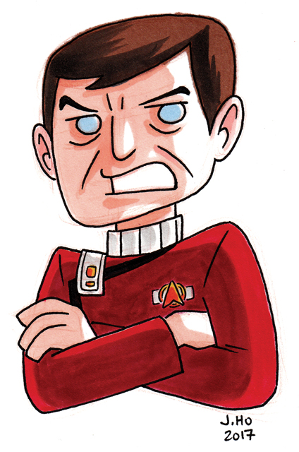
So I thought the Star Trek tattoo from a few months ago was the first time my art had been turned into a tattoo, but I forgot that a few years ago Kara, commissioned a Deadpool from me for her husband Jake, and he liked it so much he had it inked:
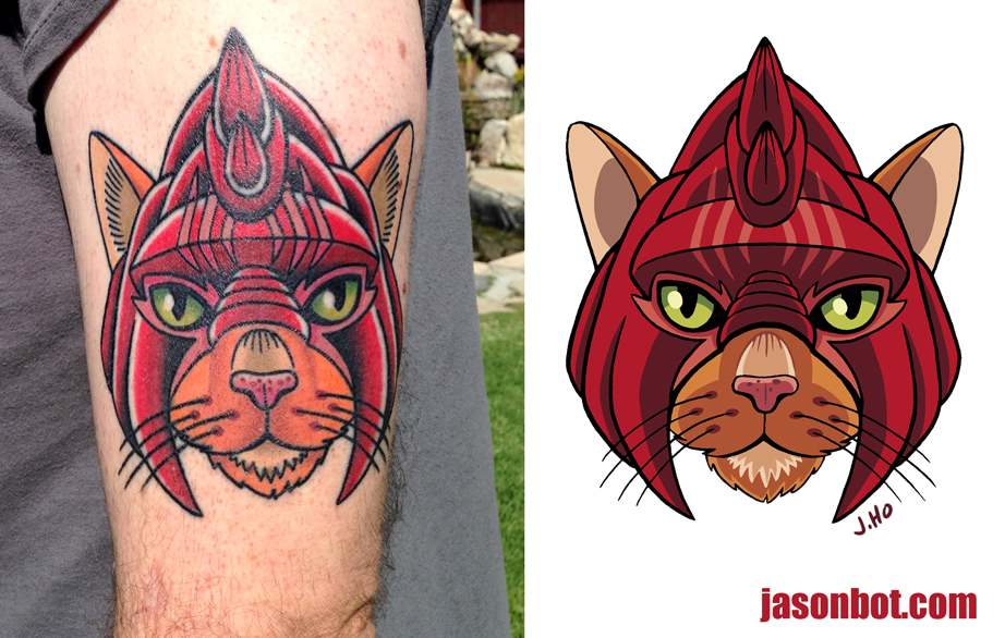
So that’s two tattoos from my art so far, but the next one is definitely the first time I was commissioned specifically to design a tattoo! My good friend Scott wanted to pay tribute to his own personal Battle Cat, the late great Apollo, and I was more than happy to help…
It’s humbling to see folks want to put my doodles into permanent display on their bodies, and amazing to see how the tattoo artists translate my work! I’m talking to a few more friends about this kinda stuff, so who knows, maybe this will become a regular thing for me?
ink on paper
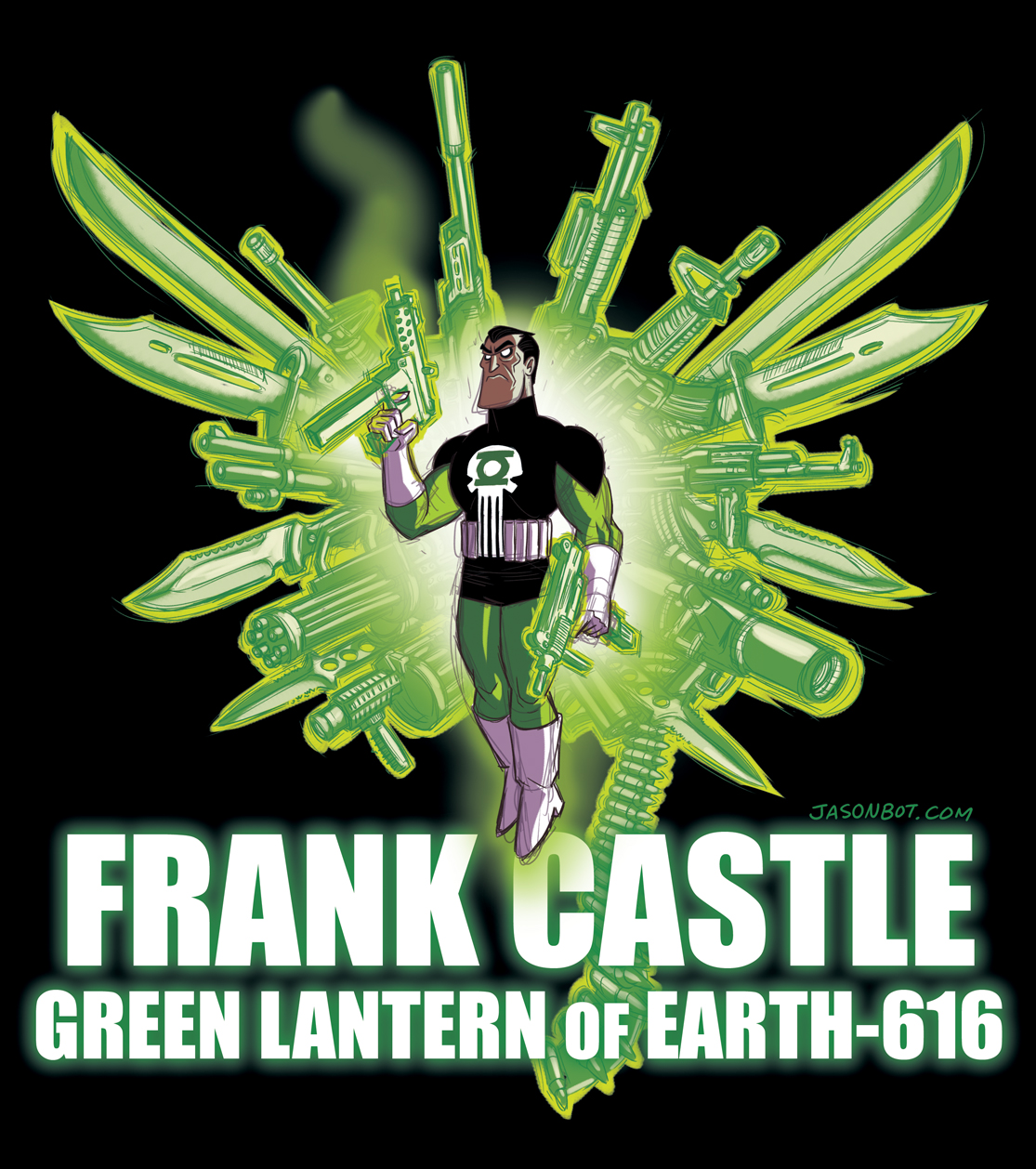
GL of Earth-616
I was thinking about Simon Baz and the idea of Green Lanterns + guns, then I was thinking of the traditional Green Lantern Corps uniform with white gloves and what other characters wear white gloves and then this happened:
Notes:
– RE: the ring-construct weapons… I dug up photo reference of various weapons at angles that would work for what I had in mind, arranged them fanning out in a somewhat wing-shaped collage (I bit that idea from one of The Expendables movie posters), then I did a simplified sketchy trace-over.
– The costume is basically an inverted Hal Jordan/GLC uniform mashed-up with Frank Castle’s traditional Punisher costume.
– I guess I shouldn’t be surprised that after drawing Green Lantern characters for two weeks I randomly felt compelled to draw a super nerdy crossover. This isn’t the first time I’ve drawn an unlikely Green Lantern mash-up! (Previous incidents: HERE, HERE, and HERE)
Okay, back to regular GL characters, there are still a lot that I want to draw!
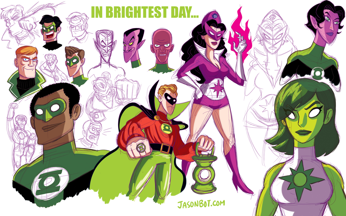
GL & Friends
Just sketching up some of the Green Lantern cast…
Notes:
– I draw really long necks.
– Pay no attention to the completely wrong perspective on Alan Scott’s lantern.
– John Stewart has been around for so long that you could give him his classic hairstyle back and it would be hip again (so I did exactly that).
– I was trying to draw a more classic Abin Sur, but he doesn’t look enough like an alien.
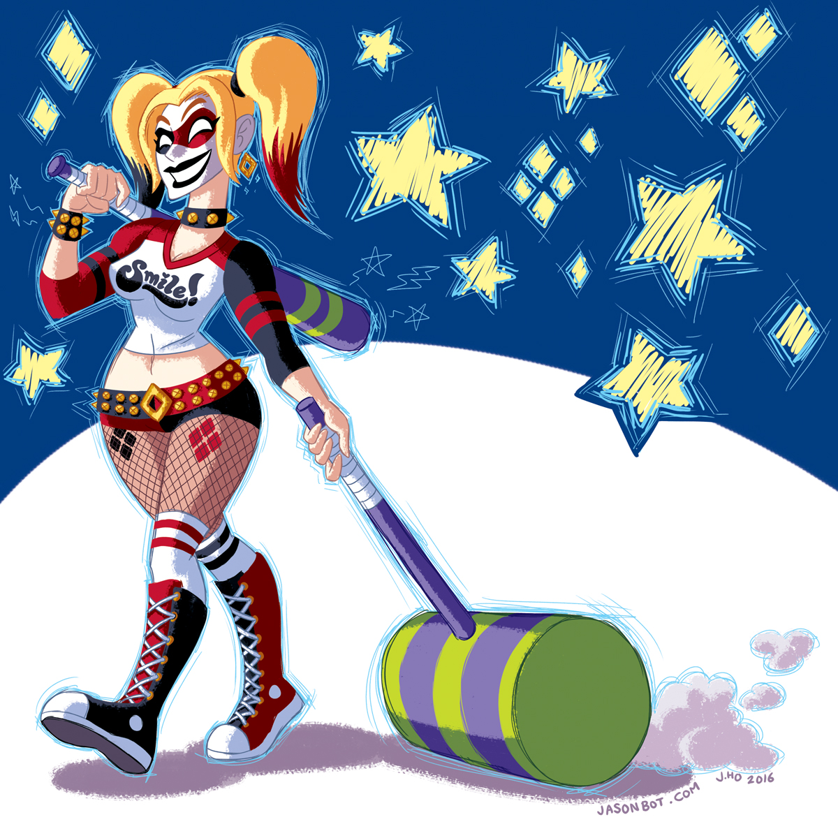
HQ
Haven’t seen the movie yet, but I like Harley Quinn’s costume in Suicide Squad. I wanted to draw a version of it that was in traditional Harley colors with a more streamlined cartoony look. There’s a dash of the Amanda Connor roller derby version in there, and the tattoos are inspired by the excellent cosplayer Katy DeCobray!
Feet (and Face) of Clay

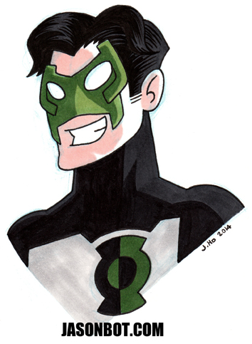
Kyle Rayner!
A day late, a bat short
Betsy
I had a somewhat long piece of glossy paper, so I decided to draw something with Sharpies. Thus, Psylocke:

Cap.
I took a trip to Portland a few weeks ago, and sat next to a really friendly couple on the plane. I drew this Captain America sketch for their son. They asked me to, I don’t just force sketches on strangers when I’m on a plane!

(Posted this on Instagram, but thought I’d put it up here too, just for archive purposes and all of that.)
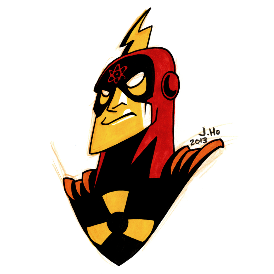
UP AND ATOM!
Draw… SOMETHING (03)
Art dump, incoming!
The past few weeks have been busy and frustrating. Minor physical maladies (shoulder/neck pain) have made drawing difficult. I will not bore you with details! I am fine now, and the past few days I’ve been drawing whilst continuing to marathon Star Trek: The Next Generation.
I have enough posts to catch me up (5 total), but I’m going to split them up rather than group them all together in one post. Why? Because I am a nut for proper organization and categorization.
First up is your friendly neighborhood Spider-Man:
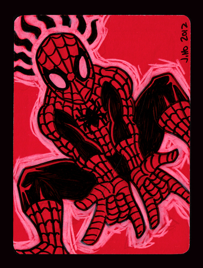
Roughly 3.75″ x 5″, drawn with black Sharpie and white color pencil on the back of an extra RSVP card.
SMILE
When I see green, orange, and purple color pencils on my desk, I say to myself, “Damn, I should draw the Joker.”
So, I drew the Joker:
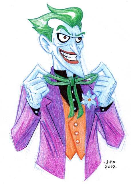
You can probably tell that my idea of the Joker is heavily based on Bruce Timm’s animated version, with just a dash of Brian Bolland thrown in.
(This Joker is not intended to go with the timeline I have imagined for my “Sons of the Bat” re-designs, but I imagine I will use this as a basis for a future Joker if/when I get to the villains of that era!)
Allies of the Bat: Phoenix
For those who missed the first round of drawings or want a refresher, these re-designs imagine a future timeline combining elements from the comic book continuity (pre-New 52) and the Bruce Timm animated universe. For context as to how far in the future this timeline exists–Damian Wayne is in his mid-20s. Here are links to the original Sons of the Bat posts:
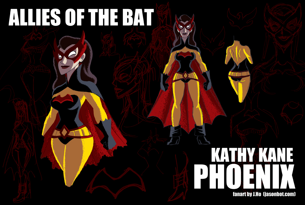
I’m going off the reservation a bit for today’s entry. The subject is Kathy Kane, who was the original Batwoman (on either Earth-1 or Earth-2), not to be confused with Kate Kane, the modern day Batwoman who, if I understand correctly, is distantly related to the first Kathy Kane who may or may not be retconned from existence in the current DC universe. Listen, I know. It’s confusing.
I have further complicated matters by deciding that in my fabricated “Sons of the Bat” continuity, the mantle of Batwoman is now taken up by Barbara Gordon. This means both Kathy and Kate Kane need new identities. I’ll get to Kate soon enough, but for now I have renamed Kathy “Phoenix” which is a codename meant to match her niece, Flamebird. Just go with it:
- Age: Early 50’s
- Although she had left Gotham and retired her “Batwoman” identity long ago, heiress Kathy Kane was more than content to do good in the world as a philanthropist and entrepreneur. But when her nephew and most of his family is killed, she returns to action, reborn as Phoenix, and partnering once more with her niece Bette Kane, AKA Flamebird. Following the trail of the murderers to Gotham, Kathy decides to move back to the city, bringing Bette and Rebecca (her orphaned grand-niece) in tow. While seeking answers and justice, Kathy inevitably crosses paths with the Sons of the Bat, who agree to aid Kathy’s investigation in any way possible.
- Kathy’s ulterior motive for returning to Gotham City is to ask Dick for guidance, knowing that he has been through a tragedy similar to what her grand-niece has suffered.
- With Bruce comatose, the safety of Gotham is tenuous, as is the security of Wayne Enterprises. Tim pushes for a longer term alliance with Kathy, both in her identity as Phoenix and in her civilian role as a businesswoman and investor. Initially, Selina Kyle-Wayne vetoes this alliance, questioning Kathy’s motives, but eventually the two develop a level of trust and respect.
- Yet another case of a minor re-design, plus some color shifting. I wanted to keep her original costume’s red and yellow to match up with the phoenix/fire theme, but I added in some black to help ground the costume.
- Her simplified emblem is meant to be ambiguous enough to be a bird or a bat.
I feel like the original Batwoman and Batgirl get crapped on a lot, so I wanted to respect the characters, and give them identities that moved beyond ‘heiresses with crushes on Batman and Robin.’ I also wanted to tie in the modern day Batwoman, which I’ll elaborate on later.
The black/red/yellow colors running through the last three posts have been unintentional, I assure you! Apparently that’s a popular palette for Batman’s friends and rivals, and I don’t want to change any character’s representative colors unless I can come up with a good reason!
Not sure what the next post will be… I have some Allies of the Bat ideas lined up, but I might take a break. You’ll have to tune in to see!
Allies of the Bat: Anarky
For those who missed the first round of drawings or want a refresher, these re-designs imagine a future timeline combining elements from the comic book continuity (pre-New 52) and the Bruce Timm animated universe. For context as to how far in the future this timeline exists–Damian Wayne is in his mid-20s. Here are links to the original Sons of the Bat posts:
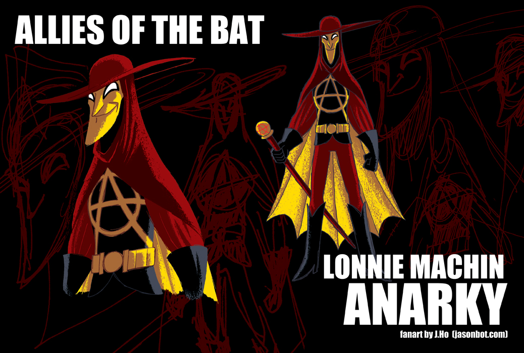
Today’s entry is Lonnie Machin, AKA Anarky:
- Age: Late 20’s
- As a child prodigy, Lonnie Machin developed an iconoclastic world view at an early age. In adulthood, Lonnie has managed to balance his idealism with realism while staying true to his beliefs. Though he and the Sons of the Bat sometimes find themselves at odds, they share a mutual respect for each other’s beliefs and skills. This alliance truly solidified when the Calculator orchestrated a physical and digital assault on the Sons of the Bat–Anarky came to Oracle’s aid, and was instrumental in destroying the digital criminal empire that Calculator had built.
- I see Lonnie and Tim as kindred spirits. On the other hand, Lonnie and Damian have a somewhat antagonistic relationship, but their philosophies and goals ultimately have a lot of crossover, and I think someone like Lonnie would keep Damian honest. Jason is amused by Lonnie’s rebellious and subversive personality, and loves seeing others riled up by him.
- This is another slight re-design. Actual costume changes are very minor, but I shifted a few colors around. You can see from the other drawings in the series that I like giving the lining of a cape a striking color that offers stark contrast to the character’s body, creating a strong silhouette.
- It doesn’t really make sense for Anarky to wear a scalloped bat-cape. However, thematically it’s an abstract nod to the fact that Anarky has something in common with the Batman Family’s moral code, even though they aren’t always on the same side.
- As a child, Anarky’s costume was built to create the eerie illusion of a tall adult. I like the idea that he’s since sprouted up into a weirdly tall grown-up. I should try playing around with body types more on the other designs…
- In addition to being a melee weapon, his baton can discharge energy to stun his weapons, and has a retractable grappling line.
Maybe when I first encountered him, I was just at the right age to be receptive to a character named “Anarky,” but I think he’s an awesome character. In spite of his name, he’s not as obvious as the usual rebels and anti-heroes, plus he has an intellectual side that is sorely lacking in many comics these days. Definitely an underused character.
Allies of the Bat: Azrael
I was rather pleasantly surprised earlier this month when someone on Twitter pointed out to me that Project: Rooftop had featured my Sons of the Bat re-designs!
From the feedback I’ve read, people have generally been positive (which I truly appreciate), and would like to see Barbara Gordon as well as other female characters (which I would have guessed). As I mentioned before, I have every intention of drawing up the Daughters of the Bat. However, for the moment I decided to draw a few of Batman’s supporting players (male and female) who don’t quite fit the category of being his “children.” Allies of the Bat will be an open set of drawings and/or re-designs that I post here from time to time.
For those who missed the first round of drawings or want a refresher, these re-designs imagine a future timeline combining elements from the comic book continuity (pre-New 52) and the Bruce Timm animated universe. For context as to how far in the future this timeline exists–Damian Wayne is in his mid-20s. Here are links to the original Sons of the Bat posts:
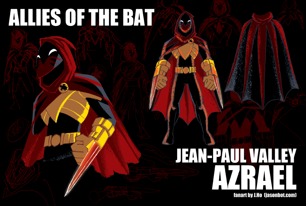
Onwards! Today we have Jean-Paul Valley, AKA Azrael:
- Age: Mid 30’s
- At various times Jean-Paul Valley has been an ally, substitute, and antagonist for Batman. After many years of chaos, Jean-Paul faked his death (unbeknownst to all but Bruce Wayne and a few others). He travelled the world searching for his own identity, as well as seeking to better his mind and body. He studied martial arts with Connor Hawke, and meditation with J’onn J’onzz. In Madripoor he sparred with a grizzled warrior, and in Texas he debated faith with a preacher. Newly grounded, with a fresh outlook on life, Jean-Paul Valley returned to Gotham City. When he heard that Batman had fallen and the Sons of the Bat were in dire need, he sprung into action as Azrael once more.
- With the telepathic aid of J’onn J’onzz, Azrael is completely freed of his previous mental conditioning.
- This is a verrry slight re-design. I basically streamlined and simplified things, and made his body suit black to offer more contrast against his red cape.
- His retractable flaming blades have been replaced with the hard light constructs which are more precise and have no risk of collateral fire damage.
(If you caught the two non-DC Universe references in the quick little bio I wrote for Azrael, then you are a good nerd!)
So, to be honest, I’m rather torn about this costume now that I’m posting it. The problem with Azrael is that (I feel) everyone basically wants to see him in his (more or less) original costume… however, storywise, that costume represents everything the character is trying to escape. I guess I am struggling with Jean-Paul Valley’s identity as much as he is. I reserve the right to give Azrael a proper redesign in the future, besides which, I need to consider the Suit of Sorrows as well!
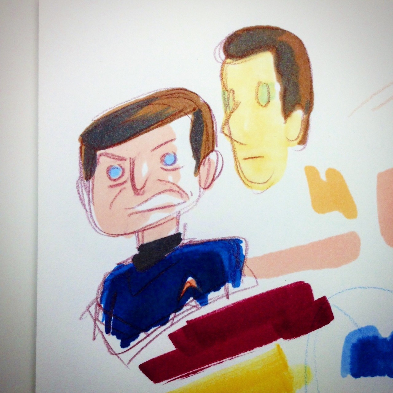
Anyways, during my preliminary sketches of Azrael, I did a really crude color study to see how I felt about the increased amount of black in the costume. I was going to use this as one of images in the backdrop, but when I monochrome-ized* it, I liked it enough that I thought I should post it. Plus, you know, I’m one post behind, so I needed to catch up. Two bats with one stone! So to speak.
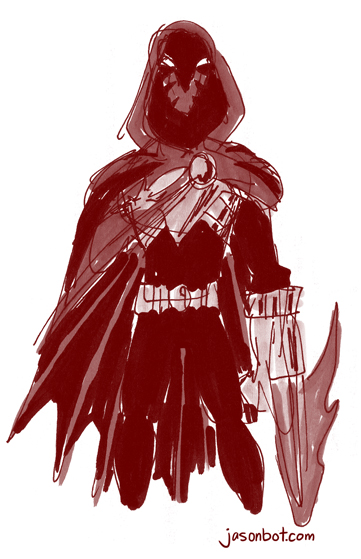
*monochrome-ized… past tense of monochrome-ize… that’s a word, right?
Aqua Zone
For no particular reason, here’s a drawing of Aquaman zoning out:
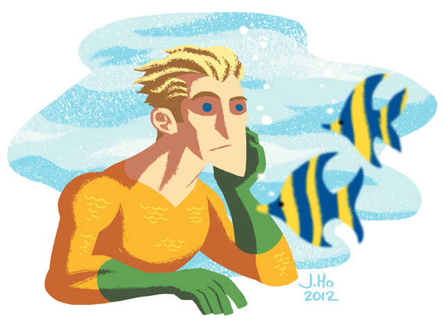
I FEEL THE SAME WAY, AQUAMAN.
As you can see, I’m continuing to experiment w/ shapes as opposed to lines and forms. Not sure where this is heading, but sometimes you just have to let the current whisk you away. YOU SEE BECAUSE I DREW A PICTURE OF AQUAMAN UNDERWATER, AND CURRENTS ARE THINGS THAT HAPPEN IN THE WATER. K, time to sleep.
(Why yes, I am both late as well as one post behind. Sigh.)
