Flight of the…

…BUMBLEBEE!
click above for larger view

Those who know me have probably been baffled and confused that my blog has been so primarily focused on the world of He-Man. Indeed, even I am shocked that it has taken almost three full months for an illustration of a full-fledged Transformer to show up here (sorry Battle Beasts, being a part of the Transformers universe isn’t the same as being a Transformer).

Bumblebee was the fresh-faced rookie of the original Transformers cartoon–he transformed from a Volkswagen Beetle into a robot. Since then, there have been, like, a million iterations of him in the toyline, but I won’t get into that. A new version of the character is also going to be one of the main characters in the upcoming Transformers live-action movie.

My sketch is a pretty faithful rendition of the original cartoon version, and I was able to complete most of the drawing without needing to look at reference. Whether that’s sad or awesome, I leave to you, dear reader. My pencil drawing was a little tighter, and therefore the inks were as well. The coloring on this one was fast and simple (but maybe a little bit plain and flat)–you’ll note that I have left the black lines intact for the most part. The type treatment just sort of came to life on its own after the drawing was done. All in all, this was smooth-going, and I wish all my pieces came together this easily!

SCARCE COCO NIMROD FEZ is an anagram for…

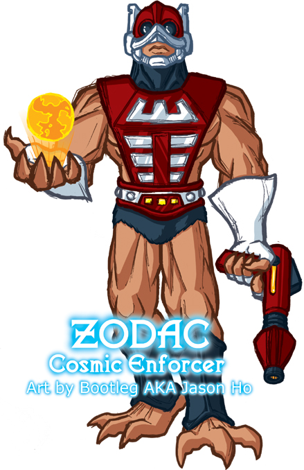
Zodac, Cosmic Enforcer!

(Posted early because I don’t know if I’m going to be sitting in front of my computer when midnight hits. I just might be unconscious with fatigue.)

This He-Man action figure was originally billed as being “evil.” The cartoon, however, made it pretty obvious that he was a neutral figure who leaned very heavily towards the side of good. As far as characterization goes, I take most of my cues from the cartoon, so I’m filing him under the good guys.

click above for larger view

This time, the static pose was actually intentional–meant to emphasize his supposed neutrality. The holographic globe (which is meant to emphasize his cosmic nature) is just something I came up with, as far as I know. It’s possible that my brain pulled it out of the subliminal depths of long forgotten He-Man episodes from my misspent youth. But those episodes won’t be forgotten for long–I do plan on completeing my He-Man DVD collection soon.

The costume tweaks that I made on this design are rather similar to the modifications that I made in my illustration of Tri-Klops–I consolidated the harness from his chest plate with his belt to avoid a redundant-looking double-belt, and I ‘covered’ his neck. The covered neck on Zodac, as with Tri-Klops, is inspired by the 200x version. The rest of the costume is pretty much straight up from the original.

This was posted on the He-Man.org fan-art forums. My post is here, the entire thread (including some of my previous sketches) is here.

For more anagrams:

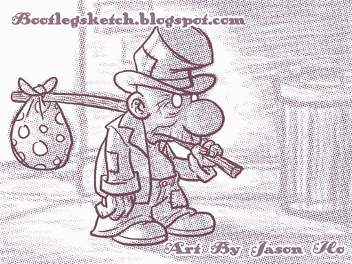
Hobo By J.Ho

Posted early while I’m at work, because my DSL is down at home…

Character of the week, for Rick’s character design blog–a hobo:

click above for larger view

I definitely took a different approach this time–this one was completely digital. I just started sketching in Photoshop, without knowing where I was going to end up. I refined the line art for the hobo in a separate layer and started shading the hobo and rendering the background in the original layer. For the final touches, I used a half-tone filter on the shading/background layer, adjusted the hue/saturation on the whole thing to get a sort-of sepia color, and then dropped in my signature and URL in an old-timey font.

There are some bad tangents and clutter where the hobo’s upper lip eclipses part of his left hand… I need to be more aware of that kind of stuff in the early stages of sketching, because by the time I noticed it, I was too lazy to go back and re-do that whole section of the drawing.

Not a style that I’ll be going with all the time, but this was quick and fun. It’s good to mix it up so I don’t feel like my stuff is getting stale.

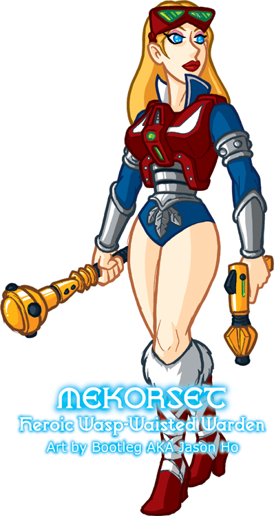
Mekaneck’s Wife Is Hott!

Re-design challenge at the He-Man.org fan-art forums for the first half of March–my post is here and the original thread is here. The voting thread is here–I snagged a first-place vote… sweet!

The subject today, is the mother of Mekaneck‘s son Philip. I phrase it like that because she is a character who was neither seen nor referenced in the old He-Man cartoon. The only inference of her existence is the existence of Philip. In fact we don’t even know if Philip is Mekaneck’s biological son. But for the sake of my entry, I make the assumption that Philip is the biological son of Mekaneck and this classy lady:

click above for larger view
The design of “Mekorset” is really just based on pre-existing elements. Her armor and goggles are extrapolated from Mekaneck himself, and the rest of the costume elements are swiped from Teela/Evil-Lyn. The club and pistol are weapons from Man-At-Arms and Zodac, respectively, re-colored to match Mekaneck’s club, and modified just slightly. The name “Mekorset” is a contraction of “mechanical” and “corset,” the same way Mekaneck’s name is a contraction of “mechanical” and “neck.” Where Mekaneck has the ability to extend his neck, his better half can extend her midriff. Pretty clever, yes? No? Right.

What you are looking at is essentially the very first drawing I did of this character. I’m pleased with how it turned out–yes, it’s a typical static girl-pose that you would expect from me, but something about her stance is natural and relaxed (well, relatively relaxed, considering that she’s armed to the teeth). And it’s always nice when you get something on the first try.

The colors, on the other hand, are pretty bland, I think. The colors of her uniform follow Mekaneck pretty closely, and she has blonde hair to match her son. The lighting is even less dynamic than usual, but I didn’t want to spend a ton of time on a really obscure character who’s the estranged wife of a second-stringer. How do I know that she’s estranged, you say? I’m glad you asked–read on for some background info, nerdily composed by yours truly!

* * *

PROFILE: In her public life, MEKORSET is a steadfast yet just authority figure, well-loved in the territories that she oversees. In her personal life she is fiercely devoted to her family. She is equipped with a bionic midriff that can extend up to 10 feet–beyond making her a “human periscope” like her husband, she also uses the ability to enhance her hand-to-hand combat abilities. Her goggles provide her with a variety of enhanced visual senses–telescopic vision, nightvision, thermal vision, video recording and transmission etcetera. Her light battle bludgeon is standard issue to Eternian military, but her sidearm is a special model engineered by Man-At-Arms from off-world technology. In close and ranged combat, Mekorset is surpassed by few.

HISTORY: Mekorset and her husband Mekaneck, were both injured when trying to to track their son Philip through a violent storm generated by the evil sorcerer Count Marzo, who had kidnapped Philip. The couple each received bionic prostheses which not only saved their lives, but gave them new powers. However, the loss of their son, compounded with the fact that they had married at a very young age, caused excessive strain on their marriage. Mekorset, as she was now called, became one of the King’s wardens, and transferred to a distant outpost, overseeing some of the King’s territories on the frontier.

In the aftermath of Mekaneck discovering and rescuing Philip from Count Marzo, Mekorset has reunited with her son and her estranged spouse. By decree of King Randor and Queen Marlena, Mekorset was transferred to an outpost closer to the Eternian capitol (roughly half a day’s ride on a Stridor unit) where she remains one of the King’s most trusted Wardens. Mekaneck, who still serves as a special agent in the reconaissance division of the Royal Guard, now lives with his wife and son at the outpost. Mekorset and Mekaneck are currently seeing a marriage counselor, and seem to be well on their way to rebuilding their family. Their son Philip recently became a junior recruit in the Royal Guard.

* * *

Further Tangential Fan Speculation Regarding Mekaneck’s Family: Some folks on the forums pointed out that another Philip who showed up might be the same Philip as Mechaneck’s son, though no reference is made to corroborate this.

Also: Yes, I realize this is all ridiculous, but as you ought to have guessed, I have unsurpassed affection for nerdy and obscure things. IT’S JUST WHO I AM… O_O

Don’t Go In There–It’s A Trap (Jaw)!

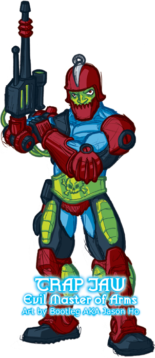
The subject of today’s mega-nerdy post is Trap Jaw, another henchman of Skeletor, described on as “Evil and Armed For Combat.” (Unfortunately, Wikipedia lives up to its reputation for inaccuracy in this instance–“Trap Jaw” is not hyphenated. Shameful.)

click above for larger view

“Evil and armed for combat” is all good and fine, but as you can see, I changed Trap Jaw’s blurb to “Evil Master of Arms.” I prefer it because it’s a title rather than a description, plus it has a pun in there, which is always good for a He-Man character (Trap Jaw has a prosthetic arm with interchangable attachments, for those of you who don’t know).

The pose gave me quite a bit of trouble this time around… this is actually my third go at Trap Jaw. I got as far as starting inks on the two previous attempts, but they were really very awkward. I ended up with a pretty static pose (a trap that I fall into frequently), but since the goal of this sketch blog is completion, speed, and productivity rather than perfection, I was willing to make the sacrifice. Better to finish it off and move on to the next one!

The details of the drawing are pretty faithful to the toy. In fact–not being an owner of the original Trap Jaw action figure, I never realized that his left arm is almost completely armored. However, my obsessive internet search for reference rectified this oversight. I’m pretty surprised that I have not previously come across any Trap Jaw art depicting him with an armored arm. The tubes and wires coming from the blaster on his prosthetic arm were completely fabricated by me.

I took more creative liberty with the colors than I usually do–burgundy has more of a presence in his color scheme as a nod to the cartoon, but I scaled it back just a little bit, so that there wouldn’t be large masses of one uninterrupted color.

This was posted on the He-Man.org fan-art forums. My post is here, the entire thread (including some of my previous sketches) is here.

Character of the Week: Headhunter!

Just a quick note to those who have written comments: thank you very much for taking the time to leave me feedback–I do respond to most of the comments, but sometimes it takes me a few days–so if you wrote up a detailed critique, made an obscure reference to a Disney Afternoon cartoon, typed something in Mandarin, asked for a book recommendation, just dropped by to say “hi,” etcetera, please check the comments for my responses.

For this week’s challenge over there at Rick’s character design blog, a headhunter:

click above for larger view

I’m happy with how this turned out… am I too self-congratulatory on this blog? Should there be more “artistic” self-loathing? Rest assured, dear readers, I am merely putting on a brave front for you. This bravado, this devil-may-care attitude, this John Wayne-like swagger–an act, all of it. Inside, I am suffering like the most neurotic of nebbishes… But nevertheless, I’m pretty happy with how this turned out. There are some problems with perspective (which is sadly standard for me) but I set out to do something with a bit more action and to mix it up with the colors, and I think I accomplished those goals. Admittedly, the all-cool color scheme is something that was inspired by Jacob’s mime from last week’s challenge.

A (Humanoid Robotic) Horse Is A Horse, Of Course, Of Course…

Re-design challenge at the He-Man.org fan-art forums for the second half of February–my post is here and the original thread is here. The voting thread is here–I placed second.

The subject is Stridor, “Heroic Armored War Horse.”

The original Stridor toy is a solid, straightforward design without much room for improvement. My solution for the re-design challenge was to instead give him a completely new humanoid transformation. Actually, it’s not too much of a transformation–he pretty much just stands up on his hind legs, and his articulated hands pop out; a few other things shift around, but nothing too complex. To accommodate his humanoid mode, the tail gun is now mounted on the hip, and a protective shield guards what would otherwise be a vulnerable belly. The jousting lance is my addition as well. Color-wise, I stayed pretty faithful to the original–a notable addition being the coppery orange that I used for his joints:

click above for larger view

What’s that? You’re just not getting a feel for my interpretation of the character? The artwork is okay but you wish I had come up with some background info to flesh out and explain my re-design? Well, here ya go:

* * *

PROFILE: On the battlefield STRIDOR is a courageous leader, a shrewd strategist, and a firece fighter. Off the battlefield he is gentle and easy-going. In horse mode he is the size of a large armored war horse, and in humanoid mode, he stands almost twice as tall as a man. His ranged weapons include dual heavy laser cannons, and a rapid-fire hip blaster. His primary weapon in close combat is a heavy jousting lance.

HISTORY: The Stridor Project began in Man-At-Arms’ laboratory as a simple experiment in robotics and simulated AI. His goal was to create a robotic mount with the equivalent of a horse’s IQ, for military use. The Stridor prototype was field-tested by Teela, Captain of the Royal Guard, and over time Man-At-Arms gradually improved on Stridor’s design and programming. The Stridor prototype became the template for a mass-production model that would completely mechanize the Royal Armored Cavalry.

When the Eternian capital found themselves under seige by an army of centaur-like cyborgs–conquerors from the remote planet Equestris–Man-At-Arms engineered an alternate humanoid transformation for the original Stridor prototype, so that he could more efficiently battle this new threat. With casualties running high, and few human soldiers available, Stridor went into battle with his robotic bretheren, a so-called “unmanned cavalry,” and drove the gladiators of Equestris off of Eternia.

However, it soon became apparent to Man-At-Arms that the original Stridor prototype had developed sentience, as a result of the continued improvements to his programming. Faced with a crisis of conscience, Man-At-Arms could only grant Stridor his freedom, rather than forcing him to serve in the Royal army.

For several months, Stridor travelled the lands of Eternia, pondering his place in the world. But when the armies of Equestris returned to Eternia for vengeance, Stridor knew where he belonged. He raced back to the capital and again, lead his robotic bretheren to victory (with some help from He-Man). Stridor was heavily decorated for his heroism, and asked to be reinstated in the Royal Armored Cavalry, under one condition–that the other Stridor models be given humanoid forms and the freedom to choose their path as they developed sentience. King Randor and Man-At-Arms gladly agreed.

Stridor was made Commander of the Armored Cavalry, and he has come to regard Man-At-Arms as his father, and Teela as his sister. Eventually, all of the Stridor models developed sentience, and were granted humanoid forms and freedom, and have chosen individual names for themselves. To this day, you can see Stridor’s descendants mingling with the other denizens of the lands of Eternia. Most have opted to serve the kingdom, but more than a few have chosen a path of their own.

* * *

In Case You Were Wondering:

  • The cyborgs from Equestris are a reference to the Micronaut toy Centaurus.
  • Stridor, is not a reference to this.
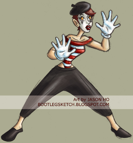
Vengeance is Mime!

Um, yeah, so the title of my post really doesn’t make any sense, but it is a terrible pun involving the subject of today’s sketch, so I stand by it. A mime was this week’s challenge for Rick’s character design blog:

click above for larger view

I’ve been having fun playing around with this new, somewhat more painterly style. But, wow… it’s been like a week and a half since I put up a nerdy fan art. I promise I’ll post something very dorky on Tuesday!

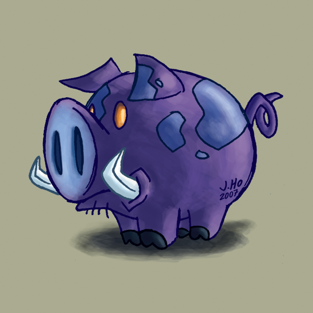
Happy New Year! Guh Wha–!?

It’s the year of the pig! (That’s on the Chinese Lunar Calendar, if you didn’t know)

My technique is getting pretty routine now which means two things:

  1. I should probably start trying some new things, and…
  2. I don’t have much to say about this.
As for why the pig is blue and purple with amber-colored eyes… I guess I just felt like giving him some fanciful colors.

Fun Fact: One of the rejected titles for this post was Should Auld Acquaintance Be Pork-ot. Seriously!

Character of the Week: Burglar… PLUS BONUS!

(Posted early because I’m too tired to stay up until midnight, and dishonestly post-dated because I am a liar…)

My friend Rick is teaching a character design class at Cal State Long Beach–he has created a blog for the class, and each week he’s having his professional friends participate in the assignments along with his students. Well, somehow Rick totally overlooked the fact that I’m way unprofessional, and has allowed me to participate as well.

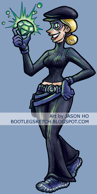
This week’s assignment was a burglar. The entries can be found here. And here’s what I cooked up:

click above for larger view

I took a little time to design this character’s build and costume, did a quick rough in blue pencil, and tightened it up in the inks. My “sketchy” ink style is starting to get cleaner the more I do this–I’m not sure if that’s a good thing or a bad thing overall, but in this case it worked, because the inks turned out pretty clean on the face in particular, so I was comfortable leaving the lines black, rather than softening them with color, as I have mentioned before. The coloring on this one was again done with the Nina technique, rather than the Skeletor technique. Surprisingly, I think the Nina technique is faster sometimes! The biggest difference on this piece is that I actually added some lighting effects from the gem’s glow. The lighting effects are a little sloppy and a little inconsistent, but for a relatively quick sketch, I’m okay with it. And hey, for me, any lighting effects at all are an improvement, yes?

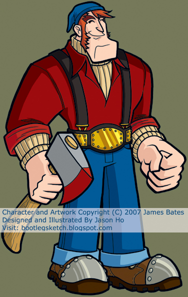
And as an added bonus… last week’s assignment from Rick was a lumberjack. The entries can be found here. This is mine:

click above for larger view

I didn’t quite have time to finish a new lumberjack illustration, so I sent Rick this, which was originally commisioned by my friend James Bates for an animation pitch a few years ago. This is a pretty good example of the anal-retentive style that I often make reference to. Extremely tight pencils and inks, but not many details on this one, because I was going for a simplified look, knowing that this was supposed to be an animation design. Looking back on it, I wish I had made slightly different color choices on the skin and undershirt, but overall it holds up OK, I guess.

Post Script: For those who did not notice–I posted a couple of reviews. Scroll down to the previous post to check ’em out!

REVIEWS: A Little Bit of Eastern Culture & A Little Bit of Arcade History

From time to time, I’m going to briefly review the books, comics, movies, TV shows, and action figures that are currently entertaining and/or inspiring me. In a roundabout way, this will give you an idea of what might be influencing me these days, even if it isn’t readily apparent.

Today’s offerings include an illustrated book and a video game anthology…

* * *

The Little Book of Hindu Deities, written and illustrated by Sanjay Patel (144 pages, full color, $14)

After reading an article about this book and checking out the author’s website, I could not resist buying a copy. Patel, who works for Pixar as an animator and storyboard artist, created this book on the side to showcase his heritage, influences, and mad skillz. He also made this book so that I would loathe my own lack of talent. The writing is lighthearted and tongue-in-cheek, and the illustrations are charming and expressive.

Verdict: Awesome. Find it for a few bucks less at one of the usual online vendors and BUY IT!

For More Eastern Religion Mixed With Pop Culture: Vimanarama by Grant Morrison and Philip Bond (104 pages, full color, $12.99)–easily one of my favorite comics of the past couple years.

* * *

Capcom Classics Collection Volume 2 (For Playstation 2 or Xbox, $19.99 )

This anthology contains numerous games from the prestigious history of arcade giant Capcom. With 20 games showcasing everything from bonafide blockbusters (Strider, Super Streetfighter II Turbo) to beloved cult classics (King of Dragons, Captain Commando, Magic Sword) and obscure gems from Capcom’s past (Avengers, Quiz & Dragons) this anthology provides a veritable cornucopia of sprite-based goodness. That’s right, a veritable cornucopia. And the great thing is, these are perfect arcade ports, which means unlimited continues! For once, my complete lack of game does not hinder me!

Verdict: Awesome. Buy it and relive your days of boundless arcade glory.

For More Boundless Arcade Glory, Good Sense Requires You To Try: Capcom Classics Collection Volume 1 (For Playstation or Xbox, $19.99). Dude. Final Fight, Forgotten Worlds, Streefighter II–need I say more?

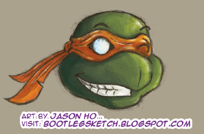
Cowabunga and Happy Saint Valentine’s Day Eve!

I’m winded from writing long rambling posts. I’ll keep it short today (for once!)…

Hope you all come out of your shells this Valentine’s Day. Eh? Get it? Shells? Like a turtle’s shell? Eh? Eh? No? Okay.

Original sketch in blue pencil, colors in Photoshop (using the same method that I colored Nina MC with). When I draw Ninja Turtles, I try and give them just a bit of a beak, so they’re a bit more “realistically” anthropomorphic. And that’s all I have to say about that!

Come back on Friday for a more involved sketch (not involoving Ninja Turtles) accompanied by a long rambling post–the kind that you have grown to expect from me.

"Uno Gato Muy Peligroso" o "Uno Blog Post Muy Nerdoso"

Yet another re-design challenge at the He-Man.org fan-art forums–my post is here and the original thread is here. The voting thread is here–I placed second.

The subject this time around is part of a line of Argentinian toys called Fuerza-T. These action figures used old He-Man molds (licensed by Mattel, as far as I know), with mixed and matched body parts and accessories, and new color schemes to make each figure appear unique. While they are not officially He-Man toys, Fuerza-T action figures are still of interest to enlightened He-Man enthusiasts. I am one of those enthusiasts.

Felinor is a member of the evil Aracnos faction. His hobbies include drinking the blood of his enemies. His dislikes include the rival villain group Escorpius, and the heroes known collectively as Fuerza-T. The toy version of Felinor is constructed from Mer-Man’s head, Beast Man’s body, Skeletor’s armor, and He-Man’s power sword. My version diverges from this a little, for the sake of making Felinor appear a little more unique:

click above for larger view

This one came together pretty quickly–for whatever reason, I was able to quickly pick colors that I was satisfied with, which I usually find difficult and time-consuming. The key for me was adding more cold colors to accompany the white face and turquoise brow of the original color scheme. His chest and shoulder armor were modified to resemble the Aracnos symbol, and the studded arm bracers are taken from the official illustration of Felinor. I added the nose, the tail, the scaley feet and hands, and the cat’s eye motif (A lot of the other fan-interpretations of Felinor include a cat’s eye motif as well). The cape is my addition too–inspired by the hood-like collar in the original illustration. Despite the wisdom of the Incredibles, I just think everyone is cooler with a cape. And as a nod to Felinor’s allegiance to the Aracnos, his cape has eight points, just as a spider has eight legs.

Man… posting a drawing of an obscure Argentinian action figure with a metafictional lineage that connects back to three of He-Man’s greatest foes just doesn’t seem geeky enough. What could I do to really geek this up? I KNOW. Since very little is known about him, I could write a little background material for this crazy cat (get it? cause he’s a cat)…

* * *

FELINOR is fiercely loyal to Carnivor, ruthless leader of the Aracnos faction. His golden sword was created by a master sword-maker, in a mortal attempt to mimic the divinely forged perfection of He-Man’s power sword. The sword-maker’s intentions were not sinister, but Felinor cast a spell to corrupt the blade, and the cursed sword now shares Felinor’s hunger for blood. To further bolster his strength, Felinor encrusted his power sword’s hilt with an enchanted gem. This gem is another counterfeit–copied from an artifact from the nearby planet Thundera (the gem on his breastplate is simply decorative). In spite of all this, Felinor’s power sword still does not match that of He-Man or She-Ra’s true power swords. It is rumored that the mysterious sword-maker escaped and disappeared, and was even able to forge more power-sword imitations. the existence of these swords has not been confirmed.

Most recently, Carnivor has discovered the existence of planet Earth, and has sent Felinor and a subterranean attack force to perform reconnaissance and prepare the planet for invasion.

* * *

I coined Felinor’s title of “Evil Nocturnal Champion” myself, but in light of the profile I just whipped up, I wonder if “Evil Copy Cat” would have been more appropriate?

Now For Something Completely Different…

It’s far from my standard uber-nerdy fare, but every now and then I get inspired to do something out of the ordinary. This one is for Jacob, who one day linked me to a German Hip Hop video on YouTube by a group named Deichkind. The video featured a female MC called Nina (sometimes referred to as Nina MC). Here is my interpretation of the very striking Nina MC:

click above for larger view

And here is the aforementioned video by Deichkind, entitled Bon Voyage (No, I’m not confused–yes, it is a German track with a French title):

My sketch is a somewhat loose take–it’s more caricature than portrait, and not much of a caricature at that. But I think it captures some of her spirit. Keen-eyed observers will note that while Nina sported a pull-over hoodie in the video, I drew her with a zip-up hoodie. My personal bias for zip-up hoodies aside, I was also looking for an excuse to draw an exaggerated, over-sized zipper.

My pencils and inks were a little bit cleaner this time around, but i was looking to do a little something different with the colors, so I took the suggestion of my friend Charles, and loosened up some. I still used Photoshop, but instead of making my usual super-careful lasso selections, I just colored the whole thing with the paintbrush tool. I chose the brush that mimics a marker tip, and brought the opacity down (30%-60%). I’m pretty happy with the results.

Don’t get me wrong, Nina is Jacob’s gal–as far as raven-haired Euro-hotties go, Nigella Lawson is more my speed (call me, Nigella!). Now, the lovely Nina aside, let’s talk about Deichkind–these dudes are freakin dope! I have no clue what their lyrics are about, but they got “mad flow” as the kids say.

Actually, now that I stop and think about it, there are only two people that I know who understand any German at all, and one of them is my Dad. Dad, if you are reading this, I apologize in advance if you heard any explicit German lyrics, and I implore you to NOT tell me what those lyrics say, because the last thing I need to hear is German obsenities translated into English by my father. Thank you.

Here for your enjoyment, is another Deichkind video, sadly sans Nina, but awesome nonetheless:

For more on Nina MC:

EX-TER-MIN-ATE!!!

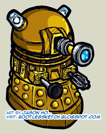
Turning anything into a baby, makes it cuter… right? This baby Dalek is for Karen, who got the entire office hooked on the new Doctor Who:

click above for larger view

I don’t think this piece was completely successful. Instead of looking like a super-deformed Dalek, it kind of just looks like a misdrawn Dalek. What do you think?

Anyways, it’s colored gold, as per the most recent incarnation of the Daleks. A semi-significant art note, for anyone interested in the details–this is the first sketch I’ve posted where I’ve completely left the line art in black. If you go back and look at previous sketches, in each one almost all of the outlines are in color. Even most spots where the lines appear to be black, a closer look will reveal that it’s usually a very dark grey, brown, or blue. The purpose of this is to “soften” up the sketch–excessive amounts of black sketch lines can look very harsh. However, harshness, I thought, would go well with a Dalek.

I always thought the Daleks were kind of silly, I mean one arm is a toilet plunger, and the other arm is a cake mixer. What’s scary about that? And then I started thinking about it while I was drawing this… one arm is a toilet plunger and the other is a cake mixer. Do not, I repeat: DO NOT, eat an unidentified cake, if Daleks are known to be within the area!

Post Script: Regardless of what you think of the old Doctor Who (or even if you know nothing about it), give the new series a shot–it’s a good time.

BONUS POST: Rare Mention of the Day Job

My first professional writing credit will be debuting in comic book stores on Wednesday January 31. Before you get too excited, it’s just a 3-pager, and I co-wrote it with my friend and colleague, one Nathan “The Hammer” Hamill. This immediately brings to mind jokes about how many people of a particular brand it takes to change a lightbulb, but nevertheless, we are proud of our efforts. As it is a 3-pager, here is the only panel I can show you that has no spoilers.

In addition to co-writing the story, I pencilled it, and The Hammer colored it. The inks were executed with steady, surgical precision by the one and only Mike Rote. Our story is entitled “Scream A Little Scream” and it appears in Simpsons Super Spectacular #4, published by Bongo Comics:

Did I use "whom" correctly in this post?

This illustration was for another re-design challenge at the He-Man.org fan-art forums. The parameters of this contest were a little different–instead of re-designing existing characters from the He-Man/She-Ra canon, the goal this time was to redesign an unused concept drawing from the He-Man toyline. The concept drawing in question depicted two different versions of an unnamed female ranger-type character. The two concepts looked distinct enough that I thought each one deserved a full-fledged character design. My post is here, the whole thread (including the original concept drawing) is here. Voting thread is here–I placed third.
click above for larger view

You may or may not notice, but the inks on this sketch are much cleaner than anything else I’ve posted so far. This is the result of a few factors:

  1. My natural tendency towards the anal-retentive style that I have referred to in the past (ironically, drawing loosely requires more conscious effort on my part).
  2. The relatively small size of the original pencil sketch, prohibiting a certain degree of looseness.
  3. Female subject matter–whom, if drawn with an excess of sketch lines, can begin to appear harsh even if that is not the intended result.
  4. More design work than usual–the more I have to design a character’s costume elements, etcetera, the tighter I pencil. The tighter I pencil, the tighter I ink.
The coloring this time around was a bit difficult for me. Because I had no pre-existing colors to go off of, I went through several different color schemes before settling on what you see here. The trick was that the image needed to capture the bright, saturated, primary colors that I associate with the style of the He-Man universe. My first few attempts were done in subdued earth tones and olive-greens that were more befitting forest rangers in the “real” world. However, the result was that my redesigns simply looked like generic Dungeons and Dragons types rather than characters that looked like they specifically belonged in He-Man’s world. With that in mind, I adjusted the colors to try and capture the cartoony feel of He-Man as best I could. I think Trakka’s color scheme is more of a success than Rayn-Ja’s.

Here’s a brief profile that I whipped up for the two of them (oh, and the cheesy names were completely created by me):

* * *

TRAKKA (an Eternian “human”) and RAYN-JA (of the Tree People) are expert foresters and sworn sisters. They patrol the wilderness ranging between the Eternian capital and the ancient home of the Tree People, guiding travellers and merchants, apprehending poachers, and negotiating disputes between various forest-dwelling tribes. TRAKKA’s skills in archery are unparalleled by any villains that the Horde or the Snakemen have to offer–only Skeletor’s henchman Ninjor has ever equalled TRAKKA’s deadly aim. RAYN-JA uses her MOON STAFF to channel potent druidic powers that allow her to shape and communicate with the wilderness. They frequently ally with Moss Man, and the matching hunting knives that they carry were given to them by King Randor in honor of their heroic deeds.

* * *

That Dude is a Beast, Man!

His name is Beast Man
Fierce Minion of Skeletor
Savage Orange Rage

click above for larger view

I’m pretty happy with how this turned out–just don’t try examining his musculature–it’s an anatomical mess! Action pose is a little awkward, but better than my Mer-Man or Tri-Klops, I think. As usual, I tweaked the colors a little bit, where I thought it was logical to do so–the biggest change being that I made his arm-pads gold instead of red. I have no idea if there is any precedent for his whip to be made of energy, but the idea of coloring a plain black whip seemed BO-RING. I do know that the villain Blade had an energy whip in the live action Masters of the Universe movie. (+4 geek points)

As usual, this was posted on the He-Man.org fan-art forums. My post is here, the entire thread (including some of my previous sketches) is here.

Found $1300 This Weekend!!!

Okay, that title is wildly misleading, but stay with me, Dear Reader, as I relate my fantastic tale:

This weekend, my mom found a stack of my old college notes and papers. I sorted through it, and about half of the papers were blank on one side and therefore still usable as scratch paper for me to draw obscure He-Man characters on. (I compulsively save any paper that can still be drawn on–I sort of have a reputation for being “that guy”)

Anyways, after doing some calculations about the time span that those papers covered, and the amount of tuition paid during that time, I somberly informed my mother that it was about $1300 worth of paper that I was recycling, and the stack of scratch paper I was taking with me was worth another $1300. I don’t know if she found it as amusing as I did.

What does that have to do with anything? I guess I just thought it was a funny little story. OH RIGHT, you folks are here for sketches of obscure nerdy characters. Here you go:

click above for larger view

However, speaking of my rabid conservation of scratch paper, it is worth mentioning, for those who are interested, that the preceding illustration was drawn on a piece of lined yellow paper from a legal pad. I scanned it in color, and by fiddling around in Photoshop with the “Select Color Range” function, I was basically able to clean up the image without doing much work, and color it as I normally would.

Numbered 017, Hardtop Tortoise (known in Japan as Black Turtle), is one of many characters from the toyline Battle Beasts.

Fun Fact: Battle Beasts started off in Japan as a spin-off of the Transformers, and they were known as Beast Formers. When they were brought to he United States, they were renamed and marketed without any mention or indication of their relevance to the Transformers mythos.

TERRIBLE TITLE: If At First You Don’t Succeed, Try, Try, Tri-Klops Again…

A few quick notes–

  1. For anyone who did not notice, I put up a bonus post on Wednesday night. Check it out–it features more J.Ho art as well as some non-J.Ho art!
  2. For those who don’t care about He-Man (who are you people?)–please keep checking back–I have several pieces coming up that have nothing to do with He-Man, and at least two that don’t even have anything to do with cartoons. Really!
  3. There was an issue with the line-spacing in my posts, where I was getting single-spacing and double-spacing at seemingly random intervals. I have fixed it, and conformed all posts to single-spacing. If you have a strong preference for double-spacing please let me know.

Okay, enough with the small talk–today’s entry is Tri-Klops, another evil minion of Skeletor:

click above for larger view

This was kind of an odd one–I started with a really messy sketch, which was so heavy with blue pencil that i couldn’t go over it with ink to tighten it. I was able to do a slightly-refined-but-still-very-messy ink sketch over that. I scanned that in, and tried inking it in Photoshop, but that was too clean compared to the other sketchy He-Man pics that I’ve been drawing. So I cleaned the scanned ink sketch a bit (but obviously retained a level of sketchyness to be consistent with my other drawings), and merged that with the “too clean” Photoshop “inks” to get the final line art. That whole process didn’t take as long as I might have made it sound, maybe an hour or so. The coloring of Tri-Klops was basically uneventful.

This pose is a little more dynamic than the others I’ve posted so far… still a bit awkward, but for the time it took me, I’m basically okay with it. As usual, I took a few liberties in depicting the costume details and colors. I merged the harness of his armor with his belt, because I felt that the design on the original toy was a bit redundant, and I made the green parts of his armor more olive, because I felt this matched the orange better. In a nod to the 200x design, I “covered” his neck. I also changed the colors of his sword, but I’m not sure how I feel about the result.

As for the title “Evil All-Seeing Swordmaster,” well, I’m kind of freestyling there. The original tag for the action figure was “Evil and Sees Everything.” Skeletor is a “Lord of Destruction,” and Merman is an “Ocean Warlord”… all Tri-Klops gets is the same description that I would use to describe a nosy neighbor? Not very intimidating. So anyways, I tried combining what is known about the character to create a more menacing title, while trying to stay within the style of the original toys.

As usual, this was posted on the He-Man.org fan-art forums. My post is here, the entire thread (including my Skeletor sketch) is here.