You can guess who’s coming up next, but to start, here’s Oliver Queen, the Green Arrow:
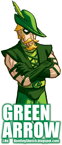
Hmmm… I probably should have drawn his quiver of arrows. I guess Ollie is ‘off duty’ in this picture.
You can guess who’s coming up next, but to start, here’s Oliver Queen, the Green Arrow:
Hmmm… I probably should have drawn his quiver of arrows. I guess Ollie is ‘off duty’ in this picture.
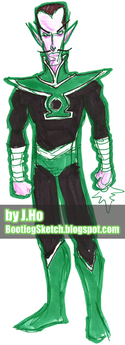
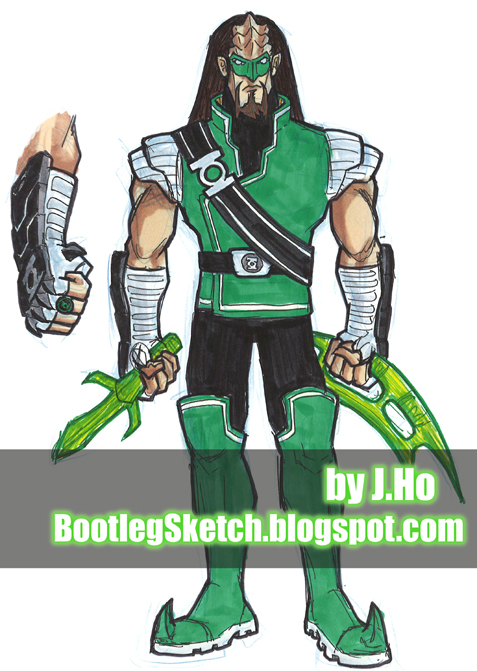
Believe it or not, I drew this sketch some time ago, long before the Rebirth storyline–so the resemblance to Sinestro’s current uniform is actually just a coincidence. Of course, as a result of the aforementioned Rebirth storyline, it would be difficult (if not impossible) to write a credible story rehabilitating Sinestro in any way, shape, or form. I’m okay with that, because not only do I dig Sinestro’s current uniform (I even drew it once… sort of), I think the storyline of the Green Lantern(s) has been hitting all the right notes in recent years. But if Geoff Johns ever gets sick of his job, I’ll be glad to take over.
For my first take on this guy (left), I gave him the traditional Green Lantern insignia, but on the second take (right), I gave him Kyle Rayner‘s insignia, to emphasize his rookie persona. The next post is NOT a Green Lantern whose species originates from outside the DC Universe.
My apologies to hardcore Trekkies, the Bat’leth and D’k tahg were drawn without reference, so the details are a little sloppy. Stay tuned for more nerd synergy!
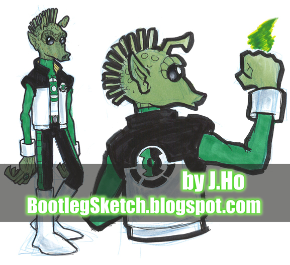
These sketches were done quite some time ago–for the first installment, a Skrull and a Wookie:
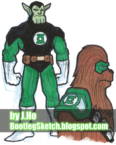
As you might notice, these are blue pencil sketches, hastily inked and colored with marker. I basically just wanted to get these down on paper, rather than stress out over them. I’m not trying to make excuses though–that Skrull’s foot is terribly contorted and way too big. The next installment will be better, promise.
I love all those versions of Batman–but to me, this is the guy. The Batman of Dennis O’Neil and Neal Adams:
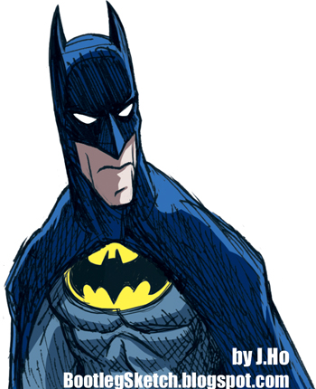
He’s lean, he’s mean, he’s blue and grey, and he’s got the yellow oval (though I drew it a tad too big). And I’m waffling… he might sound like Kevin Conroy.

I drew this right after seeing the movie, but it’s only loosely based on Gary Oldman, drawn without looking at reference. More Bat-stuff next time. Perhaps even the Man himself?
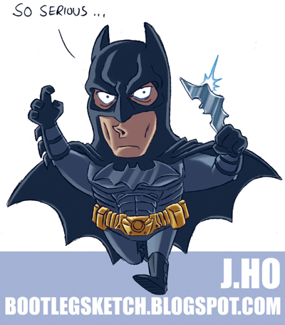
Given my complaint about seriousness, it was pretty funny to me when I found out that the Joker’s tagline for The Dark Knight was “why so serious?” At any rate, I’m looking forward to The Dark Knight.
It’s out today (Wednesday, July 9), so go support your local comic book store and buy a copy! Right now! Or order it online! Right now!
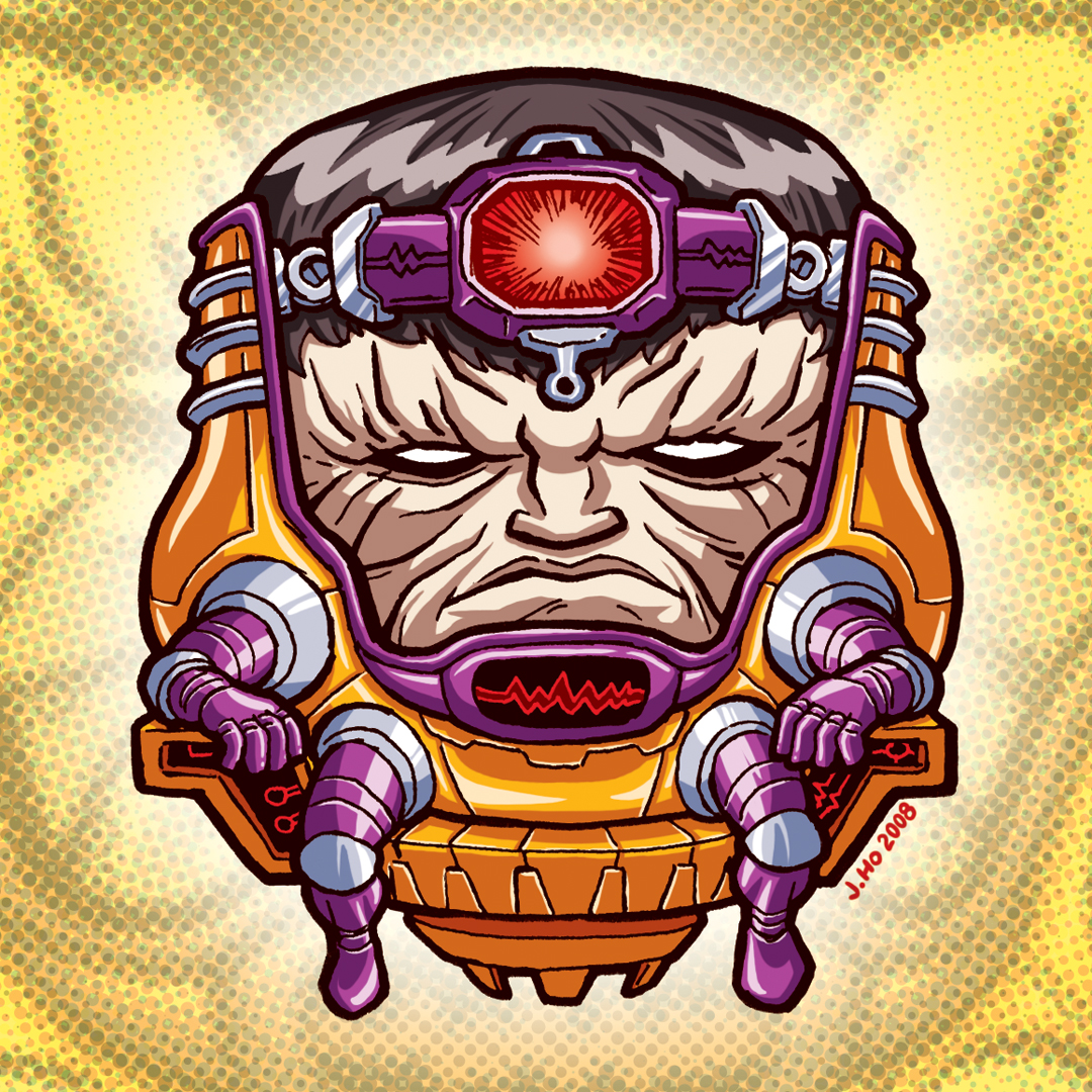
MODOK is spectacularly hideous, and therefore great fun to draw.
And now, a five second review!

The Fall (In theaters now!)
Contrasting a slyly humorous, self-aware, and visually gorgeous fantasy world against a nostalgic yet poignant view of 1920’s Los Angeles, The Fall elegantly tells the story of two convalescent hospital patients. Watch the trailer here.
Verdict: Awesome. Just go watch it!
For More Fantasy Movie Awesomeness: Corny and not self-aware, Krull is still pretty awesome. Just saying.
L’il Logan!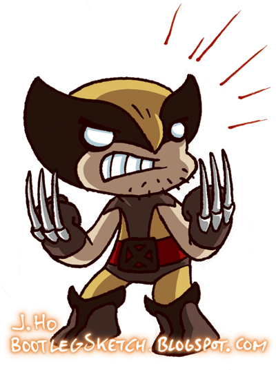
My non-l’il version of Wolverine can be seen here, if you care to compare the two.
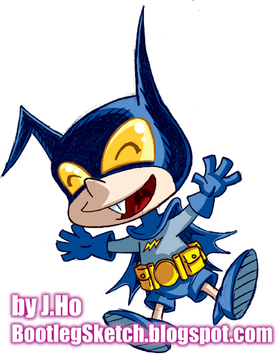
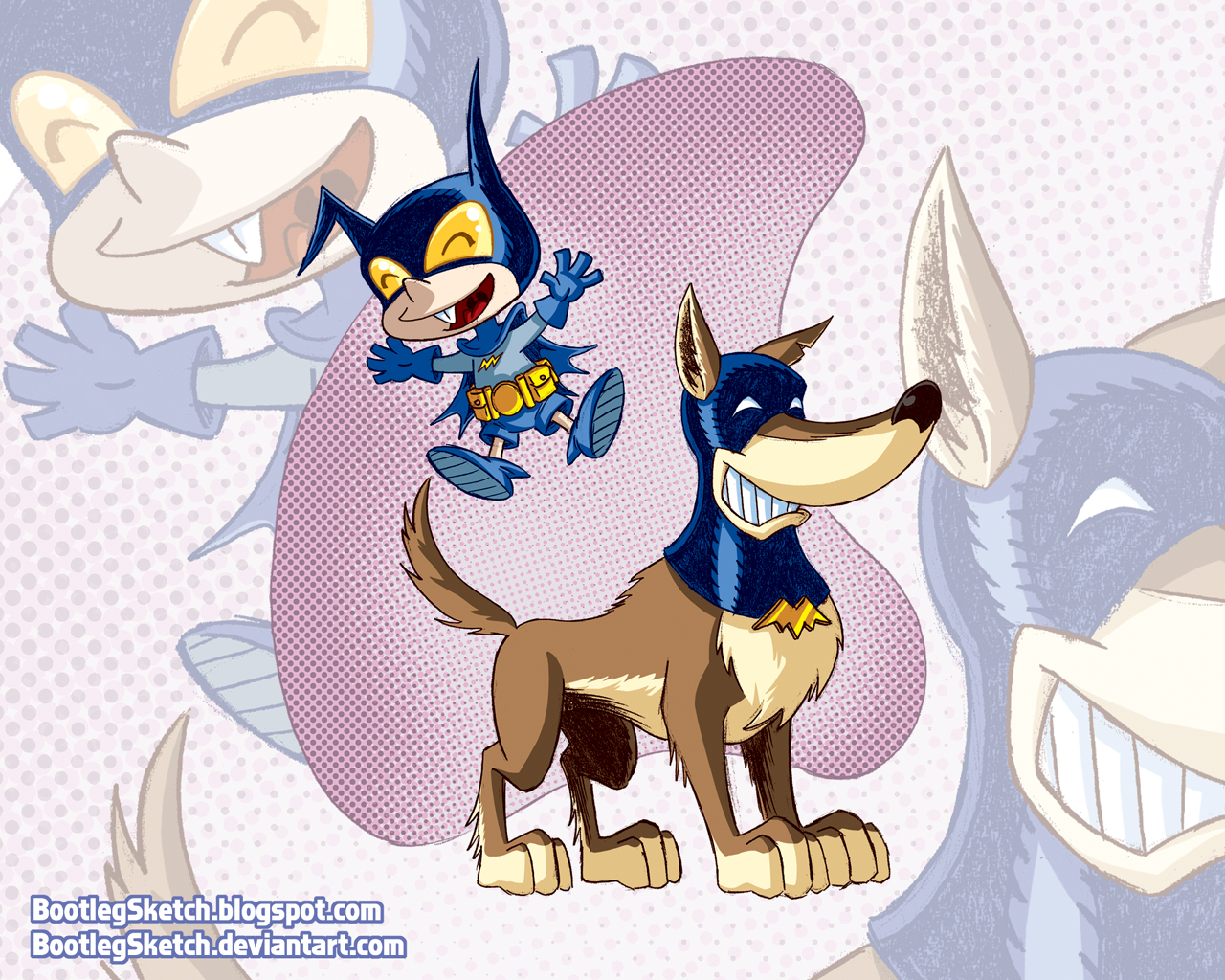
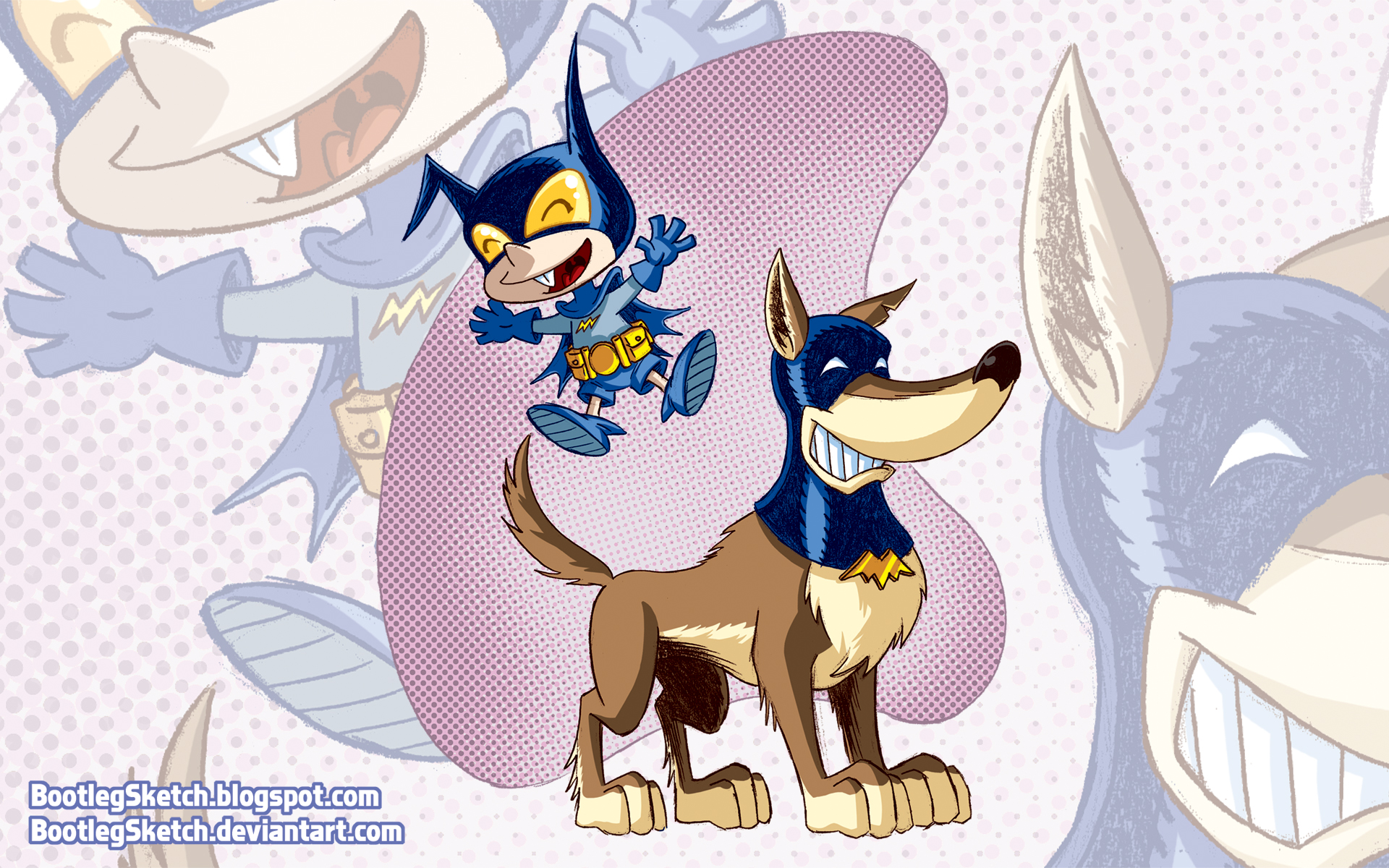
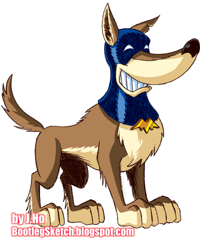
If anyone from DC editorial is reading this, please hire me to write and draw a new Bat-Mite series, co-starring Ace the Bat-Hound. Thank you.
Sincerely,
J.Ho
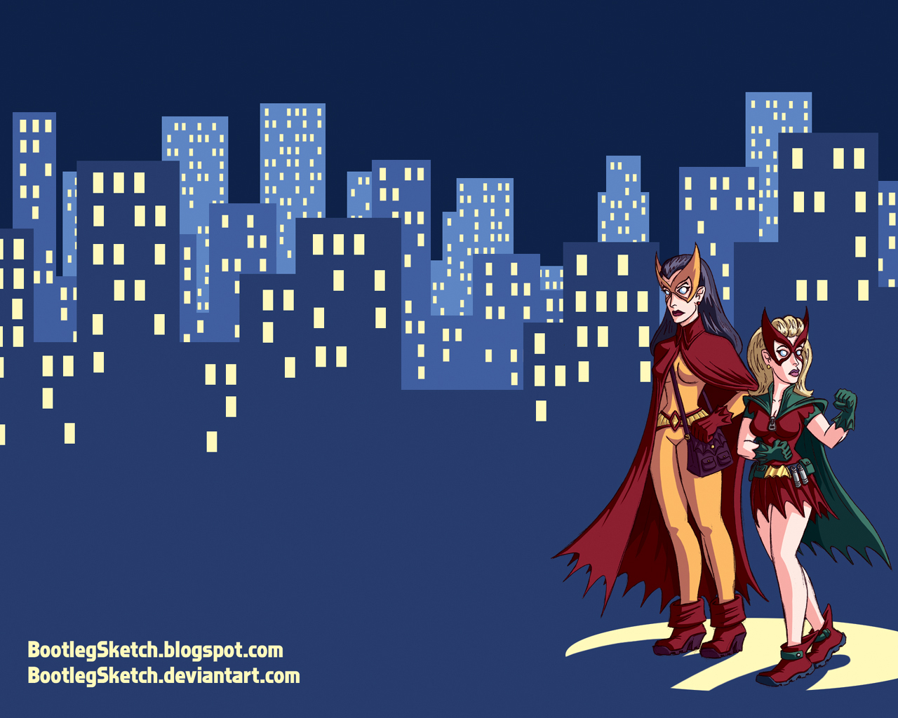
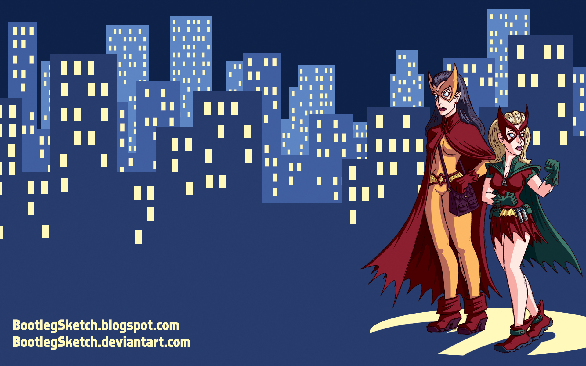
Post Script: Here is a wallpaper as incentive, conveniently available in both fullscreen and widescreen:
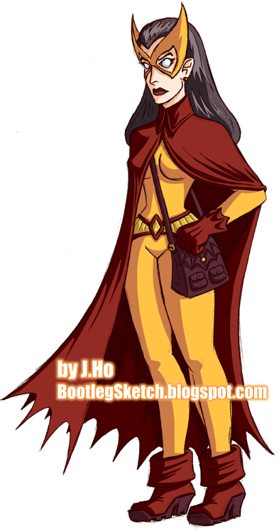
This was drawn around the same time as the Batwoman and Bat-Girl pieces that I posted two weeks ago. If you haven’t guessed which character I’ll be posting on Friday, here’s a hint: he does wear short-pants sometimes, but he is not Robin. See ya Friday!

And a wallpaper–available, for your convenience, in both widescreen and fullscreen proportions. Please enjoy:
This is an older drawing that I colored up. You can probably imagine what’s coming next friday when I post the companion to this piece.
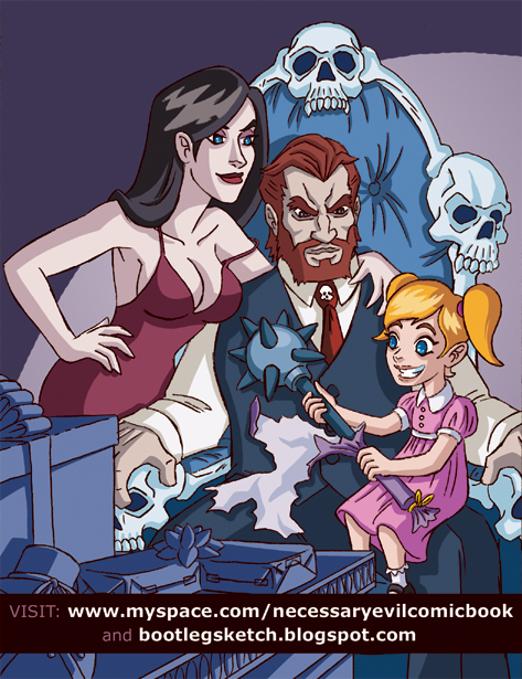
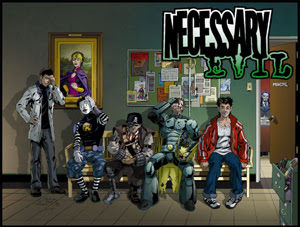
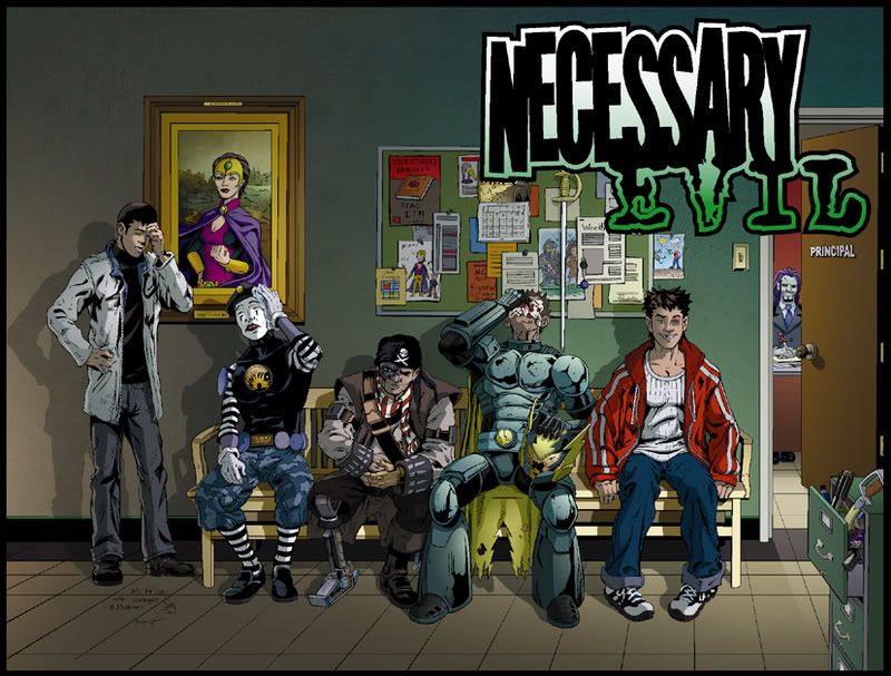
The full three pages are available to read for free (that’s right, free) on Josh’s blog, the Necessary Evil MySpace page, or on Desperado’s forum. Check it out at any of those sites, and let me know what you think! (EDIT: also posted on Newsarama and CBR)
The first two issues of Necessary Evil are available in comic book stores now, and Issue #3 should be on the stands in early January. Ask your local comic shop to order Necessary Evil–it’s available in Previews. And after you’ve done that, add Necessary Evil as your friend on MySpace.
Previous Necessary Evil posts:
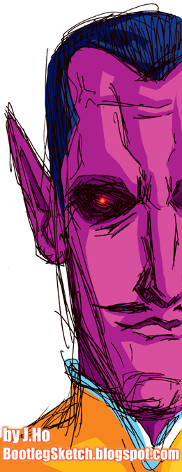
It started out as a quick pen sketch, but it grew on me, so I decided to color it up and post it. I chose to give him his present-day colors because frankly, it never made sense to me that a character who was yellow-themed would have virtually no yellow on his uniform whatsoever. The face is cut off because I wanted to show the duality of a former hero turned villain–the missing half of his face represents Sinestro’s sense of morality, forever obfuscated by… OKAY, IT’S ALL A LIE. I drew him too close to the edge of the paper. Listen, if I had realized it was going to turn out halfway decent I would have started on a new sheet of paper. Sometimes these things take you by surprise!
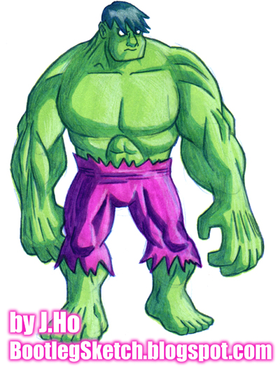
He kind of looks more like the the Jolly Green Giant‘s little pal Sprout than the Incredible Hulk. OH WELL.
I started with a rough sketch in colored pencil, and then laid down the flat colors and main shadows in Prismacolor marker. I picked up the colored pencil again to draw in the lineart and add additional shading. Finally I used a white color pencil for some highlights. The only thing I did in Photoshop was adjust the colors to match the original (it’s pretty close) and drop in the type. Overall, I prefer doing my coloring digitally, but it’s nice to take a break and get back to my analog roots every now and then.
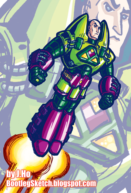
From start to finish this whole thing took under 3 hours, which is pretty fast for me. Sketched in pen and Sharpie, but this time I did look at reference and I took a little more time cleaning it up in Photoshop before coloring it. Getting the colors right on this one was surprisingly easy. But I guess when you’re coloring lime and berry power armor, it’s pretty easy to zero in on the right colors. As for the drawing itself, Lex’s pose is a little stiff (somewhat intentional) and the composition is incredibly boring (not intentional).
Continuity-wise, this one is all over the place. Identifying Lex as a billionaire in the title of the post implies the post-Crisis version (I’m pretty sure all the pre-Crisis versions were finiancially unsuccessful). However, the reference I followed was the Lex Luthor action figure from the old Super Powers toyline, which implies either the version from the Super Powers cartoon (naturally), or the pre-crisis Lex Luthor of Earth-One. Furthermore, while drawing it, I decided to give Lex his kryptonite ring, which is definitely a post-Crisis detail, and to complicate matters his face is somewhat reminiscent of the version seen in Superman: The Animated Series” and Justice League Unlimited. Of all these confusing and obscure details, my favorite is the fact that post crisis-Lex has green eyes (according to the DC Comics Encyclopedia) and pre-Crisis Lex from Earth-One had blue eyes (according to Who’s Who volume XIV)–I gave this one blue eyes. So, in summary: hell if I know. Enjoy!